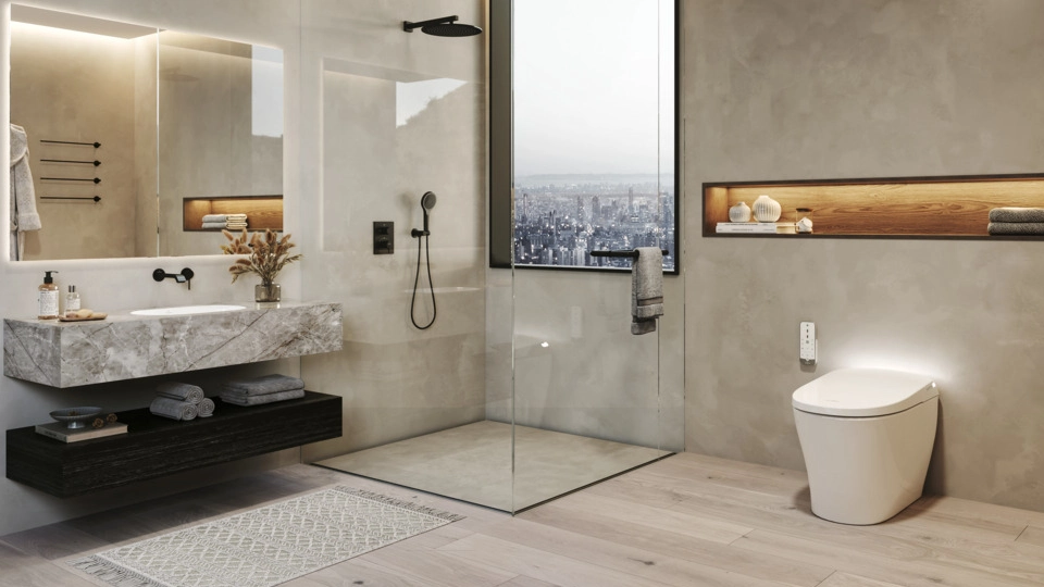

Colour has the power to make or break a room. Choosing the right colours for the space is a crucial part of its interior design. However, choosing a colour scheme and figuring out which colours complement each other is a daunting task. To resolve this issue, one needs to be aware of the basic principles of colour theory and the concept of the colour wheel. If you too are finding it hard to understand the world of colours – primary & complementary colour schemes, keep reading to explore our simple guide to understanding colours, colour theory, and finding the perfect scheme on the colour wheel.
We have also collected the most beautiful room interiors for you to help visualise various colour schemes. The interior colour scheme will definitely help you make up your mind about the colour you want to go with and also educate you on the technicalities of the colour scheme. So, let’s dive into the basics first!
What is colour theory?
Colour theory has a long and illustrious history that dates all the way back to Aristotle. Ancient philosophers debated the blending of colours and how they may be utilised to create new ones back then. Later on, scientists looked into the impact of light on the colours, the colour we perceive, and why. Around the 18th century, we began to create classifications that we still use today, such as primary and secondary colours, indicating a more modern approach to studying colour. From there, the scientific and artistic traditions of colour theory diverged. Artists concentrated on how colour could be made, blended, represented on a wheel and used, while scientists focused their theory on our perception in relationship to colour and light.
Colour theory is now defined as “useful assistance for visual artists and designers to help them come up with colour schemes and identify colours as we see them” in the artistic world. The colour wheel is the most famous tool used by painters to understand the interactions of different colours.
| Also see: Room colour: 115+ sublime wall colour schemes & combinations |
What is a colour wheel?
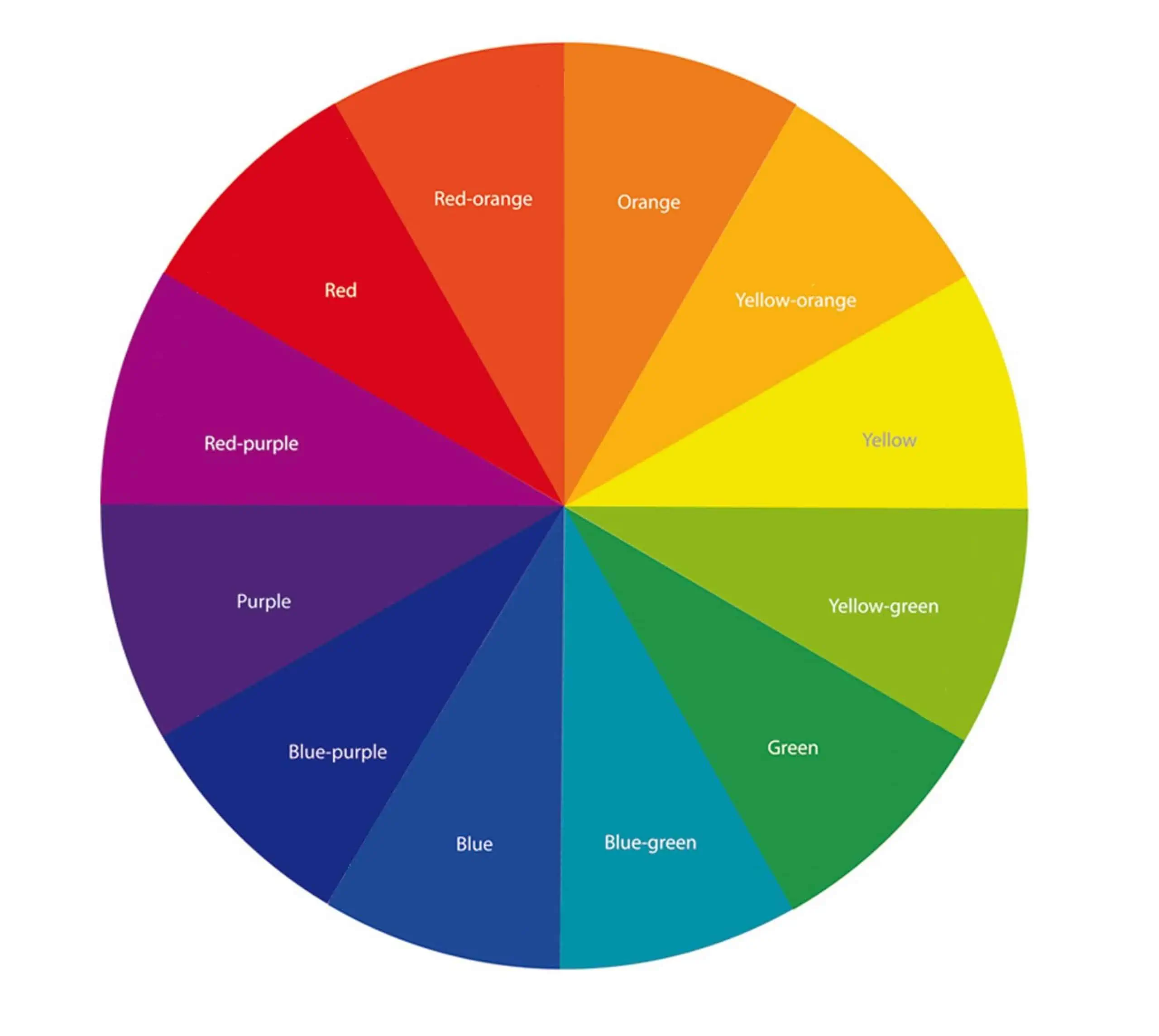
Image Source: Sosueme
A colour wheel is an illustration tool that helps us identify colours and their relationships to one another. Sir Issac Newton designed the original one in 1666, and since then, various iterations have been made. You would undoubtedly see the colour wheel in most painting schools and designers’ homes.
Colour is created in one of two ways: subtractive or additive. But why is that? It all boils down to how our eyes interpret light in order to discern colour. An additive colour wheel depicts how various light wavelengths can combine to produce visible colour. When white light, such as sunlight, reflects off of an item, the subtractive colour wheel shows how a colour appears to us.
Every decorative colour combination can be identified by its location on the wheel, a diagram that depicts the rainbow’s hues. The wheel divides the spectrum into 12 fundamental hues: three primary colours, three secondary colours, and six tertiary colours, making colour relationships easy to observe. Once you’ve mastered the colour wheel theory and its hundreds of permutations, you may use it as a guide to help you decide which colours to incorporate in your house and interiors.
| Also see: Revealing 23+ bedroom decor ideas and tips only experts know |
Classification of colours
Primary colours
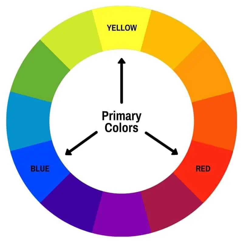
Image Source: Blendspace
Red, Yellow, and Blue
These three main colours make up the base of the colour wheel. They’re termed primary colours because their real colour pigments can’t be made any other way, and all other colours in the colour wheel are derived from these three colours. When painting, having a true primary colour from the wheel will enable you to blend a range of other colours.
| Also see: Buy modern wall art paintings for home decor at best price online |
Secondary colours
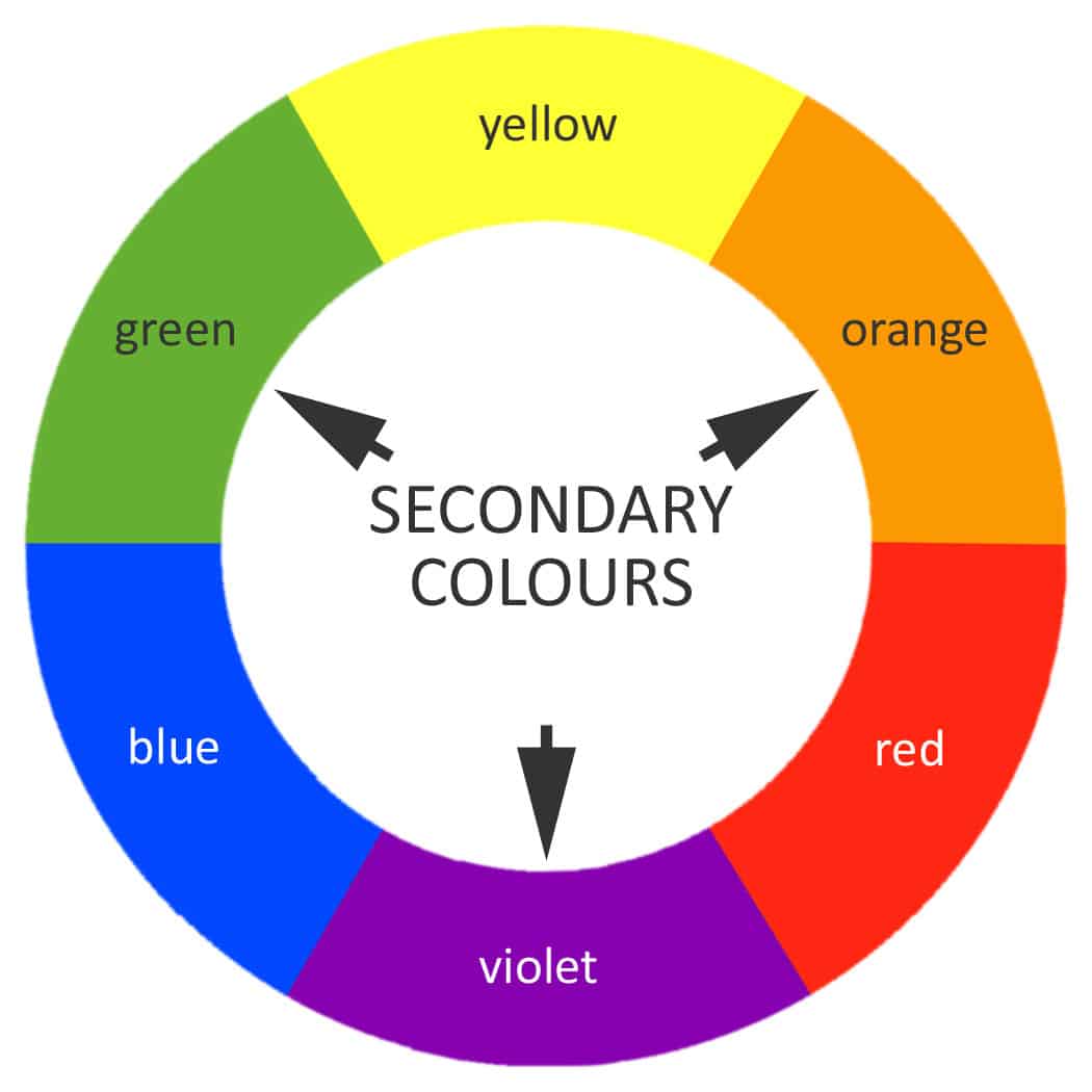
Image Source: Blendspace
Violet, Orange, and Green
Combining two primary colours from the colour wheel in equal parts makes up a secondary colour.
- Violet is created by combining true red and blue.
- Orange is created by combining red and yellow.
- Green is created by combining blue and yellow.


| Also see: Buy modern wall art paintings for home decor at best price online |
Tertiary colours

Image Source: Blendspace
Blue-Violet, Red-Violet, Red-Orange, Yellow-Orange, Yellow-Green, and Blue-Green
There are six tertiary hues in total. By combining equal parts of a primary and secondary colour, you get tertiary hues.
- The combination of blue and violet results in blue-violet.
- A combination of red and violet makes red-violet.
- Mixing red and orange will give you red-orange.
- Yellow with equal parts orange is yellow-orange.
- Yellow and green form yellow-green.
- The combination of blue and green makes the blue-green colour.
Finding complementary colours in the colour wheel
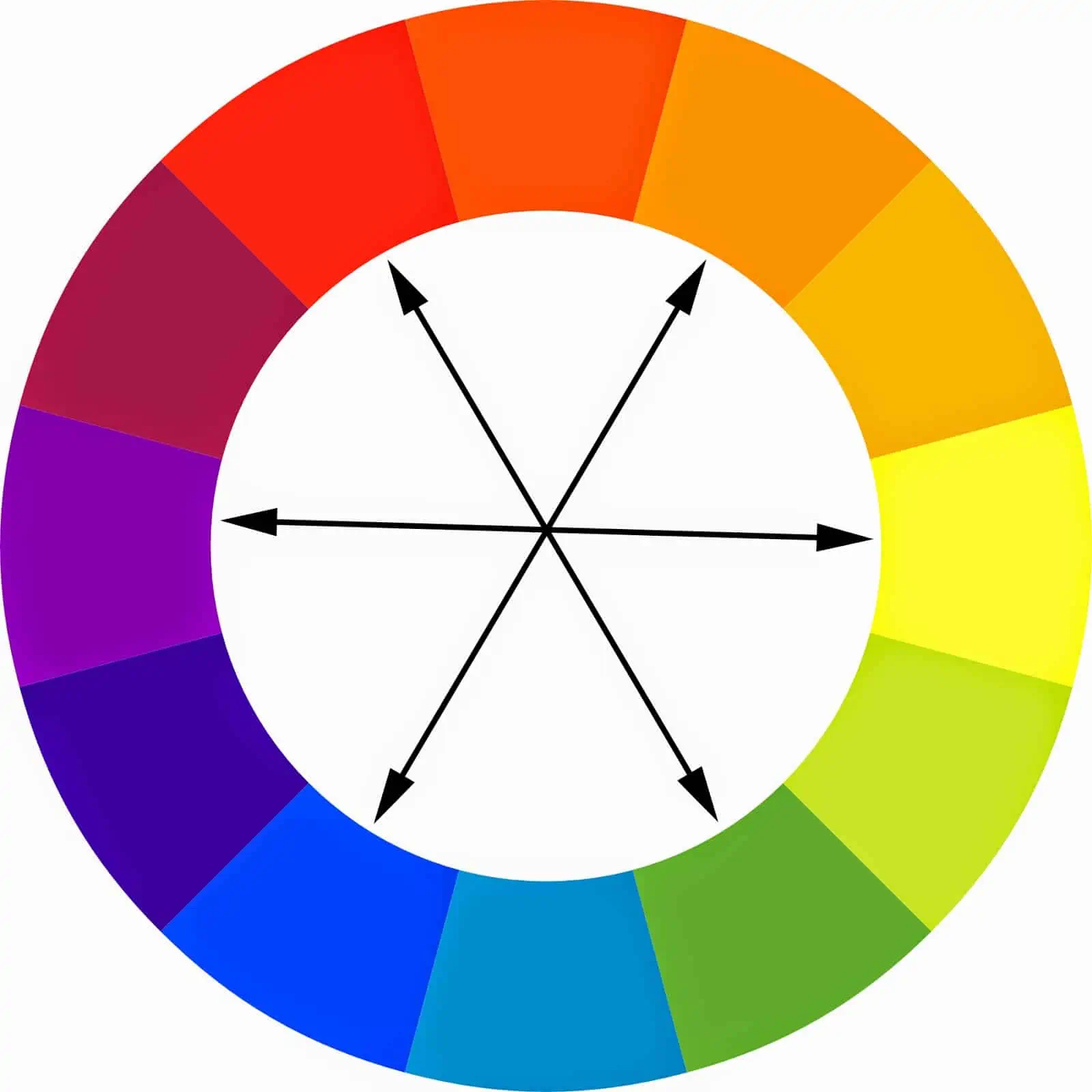
Image Source: Copic Marker Tutorials
When it comes to colour pairings, complementary colours can help you accomplish harmony in your design. Opposites attract in this scenario. Two colours present on the opposing side of the colour wheel make up this colour scheme. When you do this, you’ll get a bright, high-contrast colour scheme that really pops.
Red and green, yellow and purple, orange and blue, and green and magenta are examples of complementary colour combinations. Sports teams frequently utilise this method for their colours since complementary colour combinations are bold.
Add a third colour to a split wheel complementary scheme and make the colour scheme less vivid. It has a single base colour and two colours that are next to its complementary in the wheel.
Using colour wheel for home interiors
The colour wheel’s divisions can aid in the mixing of colours and the creation of palettes with varying degrees of contrast. By using the colour wheel, you can create four different sorts of colour schemes for your home interiors.
Monochromatic colour palette in the colour wheel
-

Image Source: Ketsiree Wongwan
-

Image Source: Foyr Neo
-

Image Source: Ana Maria Designs
-

Image Source: Asian Paints
-
Image Source: Pfeiffer Designs

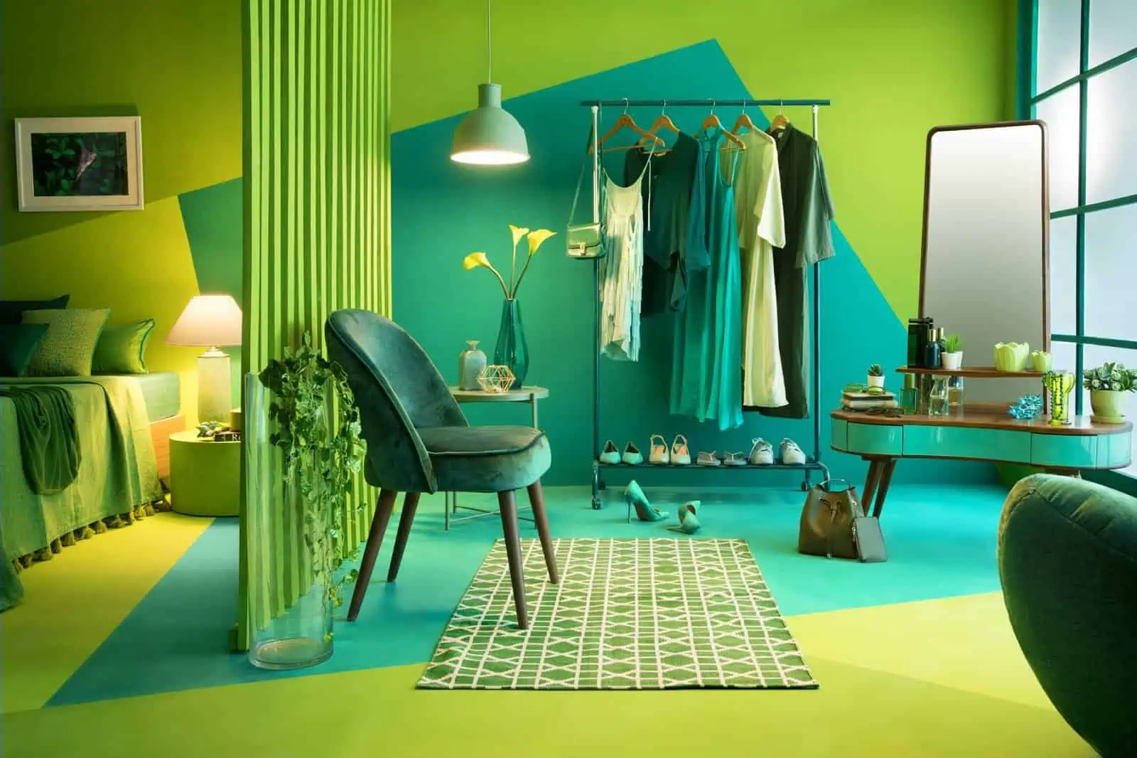
For a delicate palette, these tone-on-tone combinations incorporate many shades tints and hues such as pale blue, sky blue, and navy. Although the monochromatic aesthetic is the simplest to understand, it is also the most difficult to execute. Depending on how you approach it, a space with only one hue might feel either boring or overwhelming. The rooms in the images above feature a monochromatic palette that works.
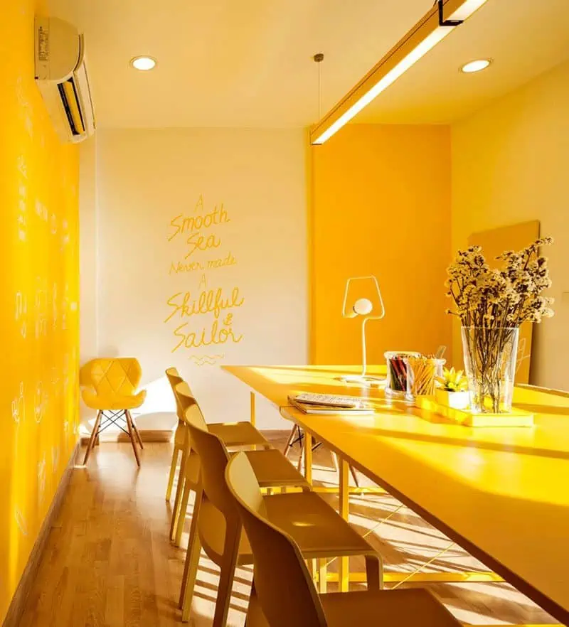
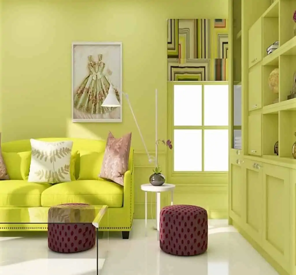
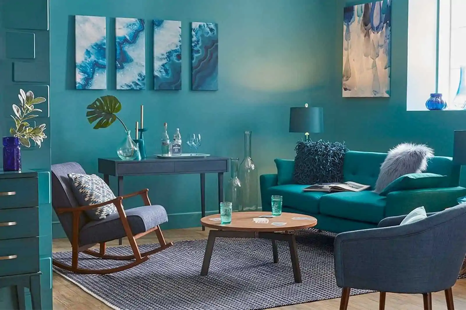
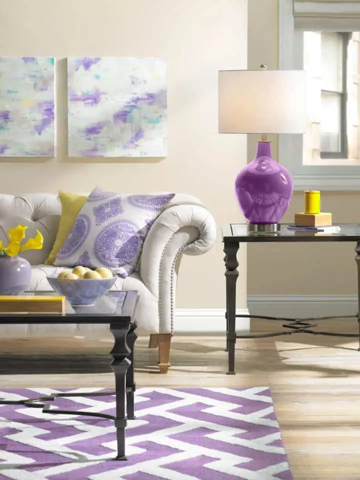
Analogous colour palette in the colour wheel
-

Image Source: Sessions.edu
-
Image Source: Anne Rosette Designs
-

Image Source: Allan Gillbert
-

Image Source: Simon Upton
-

Image Source: Dazey Den
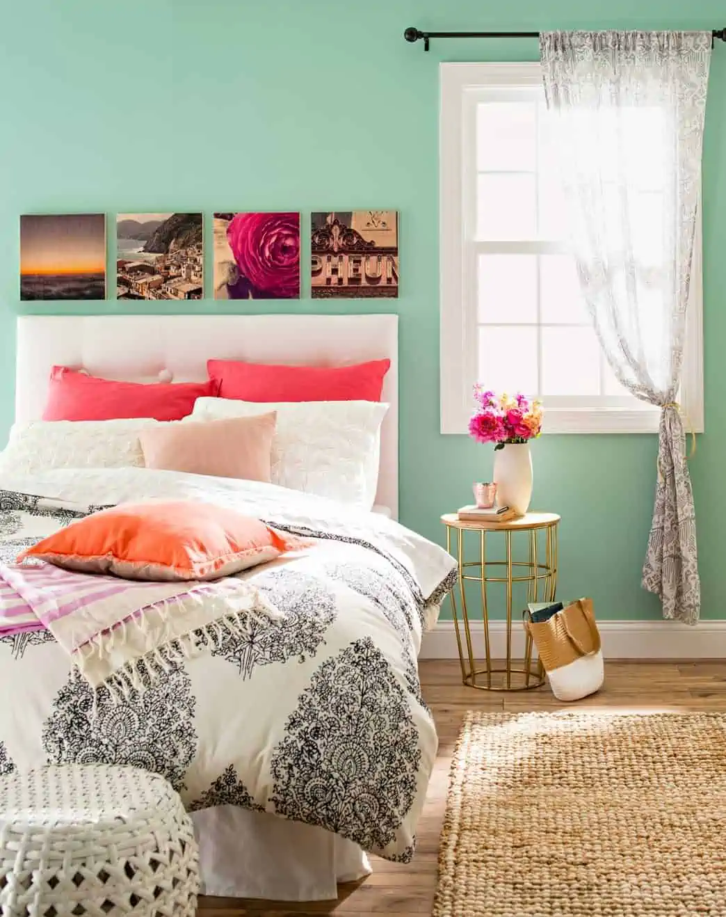
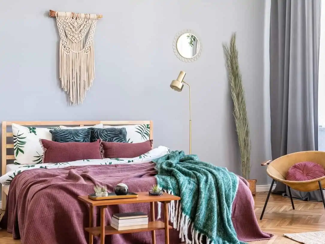
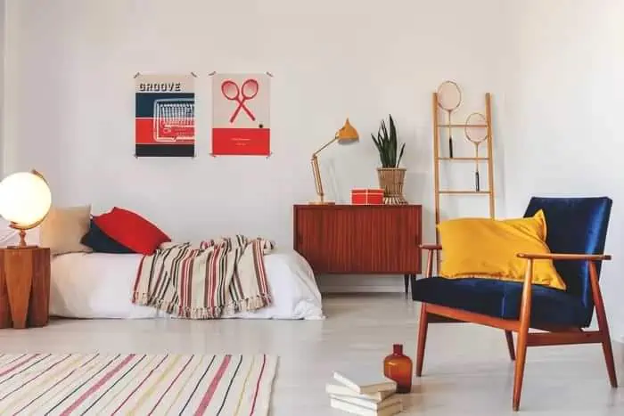
An analogous palette combines colours found side by side on the colour wheel, such as orange, yellow, and green. For a bright but calm atmosphere, this scheme adds a bit more contrast. Since they share the same foundation colours, neighbouring hues complement each other effectively. The secret to this scheme’s effectiveness is to choose one hue as the room’s main or dominant colour. It should be the most noticeable colour. Then pick one, two, or three accent colours for occasional use. The rooms seen in the photographs above have a similar colour scheme in their interiors.
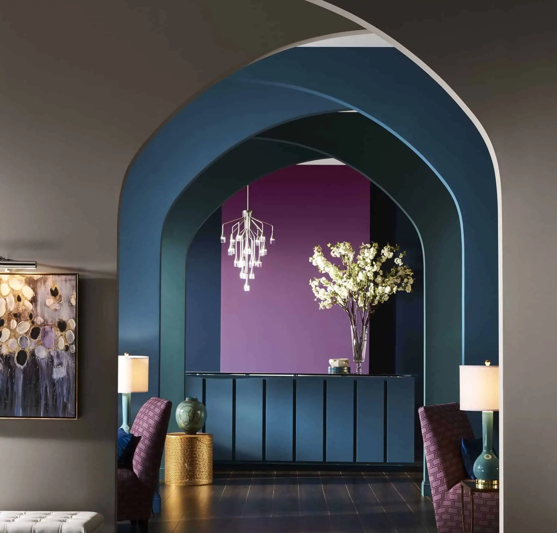
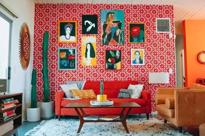
Complementary colour palette in the colour wheel
-

Image Source: Coma Frique Studio
-

Image Source: Lisa Romerein
-

Image Source: Brian Macweeny
-

Image Source: Greg Scheidemann
-

Image Source: Zylus Interior Design
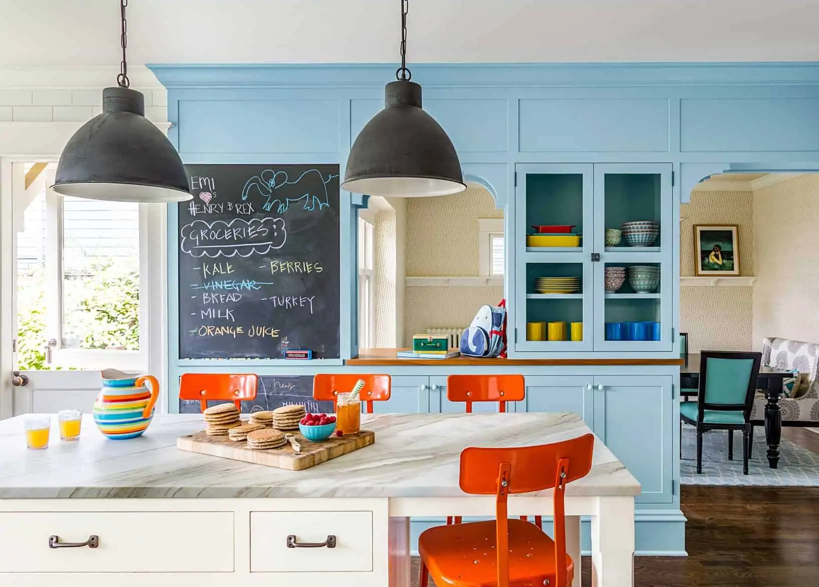
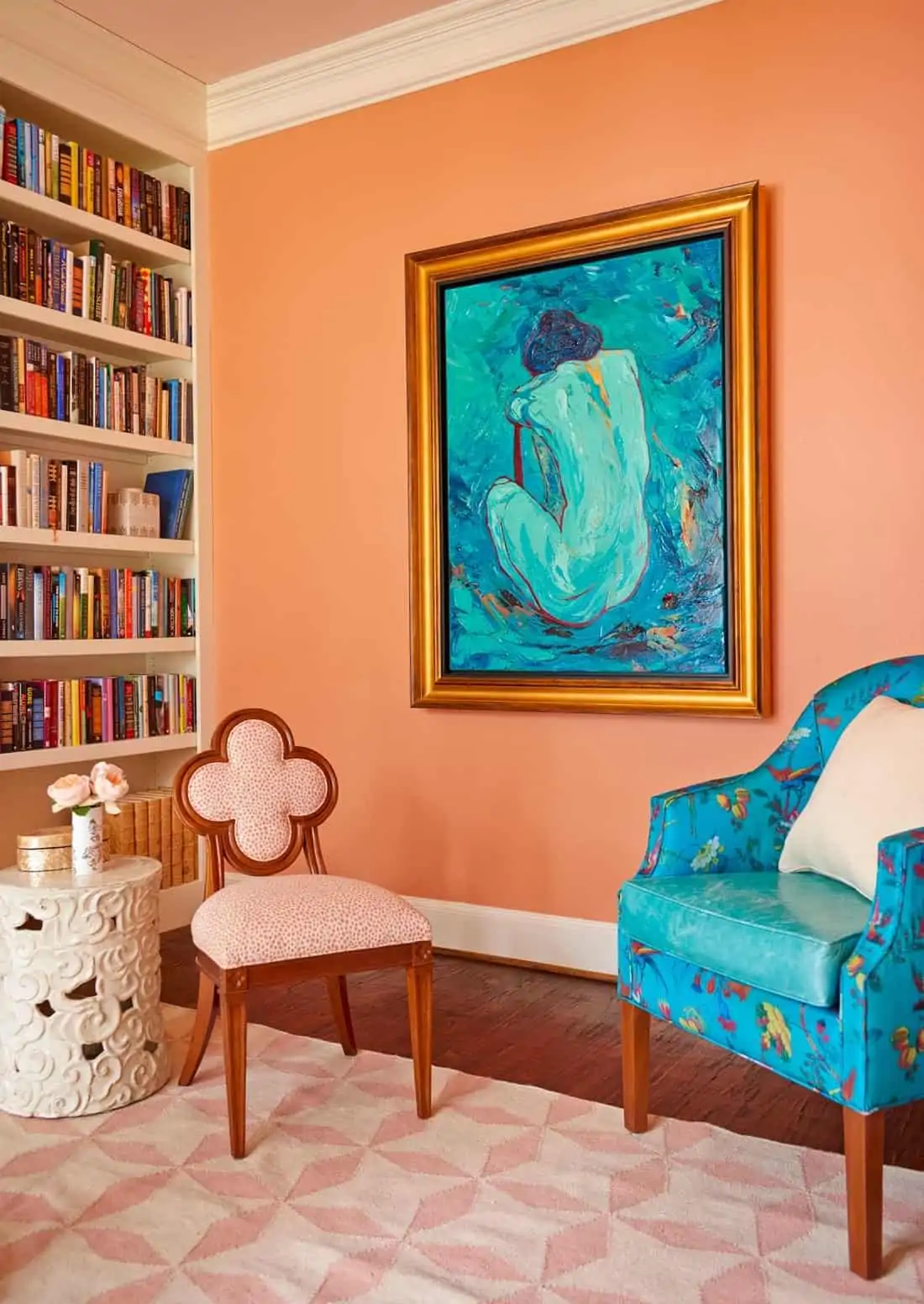
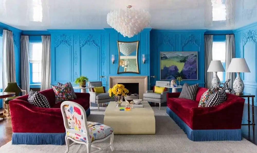
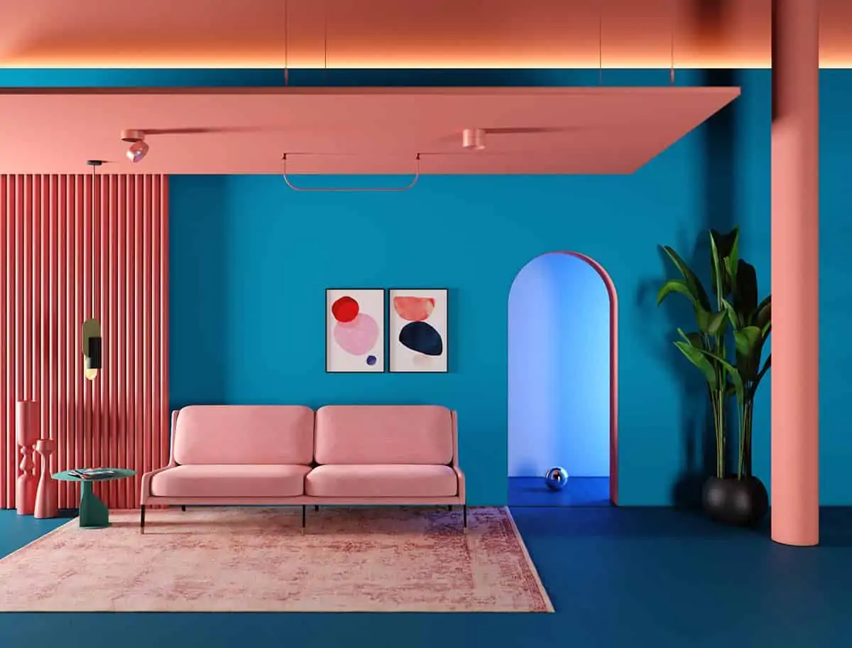
Using two colours on the colour wheel immediately opposite to each other, like blue and orange, adds energy to any space. As they visually balance one another, these complementary hues function beautifully together. You can play around with different shades and tints of these complementary colour blocks to come up with a scheme that you like. It’s crucial not to let any one colour dominate the other.
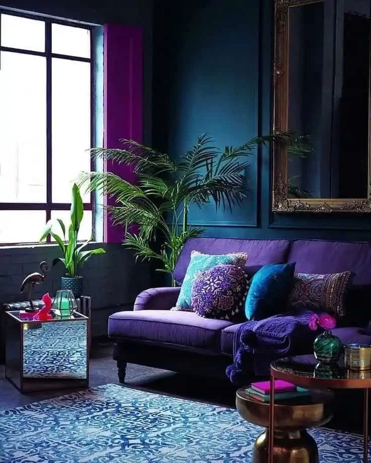
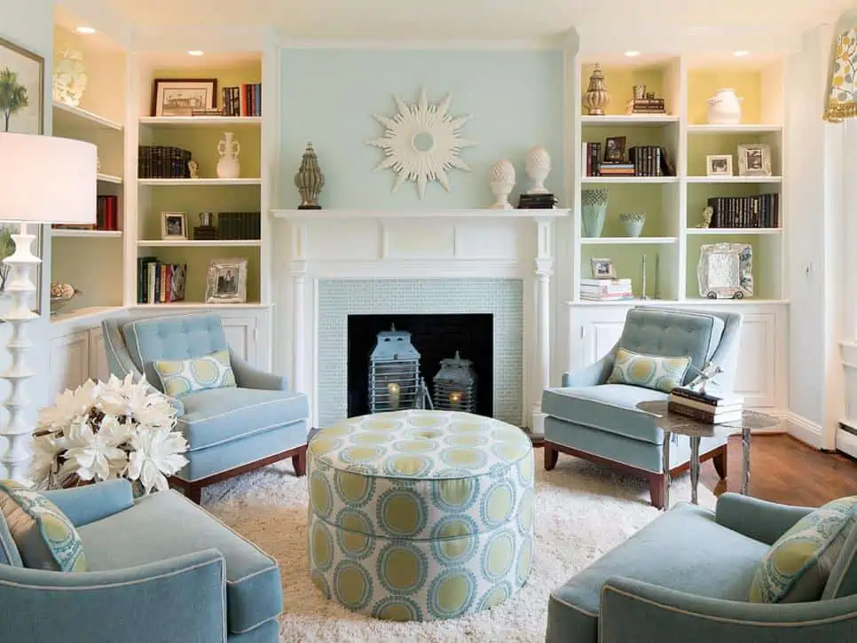
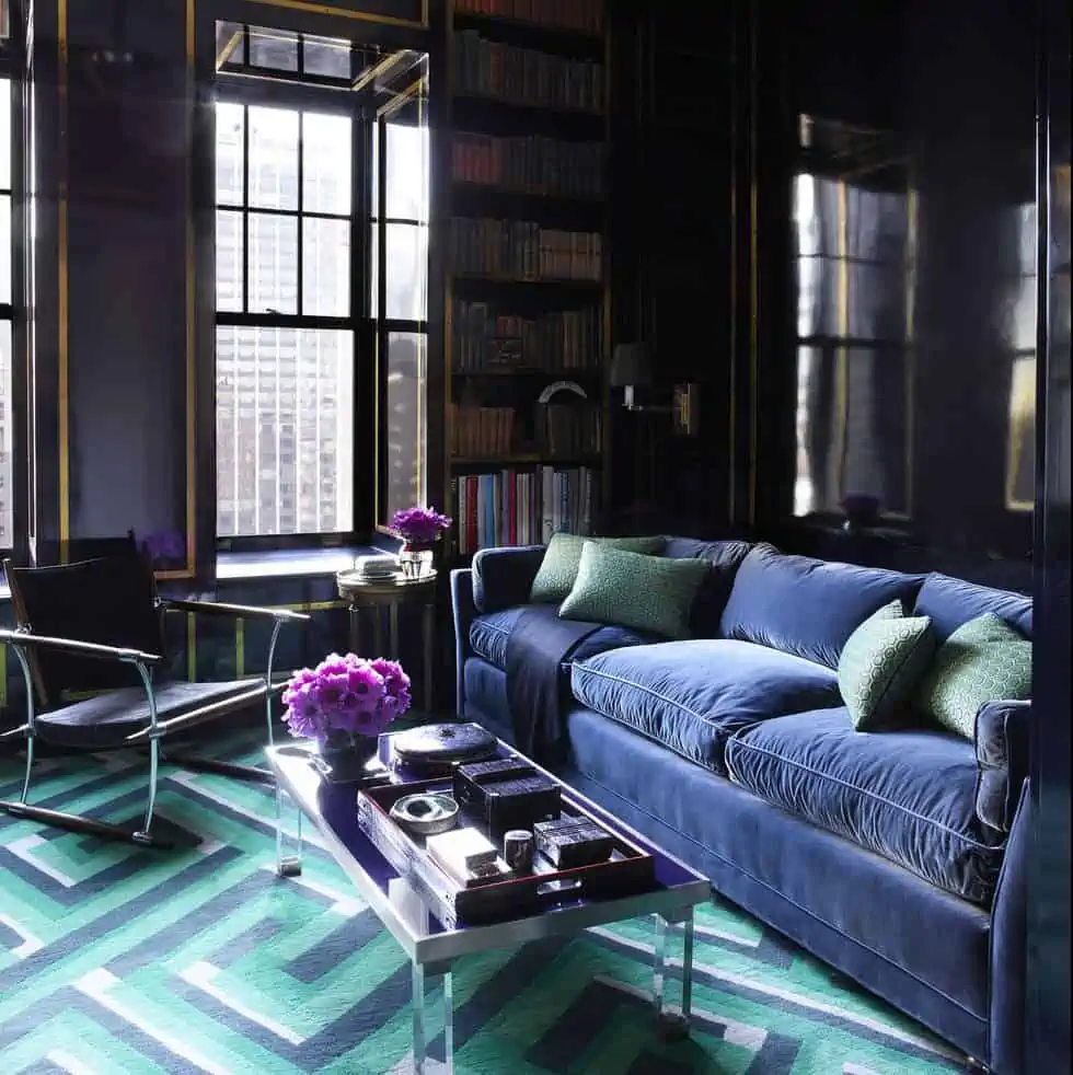
Triadic colour palette in the colour wheel
-
Image Source: FollowTheFlow
-

Image Source: The Delight of Design
-

Image Source: Black Lacquer Design
-

Image Source: Grey Hunt Interiors
-

Image Source: Katarzyna Bialasiewicz
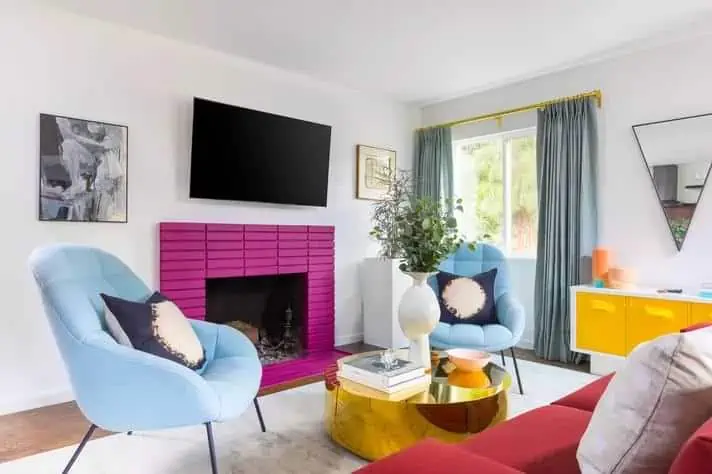
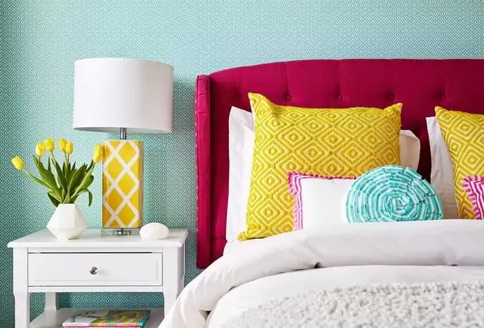
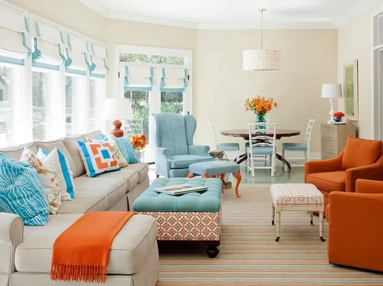
Using three hues uniformly separated on the colour wheel, such as turquoise, fuchsia, and yellow-orange, a triad offers an interesting palette. This mix creates a colour palette with strong contrasts and well-balanced hues. These bright colour choices are ideal for living rooms since they radiate a cheerful, invigorating feel. To increase contrast or decrease the brightness, use your three colours in a variety of hues and tints.
Colour psychology in home interiors
Remember that colours in interiors may alter emotional responses and create a mood when you build schemes utilising colour wheel concepts. Greens, for example, are calming, whilst yellows are energising and stimulating. Reds are bold and adventurous, yet soft pink (a tint of red) is pleasant and delicate. Purple, a very complex hue, is interpreted as sexy or spiritual. Blues are relaxing and tranquil and oranges are warm and cosy. Due to their associations, colours are classified as warm or cool. Reds, oranges, and yellow’s associations with the sun and fire are common in our minds. Due to their associations with water, sky, and greenery- blues, greens, and violets make the cold tones.
Conclusion
Colours are the core of any interior design, they are everywhere yet we rarely appreciate them. If you are a designer, home decorator or do-it-yourself person, you must educate yourself about the colour wheel and colour theory. Basic knowledge of the classification of colours helps you understand the relationship between them and also helps you make informed choices. Colours in home interiors make your life lively, so it is only wise to use classic colour schemes for your home.
Each room, whether living room, bedroom, or dining hall requires its own colour palette. Thus, one needs to make sure that the different colours look cohesive. Another key factor is colour psychology; the colour scheme you choose should condone the mood and purpose of the room. Finally, to conclude we may say that, while colours may look like the simplest thing to see they are far more complex to understand.
*The featured image used in this article is from Colour Wheel Artist
Room colour: 115+ trending wall colour schemes & combinations
The easiest and least expensive upgrade to your room is paint colours. Unlike furniture, paint colour is not a long-term comm