Colours hold a world of meaning, conveying emotion and speaking a language unique to each of us. So, it is pertinent that we give the best colours to our house. Although colour combination choices for the hall and the rest of the house depend on individual selection, there are certain essential factors that are standard. When you are selecting the best hall colour combination for Indian homes, you should first consider the impact of the colours and textures on the occupants.
Ideally, colour combinations for hall walls should tell a story that represents your personality and bring positive vibes. Trendy hall colour combinations and textures will transform the appearance of hall walls and impress visitors.
Let us take you through some finer points of selecting the best colour combinations for halls in India in this article. We have also curated some images to inspire you to select the best colour combination for your next home makeover. Read along to learn more about hall colour combinations.
Contents
Trendy hall wall colour combination ideas for Indian homes
Colours create a cohesive space and play an essential role in regulating people’s mental health conditions. It is a relief to come home to a soothing environment after a full day’s work. Also, with people working from home, dull and boring is passe while preppy accent walls and decor is in. Hence, to maintain a warm and inviting look, check out some hall painting designs and colours here.
Hall colour combination #1 – Pastel (Peachy corals with warm tones)
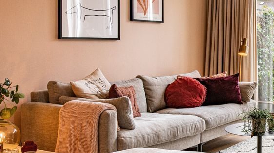
Image Source: Elske Willemse on Pinterest
The peach colour is a great alternative to pink for livening up your hall and living room colours. Peach combines well with many colours adding a nice pop without oversaturating any space, which is why pastels have become such a popular choice.
Here, the peach colour on the walls is aptly complemented by the upholstered pastel beige sofas and a few colourful decor accents. The preppy living room in pastel colours has a soothing appearance and feel, exuding a gentle, neutral, and calming character.
| Also see: Room colour: 115+ sublime wall colour schemes & combinations |
Hall colour combination #2 – Beige and White with textured effect
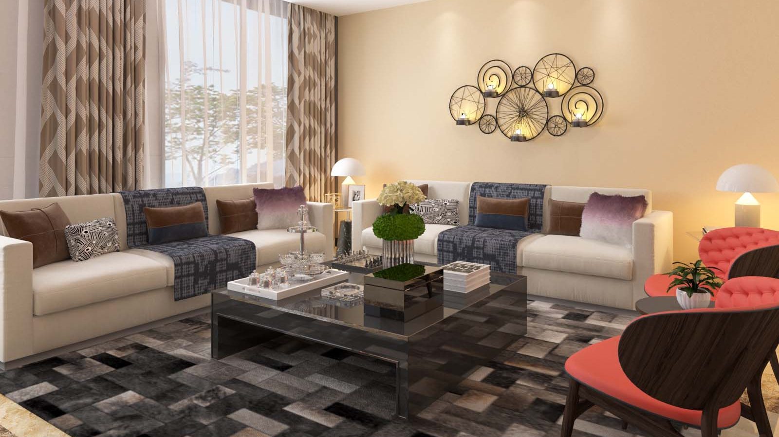
Image Source: British Paints
The shades create an elegant hall and enhance the spaciousness. These are the best colour combination for a hall with texture. Upholstery in similar shades and patterned curtains in slightly darker hues give you a stunning room in which to lounge. A skirting of neon yellow on the ceiling catches your attention and breaks the expanse of beige. The flooring in shades of grey and black is a lovely contrast to the plain sofas, while red accent chairs add a colour pop.
Hall colour combination #3 – Tones of Yellow and Cream
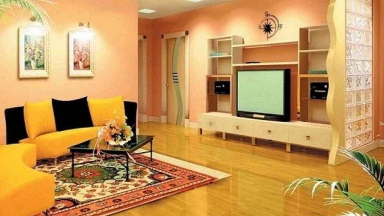
Image Source: Pinterest
Pops of bright yellow contrast beautifully with the creamy white ceiling. Shades in lighter hues of the same colours harmonize well with the wooden floor. The colourful carpet and black cushions add to the colour coordination. The bold colours are balanced by the furniture and TV unit in light pine colours.
Hall colour combination #4 – Shades of Lime Green and White
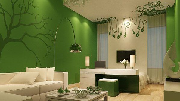
Image Source: Cuded uploaded on Pinterest
Cool shades of lime green pair perfectly with crisp neutrals like grey and white. Here, the refreshing colour combination brings spring accents to your interiors, lending a chic look. Also, the zesty green on the walls contrasts well with the white sofas, ceiling, and accent wall. The tree pattern holds your attention while the light-coloured floor balances the continuity. The colour combo is also maintained in the small decor items on the simple centre table.
| Also see: False ceiling designs for hall to make a lasting impression |
Two colour combinations for hall # 5 – Classic Black and White
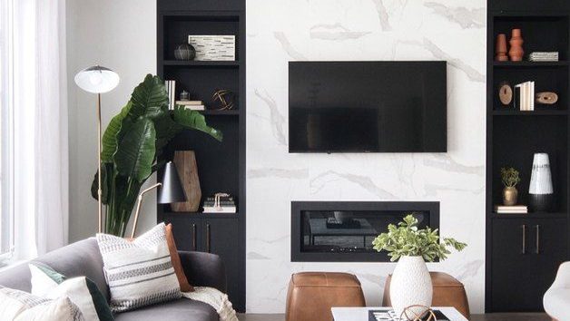
Image Source: Hunker.com
The classic colour combination adds sophistication to the hall walls. Hence, the all-time favourite combination is used to create a modern living area. The small black sofa pairs well with the industrial table, while the brown leather pouffes add a subtle pop. Also, white curtains and black accessories blend beautifully with the look.
Two colour combinations for hall # 6 – Cream and Aqua Blue
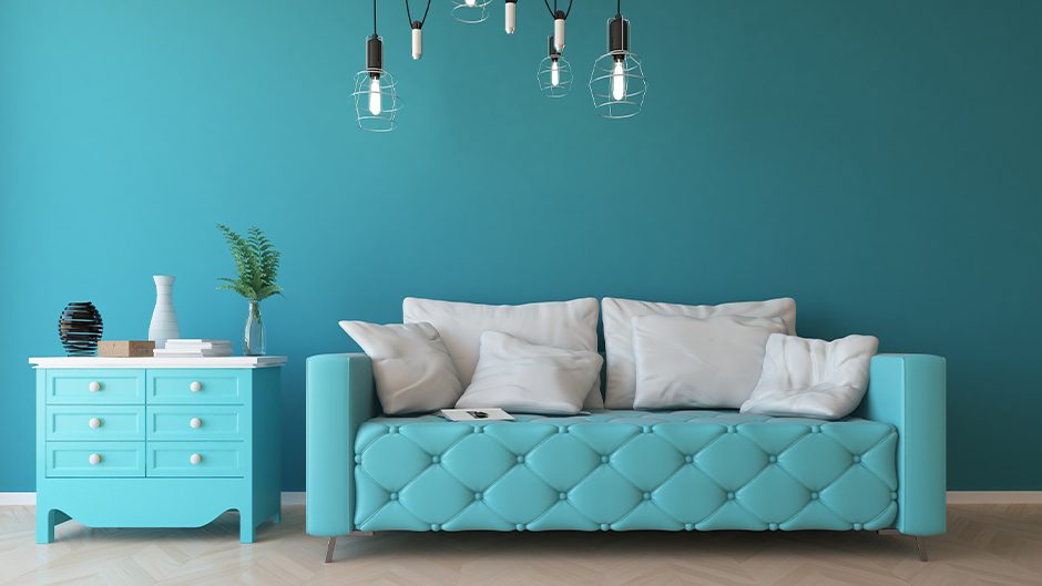
Image Source: Design Cafe
The oceanic hues bring in beachy vibes and a calm feel. It will be a home you will love to return to after a gruelling day. Therefore, these are the best colours for the hall colour combination for Indian homes. Aqua and cream always evoke a sense of tranquillity and exude positive vibes.
Hall colour combination # 7 – Colour blocking
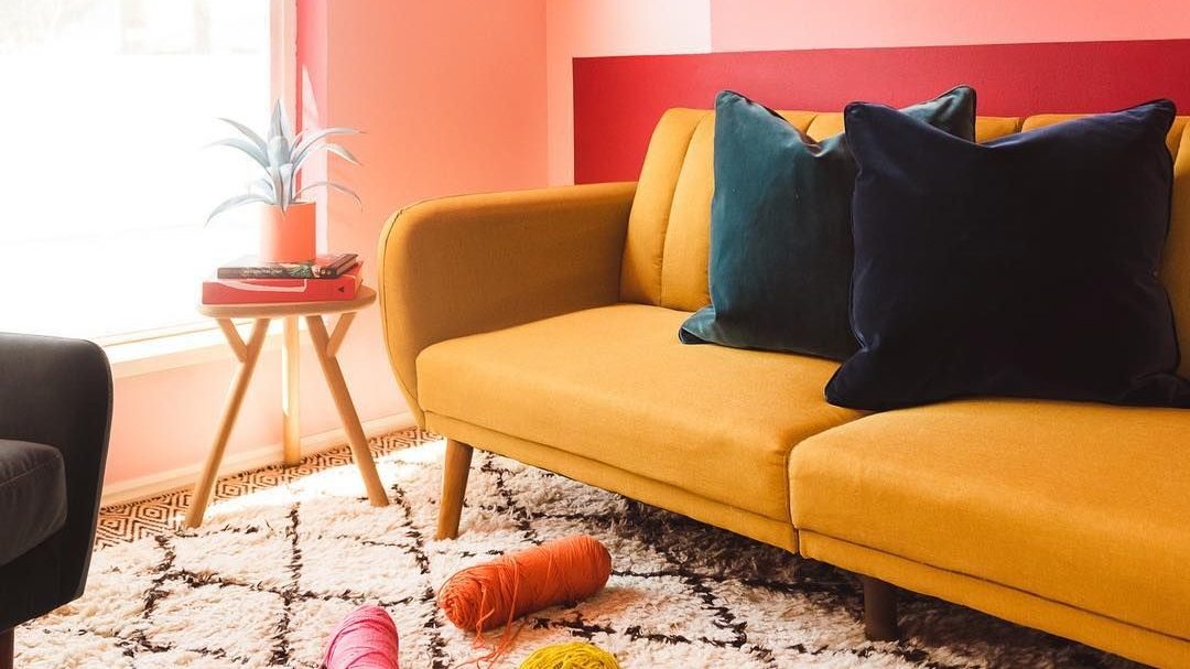
Image Source: The house that colour built
Colour blocking allows exploring opposite colours and pairing them together to create a complementary look. Here, the interesting shades of coral, peach, and orange complement each other to bring out an eclectic effect. Velvet cushions in dark green shades look stunning. The simple shaggy carpet in white and black adds to the ambience.
| Also see: Hallway ceiling designs: 29+ ideas |
Hall colour combination #8 – Multi-coloured patterns
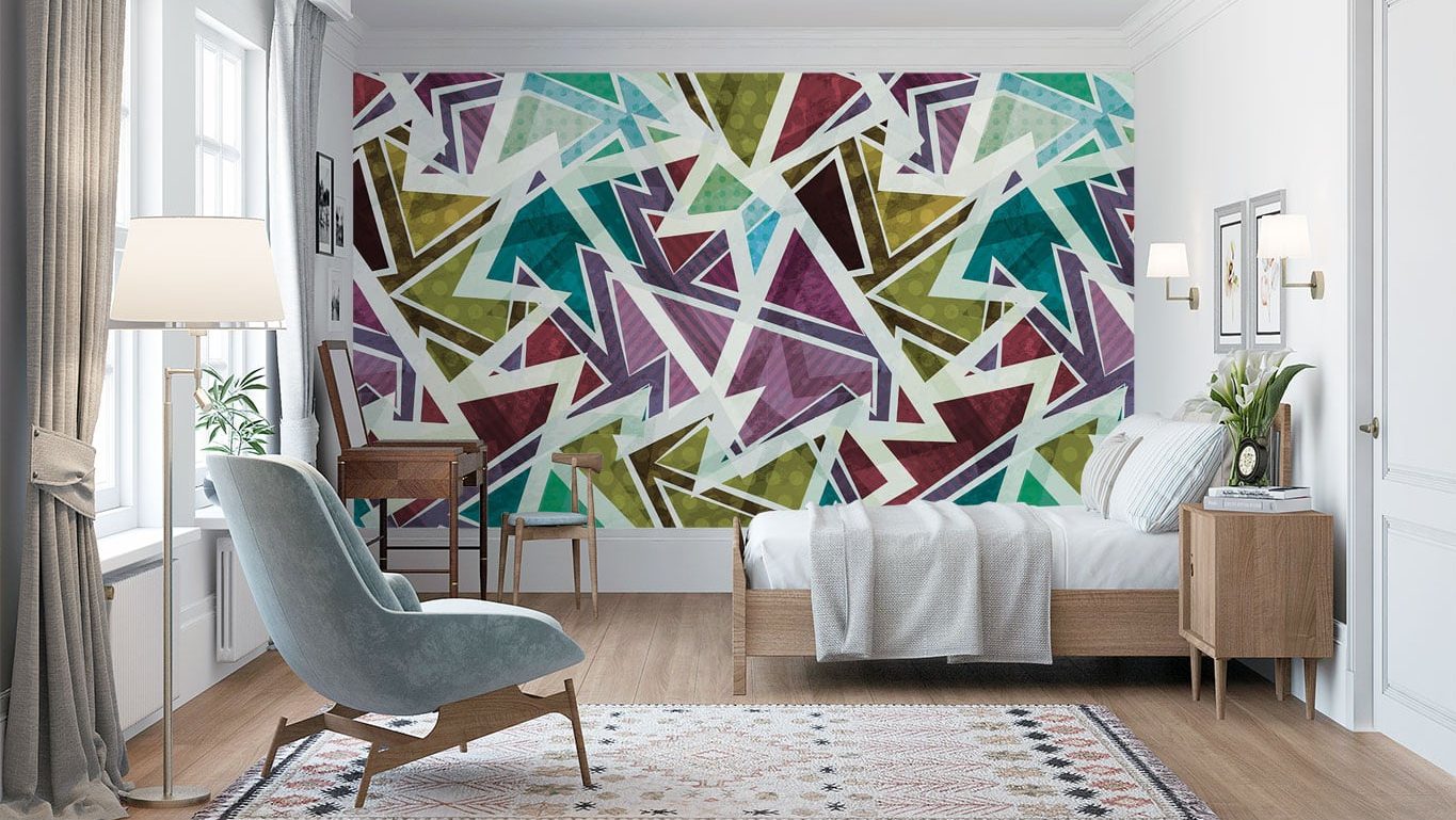
Image Source: Society6.com
Multi-coloured patterns are a bold way to break the monotony of single paint colours. However, it is wise to play with three colours instead of many. Here, the wall becomes an eye-catching accent wall to contrast the simple furniture.
Hall colour combination #9 – Shades of Grey
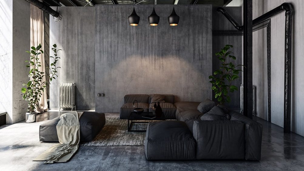
Image Source: Indigo Paints
Grey need not be as sombre as it is thought to be. It can combine with most bold colours and look great by itself. The image shows an impressive play of grey shades in the walls, furniture, and design elements. The black accents and sofa bring out the style, while the white textures and industrial touch on the ceiling bind the entire look.
Hall colour combination #10 – Embossing
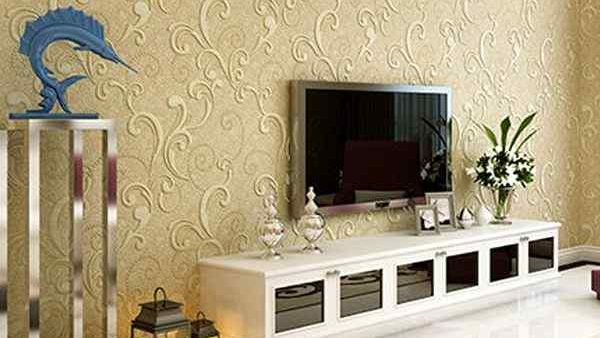
Image Source: NoBroker
Embossing is a beautiful way to bring attention to background walls. The motifs can be self-printed on light shades, or bold patterns can make a statement. The options are unlimited, from traditional designs to quirky ones. The hall in the image shows a trailing vine in a dark beige and white texture. The embossing is classy and not too overpowering for a medium-sized hall.
| Also see: Colour combo for walls: 19+ top-notch ideas for stylish makeovers |
Two colour combinations for hall #11 – Metallic colour combo
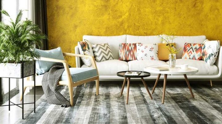
Image Source: Asian Paints
The room in the image is done up in a yellow metallic crinkle on an accent wall. Shades of black and white texture in furnishings and furniture bring out the contrast to a stunning effect. The carpet in shades of grey beautifully ties up the entire look.
Two colour combinations for hall #12 – Turquoise and Pink
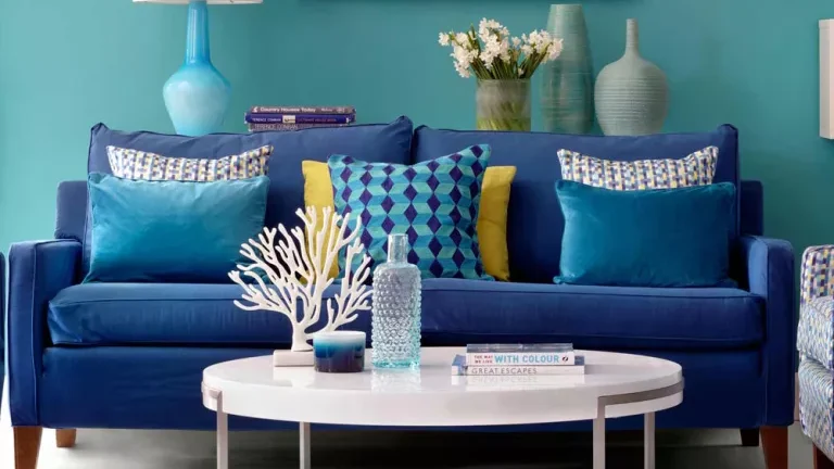
Image Source: Hip Couch
Turquoise is a versatile colour that pairs well with pretty pastels. The image here shows turquoise accents combined in different shades. This cool shade can look luxurious with pink.
Two colour combinations for hall #13 – Purple and Gunmetal
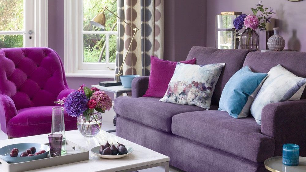
Image Source: Property Geek
The unusual combination offset each other to bring out a glamorous colour combo. The room here plays with the purple colour in furnishings, sofa, and carpet. In the image, purple tones are in different shades, while a touch of white accentuates the gunmetal shade on the walls.
Two colour combinations for hall #14 – Black and Red
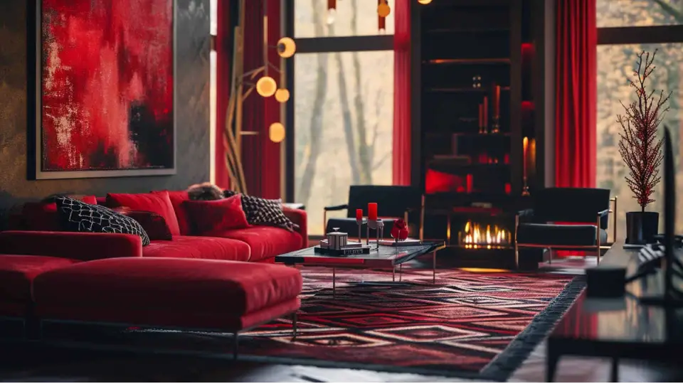
Image Source: Prestigedecoratinglondon.com
The primary colours red, black, and white combine to create the most impressive hall colour texture combination. Also, it is royal and glamorous rolled into one. Here, the vibrant combination brings out a theatrical feel, great for a flamboyant personality.
Two colour combinations for hall #15 – Shades of Blue
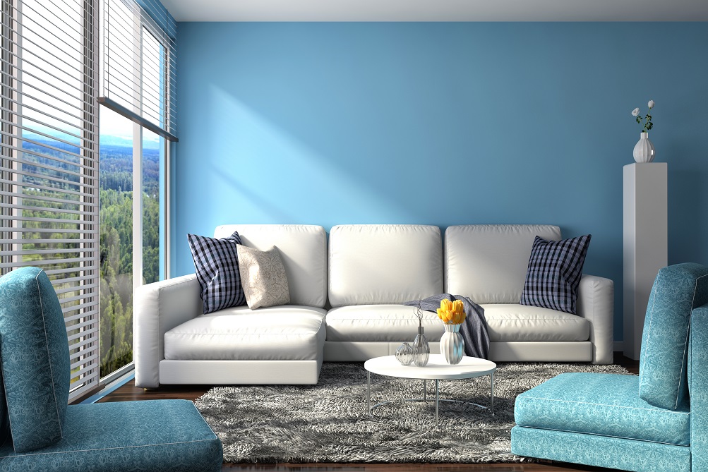
Image Source: Indigo Paints
The cool colour is a mood buster for some and the go-to colour for many. However, blue offers many options in combination and by itself. Here, the cool blue shade paired with white accents in the window and sofa offers a fresh feeling.
Two colour combinations for hall #16 – Charcoal and Gold
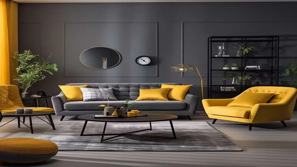
Image Source: Designcafe.com
The charcoal and gold colour combination looks luxurious and elegant. Moreover, the dark charcoal contrasts beautifully with the shiny gold, making your hall look rich and stylish.
Colour combination for hall and living room – Understanding colour theory
Hall colour combination #17 – Triadic colour scheme
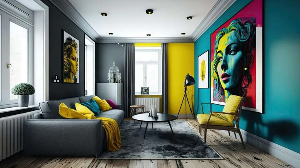
Image Source: wakefit.com
A triadic colour scheme uses three evenly spaced colours around the colour wheel. This creates a vibrant and balanced look with strong visual contrast.
Hall colour combination #18 – Analogous colour scheme
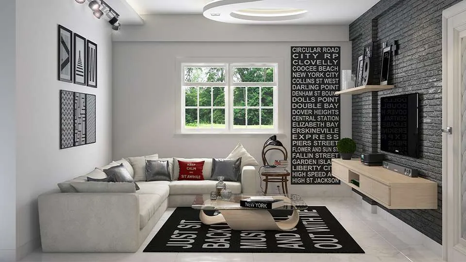
Image Source: roomix.com
An analogous colour scheme uses colours that are next to each other on the colour wheel. These combinations usually match well and create serene and comfortable designs.
Hall colour combination #19 – Complementary colour scheme
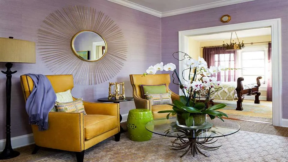
Image Source: Decorilla.com
A complementary colour scheme uses two colours that are opposite each other on the colour wheel. This creates a high-contrast and eye-catching look.
Hall colour combination #20 – Monochromatic colour scheme
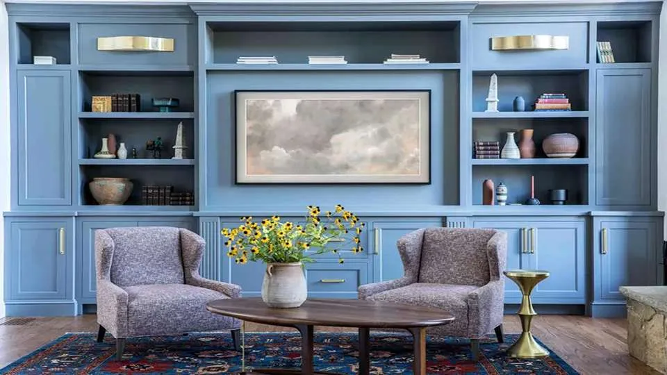
Image Source: nobroker.com
A monochromatic colour scheme uses variations in the lightness and saturation of a single colour. This approach creates a cohesive and soothing look.
Hall colour combination #21 – Pastel tones
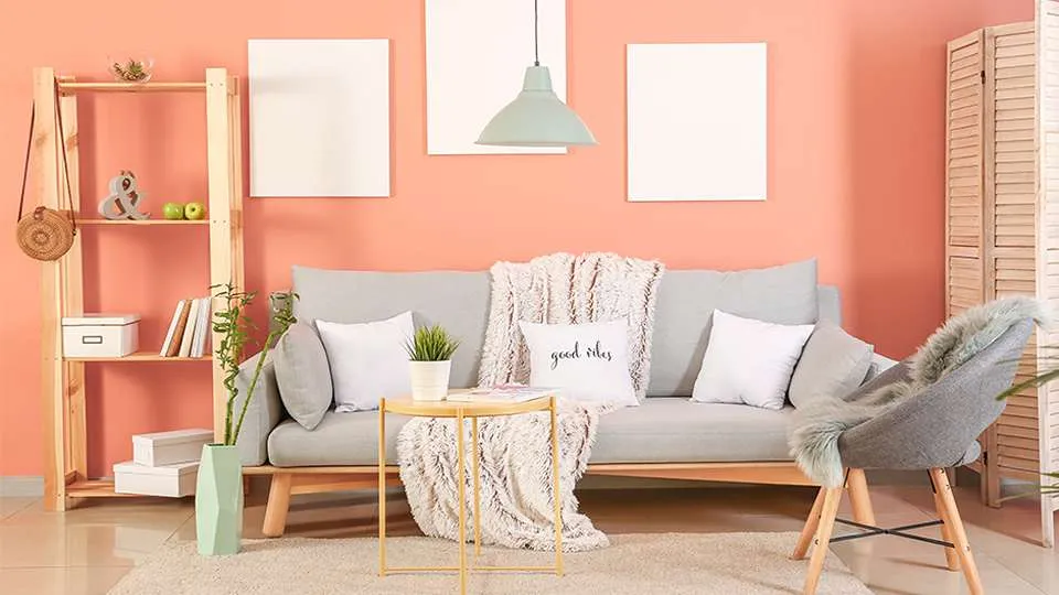
Pastel tones are soft, light colours that are mixed with a significant amount of white. They create a calm and inviting atmosphere.
Other ways to accentuate your living room by using wall colour combinations
Hall colour combination #22 – Wallpaper
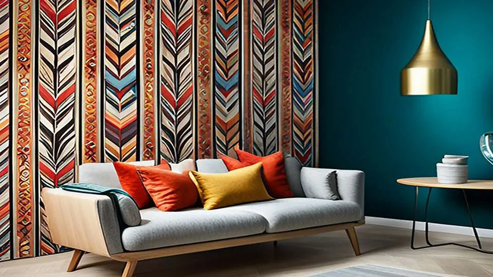
Image Source: livspace.com
Use wallpaper to add depth and character to your living room. Choose bold patterns or subtle textures to complement your wall colours.
Hall colour combination #23 – Wall design
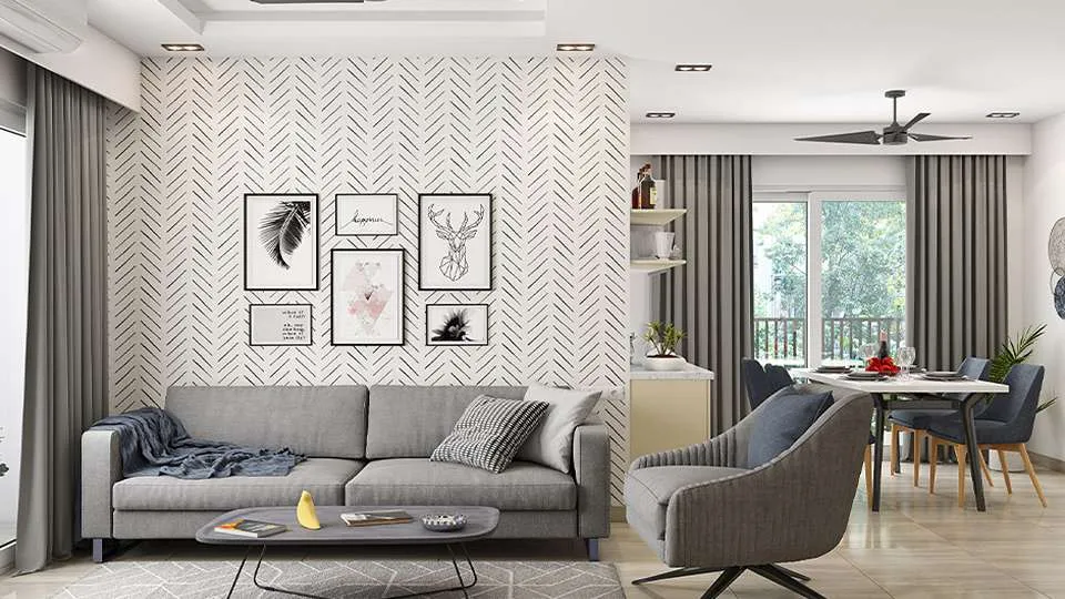
Image Source: pinterest.com
Use unique wall designs like wainscoting or panelling to make your living room more interesting. You can paint these designs in different or matching colours to improve the room’s appearance.
Hall colour combination #24 – Textured paint
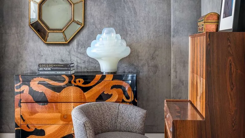
Image Source: cityfurnish.com
Textured paint can add dimension to your walls. Techniques like sponging, rag rolling, or using textured rollers can create interesting effects that enhance your chosen colour scheme.
Living room colour combination#25 – Tiles
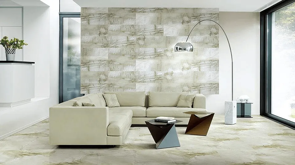
Image Source: elevationinterior.com
Use decorative tiles to create an accent wall or a unique design feature. Tiles in various colours and patterns can add a modern touch to your living room.
Living room colour combination#26 – Patterns
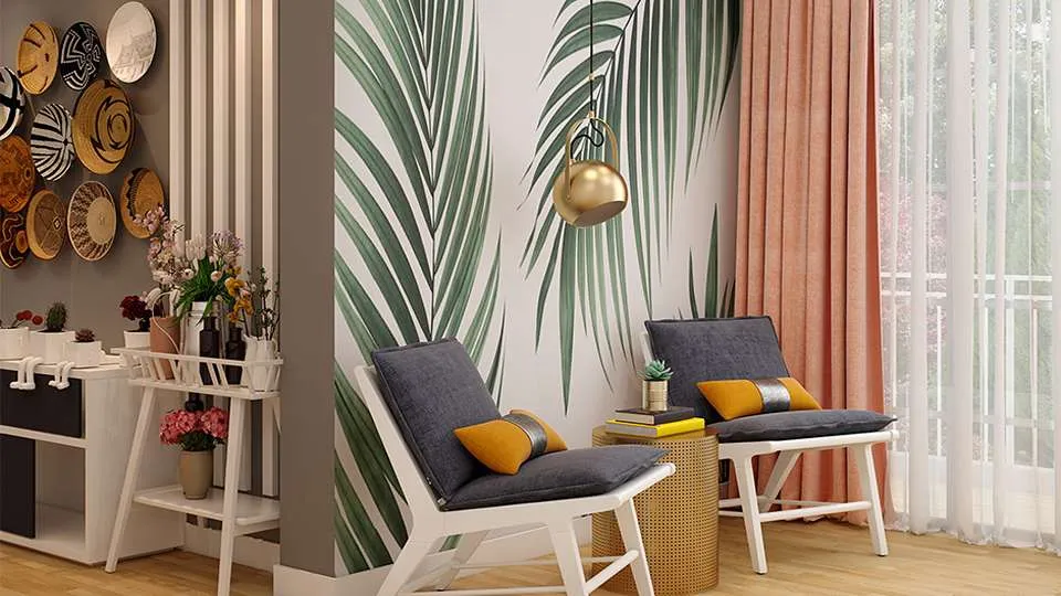
Image Source: magicbricks.com
Incorporate patterns through paint or stencils to add a dynamic element to your walls. Geometric shapes, stripes, or floral designs can break up solid colour blocks and make the room more engaging.
How to choose the best hall colour combination for Indian homes?
There is more to choosing the hall colour combination for Indian homes than simply putting textures and colours together. Before zeroing down to the final choices that need to be made, you have to consider your home interiors, floor, personality, mood, lighting, furniture, space, and the shape of the hall itself. You cannot be casual about the hall colours as it sets up the entire ambience of your house. Here are some handy tips for choosing the best hall colour combination for Indian homes.
- Match with the interiors: Hall colours that complement your home interiors give your entire home a classy look. Go for pastels, preferably light pink hues, to complement metallic interiors, as they are the best colour combinations for a hall in India.
- Consider the floor: Traditional Indian homes generally have mosaic flooring or colourful patterns on tiled floors. Hence, it is pertinent to consider the flooring. Lighter shades like beige and grey go well with wooden flooring, while bolder hues are for lighter flooring.
- Balance the scale: It is the best way to brave Indian summers. A contrast of warm and cool colours is evergreen, rejuvenates the space, and imbues zest. Also, it is the perfect way to pep up neutral shades by pairing them with warm honey-coloured hues to create magic.
- Size of the hall matters: Modern apartments do not allow much experimentation, however, if the hall is large, you can try different colours and patterns. Also, pastels and neutrals would make your hall appear larger. Indians still live in joint families where the constraint of space is a reality. Therefore, white colour with neutrals or pastels gives the appearance of more space, and it is the best colour combination for a hall in India.
- The cardboard test: The cardboard test is an amazing way to make an efficient decision while deciding on paint colours. Buy cardboard and try out different shades which you like along your walls or furniture to identify what suits better to the walls.
Watch this video: Top interior paint colours for 2025 | How to pick paint colours like a designer (18 mins 14 seconds)
Vastu tips for choosing hues for your hall
In Indian homes, the hall is a vibrant space with constant energy shifts. It is a gathering space for friends and family members. Hence, Vastu suggests particular shades for the best hall colour combinations of the hall. Here are some Vastu considerations for hall colours.
- Colour choices: Red is an energy booster and increases the activity level of the occupants. Blue combinations are considered healing, and white is for peace. Green, on the other hand, represents creation and healing. Hence, these are perfect for colour combinations of hall walls.
- Paint sheen, textures & finishes: The choice of the wall paint itself has a direct impact on the ambience of the hall. Ideally, for hall colour combinations for Indian homes, an eggshell finish works best. Hence, it is better to pick a finish between satin and matte with a flat sheen and subtle luster.
| Also see: Vastu Shastra: 29+ tips to design a Vastu-compliant home |
Colour psychology for selecting colour combinations for halls
Colours significantly influence the atmosphere of a living room, shaping its overall mood and energy. Warm tones like red, orange, and yellow create a welcoming and vibrant feel, perfect for lively gatherings. On the other hand, cool shades such as blue, green, and violet foster calmness and serenity, ideal for relaxation. Neutral hues like white, grey and beige provide a versatile foundation, allowing other design elements to take centre stage. These timeless shades are adaptable to various styles and moods, ensuring a harmonious balance. By understanding the psychology behind colour choices, you can craft a living space that aligns perfectly with your desired ambience.
The selection of the simple Indian hall colour combination is crucial in setting the tone of the home. Also, the vast array of Indian hall colour combination schemes provides us with the chance to express ourselves.
The pandemic has made us realize the importance of living in a home that inspires positivity and peaceful vibes. It has also accelerated the interest in home decor accessories like plants, furniture, and wall decor to complement the colour combinations in the hall.
After going through our tips for choosing the best colour combination and texture for the hall in India, you must have understood the basics. Feel free to refer to the above-mentioned images to know what will suit your personal style. Thus, you can avoid mistakes that people make while making random choices in colour combinations.
Now that you are well-equipped with all the information needed to give the best colour combination to your hall and living spaces in India, there is no need to mull over revamping ideas anymore.
FAQs
What are some good combinations for small living rooms with a texture theme?
Neutral colours are the best when we talk about colour combinations for smaller spaces, such as halls in India. One can pair colours like off-white or grey with other light shades like beige or cream.
Are wall textures a good choice for neutral-themed living rooms?
Definitely, yes, wall textures don’t need to be flashy all the time. Minimalist wall textures can easily be created using lighter shades for a neutral-themed hall or living room.
What combinations are suitable for a bright living space?
Bold and cheerful shades like mustard yellow or citrus orange are ideal colour choices for a bright living room.
What are the main differences between emulsion and distempers?
- Distemper paint has a textured and retro appearance, whereas emulsion paint has a feathery smooth appearance.
- Emulsion paint has a milder odour than distemper paint.
- Emulsion paint takes much longer to dry than distemper paint.
- Distemper paint is not completely washable, whereas emulsion paint is much simpler and easier to clean.
- Distemper paint has a shorter lifespan than emulsion paint.
- Emulsion paint, unlike distemper paint, does not peel off when wet.
- When it comes to colour fading in distemper against emulsion paint, emulsion paint wins because its colour lasts much longer than distemper paint.
How does natural light affect wall colours?
The intensity and the angle of sunlight falling on walls make them appear different during the various phases of the day. Some lighter colours look close to white in direct sunlight. Before choosing a colour for your hall, make sure you think about these aspects as well.
*The featured image used in this article is from NoBroker
For a few people, interior wall designs are nothing but painted walls, while for other creative and artistic souls, it is a gWall designs to transform your space (70+ ideas)


