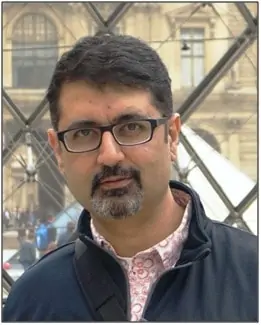
Every building project has its own set of challenges. For Ar. Vistasp Bhagwagar, Principal Architect at the Delhi-based AVA Design Pvt. Ltd., it’s been an interesting, busy, and successful journey of delivering some of the most talked-about projects in the country. BuildingandInteriors.com caught up with him to discuss one of his recent projects – Kohler Innovation Center, spread over 44,000 sq.ft., in Gurugram.
Project Brief by the Client
This was always meant to be an innovation center. So, it had to have two components- a normal office work with an R&D side to it with many labs and a design center. As a result, we needed not only the office space but also the testing and design labs. This element in the project brief made the project quite demanding.
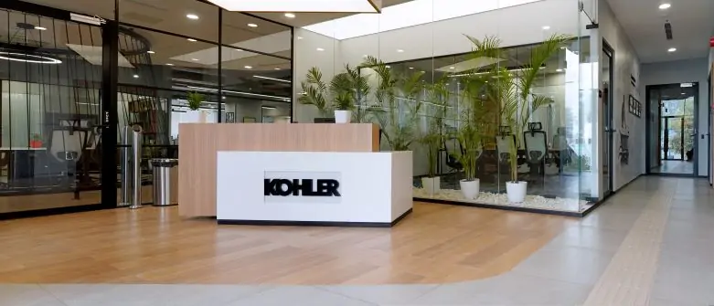
We needed about 8-10 labs for the R&D work. Mr. Salil Sadanandan of Kohler India wanted the design language to reverberate with the Gen Z kids. He wanted the place to be more open, collaborative, flexible, and variable in its usage.
Kohler Innovation Center – Zones and Intent
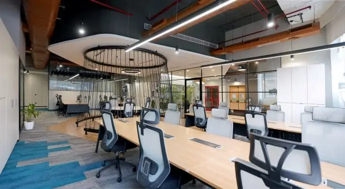
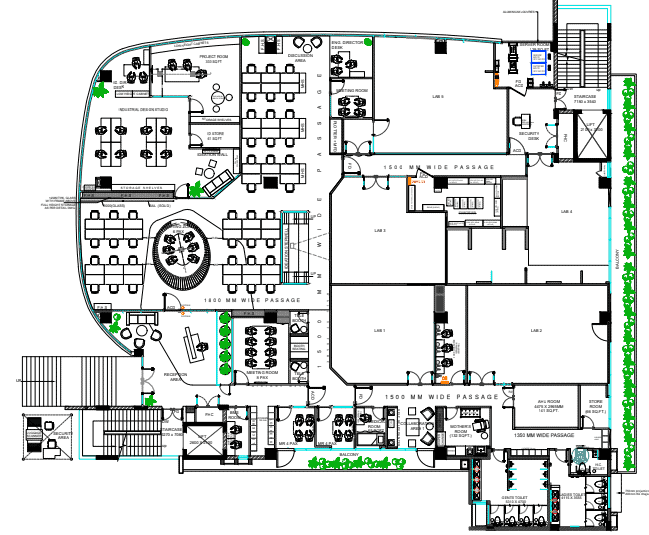
The Kohler Innovation Center building’s elevated ground floor holds the reception, the client interaction area, the labs at the back, and the work area at the front. This work area has an R&D center and a lot of collaboration space.
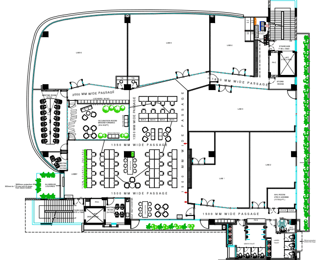
The elevated first floor of the Kohler Innovation Center has the thought incubator space around which the rest of the open and closed workspaces revolve. It also hosts a large conference room. There’s a lab at the back.
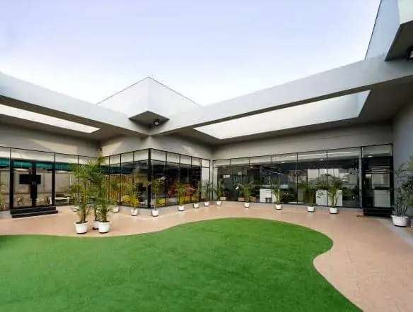
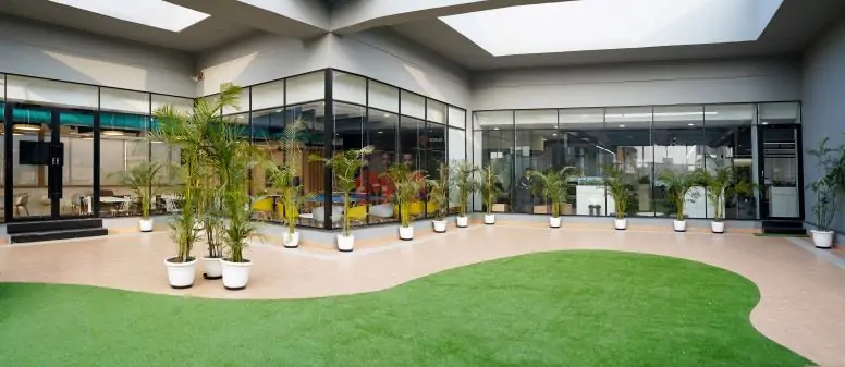
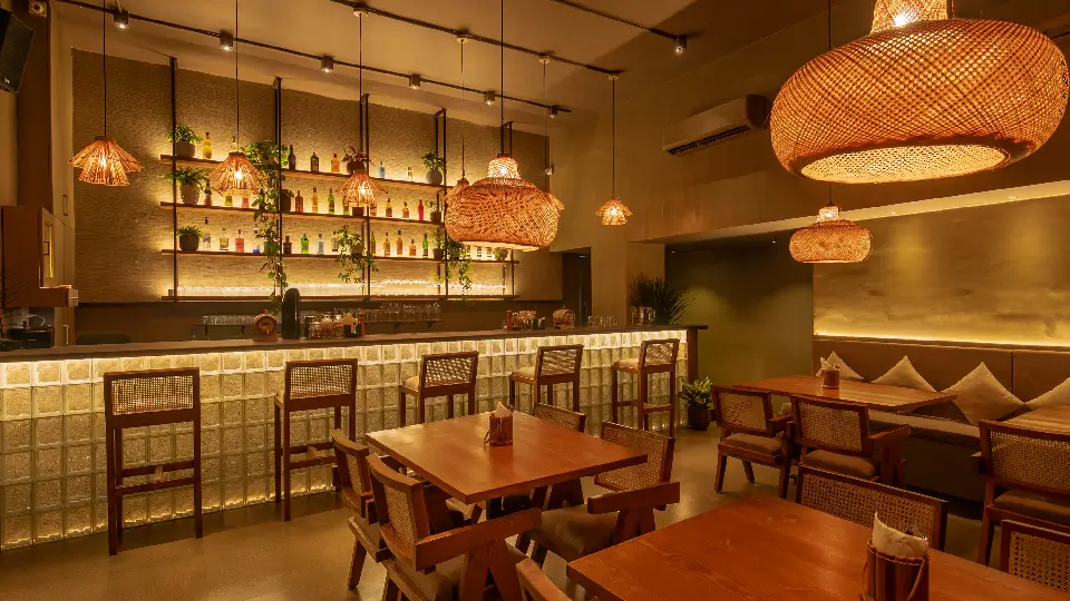
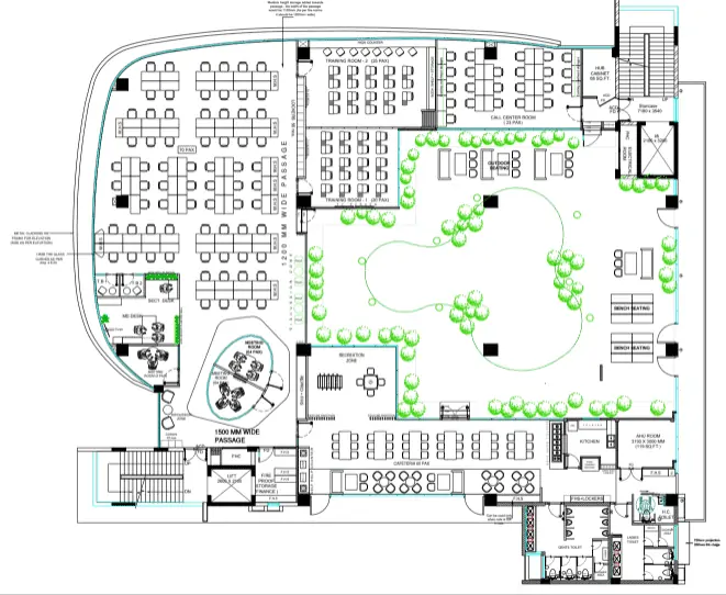
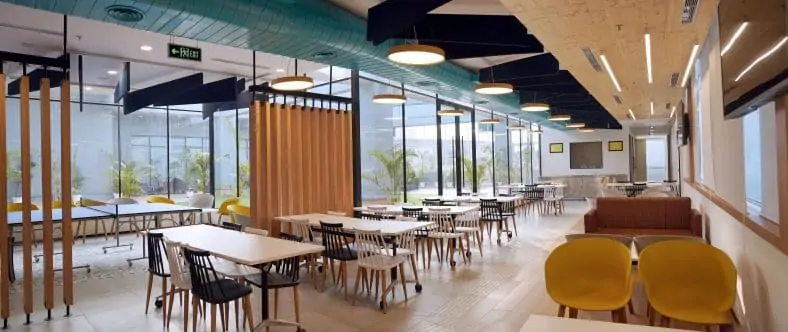
The second floor has a beautiful scooped-out terrace open to the sky. We built a café on one side of the open side and a training room on the other. There are also a couple of supporting offices between these two areas. We also promote multiple usages of space. So, the cafeteria works as a town hall.
We always try to do some brand identity research to give a more personal feel to the project. Kohler is a brand sponsor for one of the football clubs in the U.K. This detail is a proud part of the café.
Kohler Innovation Center – Design Philosophy
Our design philosophy was to keep all the space visually connected across all floors and areas. We had three-floor places to work plates to work across. We wanted visual connectivity and a sense of transparency to be across all the floors. Therefore, we have set up all the labs at the backside of the building and consolidated all other spaces to be more united and inclusive.
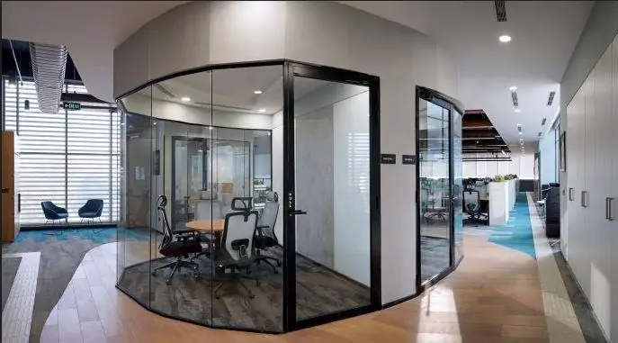
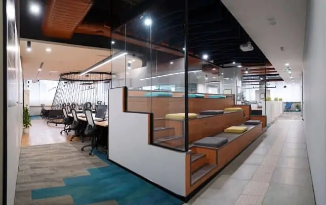
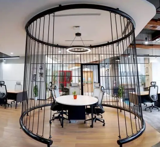
Secondly, we decided on configurations of collaborations to be scattered around the entire floor place. The ground floor has a conical meeting room featured in the center of the workspace. It is open and only crisscrossed with ropes on the periphery. Those ropes define the space without isolating it from the rest of the workspace.
The floor also has steps that are more like an arena that allows people to brainstorm against the projector and scribble wall. The area is quite interactive. Moreover, the floor also has a quiet room, booth seating, breakout areas, and telephone booths.
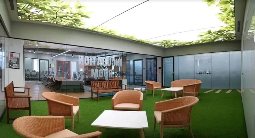
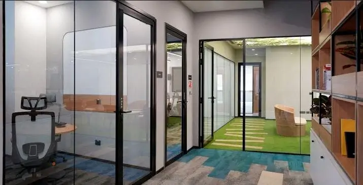
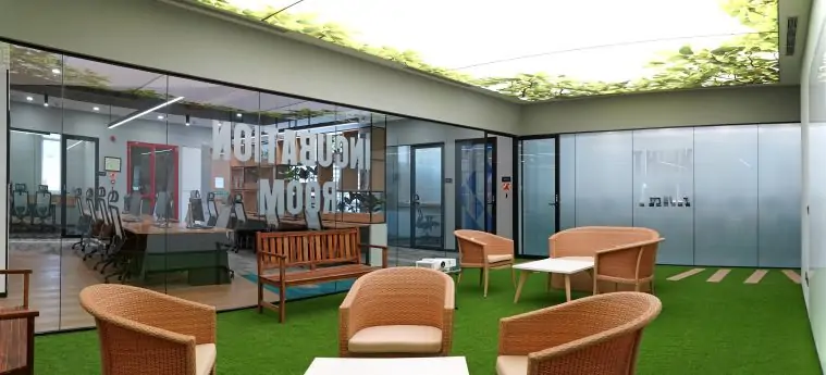
On the first floor, we converted the darkest area into the most well-lit area. The green garden space, called the incubation space has a fresh feel and gives the illusion of a courtyard. It is a place for the incubation of thoughts and ideas. As you can see, it has outdoor seating, warm dimmable lights, and a lot of soothing features.
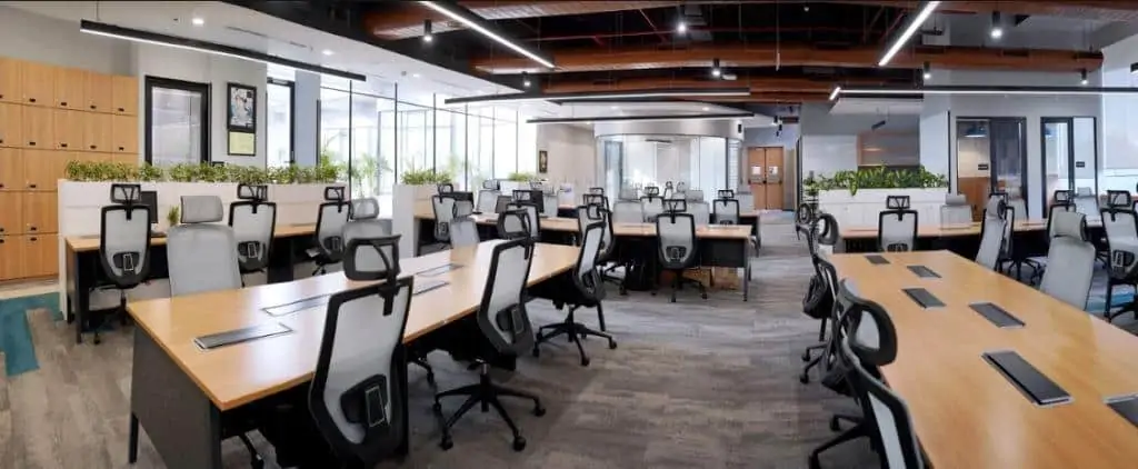
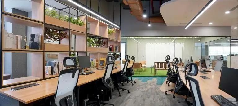
Both the floors have open workstations. They do not have any partitions. We believe in a flexible office space where people do not have to be chained to their areas. They can work in groups and move freely as and when required.
We have used the hybrid ceiling approach for this project. This implies that we have both exposed ceilings and ducts along with floating ceilings to create a sense of scale. This makes the whole space very interesting and exciting in addition to giving it an industrial look.
This project is designed for the visually impaired too. So, we use the same tiles used in metros and other specially-abled friendly areas to aid walking.
The Challenges
I remember the biggest challenge apart from the budget and aspirations was that this building is itself an iconic building. We used to call it a ‘jalebi building’ because it had a non-rectilinear shape. It had many circular edges that had to be dealt with cautiously.
The timelines were also a major challenge because they were very aggressive. The contractors were not very accustomed to this segment. But that’s a typical challenge that we face in most projects.
A shoestring budget coupled with aspirations of setting a benchmark for creativity through simplicity is often as big a challenge as can be!
The materials Philosophy
We used a palette of materials which had cherry oak, black granite, grey carpet, accents of teal, turquoise, and green on floors, monochromatic chairs, and the furniture in charcoal grey.
Additionally, we used copper-colored ducts in the ceiling that looked really striking. We also used grey cement tones on the wall and white coating on the ceilings.
The basic idea behind choosing these colors was to give a contemporary feel to the space. Therefore, we needed a deep-rooted cement-based approach. That said, we didn’t want a plain-vanilla office but a hands-on, low on maintenance, durable office with a more international vibe to it.
A Little More… And a Little Differently
At a fundamental level, we do not let budget constraints affect our ideations. We know that we have to have a certain number of workstations and chairs. Had there been no budget constraints (well, in fact, all projects do!), we would have used a more feature-loaded chair. Having said that, we have used chairs that are high on comfort yet affordable.
We are never challenged by budget. We do have to compromise with the brands but that never goes beyond the acceptable and optimal levels. For example, regardless of the budget, we never use a polypropylene carpet instead of a nylon one. We don’t want it to wear and tear.
So, there are certain dos and don’ts irrespective of the budget.
If I had a little more budget, I would have done a lot of graffiti on the walls and some more branding. I would have placed a lot more artifacts. However, we have delivered what was expected by the client. So, this has been a successful project in every sense of the word.
My Take on Sustainability
We typically work on two types of projects- one that has to be LEED-certified and the other without necessary certification but with the same intent towards sustainability.
We normally operate in the second type of buildings. Every client expects the architect to deliver designs that score high on sustainability, eco-friendliness, and the ‘green’ philosophy. I and my team believe that the essence of being green lies in the three Rs- reduce, reuse, and recycle. So, we reduce unnecessary garnishing and carbon footprints. We try not to fly in things and use local stuff. Moreover, we do not use a lot of Italian marbles. On the contrary, we try to use locally available tiles and marbles.
Secondly, the reuse aspect is more about not making changes in the building just for the sake of making changes. We try to work in the already existing structure. This remains a reason why we use exposed ceilings.
Lastly, often clients want to recycle and reuse things such as lights and furniture from their previous offices and buildings. We have incorporated this aspect in this particular building as well. In fact, we use it in most of our projects. This is how we try to maintain the sustainability of the building.
Kohler Innovation Center


