
Wall painting is not supposed to be uncertain, costly, and time-consuming. Generally, paint is used to protect, decorate, preserve, or add functionality to an object or surface. Revamping your home is never a bad idea. The latest house painting ideas using unique paint colours and wall colour combinations are a quick and effective way to do that.
If you want to feel relaxed the moment you step inside your front door, are looking for a serene oasis in your bedroom, or need a tranquil retreat in the living room, the right paint colours can help you achieve that.
The best part about colours is that they add a dash of style and sophistication to your home. At the same time, they provide a soothing atmosphere.
As professionals with expertise in home remodeling, you must be aware that the design industry is ever-changing. Also, new tastes and trends evolve rapidly and often reinvigorate from the ideas of the past. Regardless of the inspiration, a palette of bold and new paint colours emerges with each passing year.
As an architect or interior designer, understanding the right type of paint, its accurate application, the right wall colour combinations, and the common house painting mistakes to avoid remains very crucial.
Curious about the shades that will work best within your space? Look no further!
In this article, we have compiled a list of wall paint mistakes you must avoid. In order to create an aesthetically pleasing space, take a look at this informative list for colour ideas for interior and exterior applications.
Contents
- 1 Most common wall paint mistakes to avoid
- 1.1 Choosing the paint colour before other elements of the room
- 1.2 Creating an all-bold or all-monochrome look
- 1.3 Being unsure about the mood
- 1.4 Not letting one theme flow throughout the home design
- 1.5 Not testing the paint colours
- 1.6 Neglecting the finishes/sheens
- 1.7 Deciding too quickly
- 1.8 Completely disregarding natural light
- 1.9 Going overboard with matching elements
- 1.10 Painting every room a different colour or the same
- 2 6 things to keep in mind while selecting a wall paint
- 3 House exterior paint colours
- 4 Interior wall paint colours
- 5 Wall paint brands & prices
- 6 In-trend wall paint images to inspire you
- 6.1 Wall paint image #1
- 6.2 Wall paint image #2
- 6.3 Wall paint image #3
- 6.4 Wall paint image #4
- 6.5 Wall paint image #5
- 6.6 Wall paint image #6
- 6.7 Wall paint image #7
- 6.8 Wall paint image #8
- 6.9 Wall paint image #9
- 6.10 Wall paint image #10
- 6.11 Wall paint image #11
- 6.12 Wall paint image #12
- 6.13 Wall paint image #13
- 6.14 Wall paint image #14
- 6.15 Wall paint image #15
- 6.16 Wall paint image #16
- 6.17 Wall paint image #17
- 6.18 Wall paint image #18
- 6.19 Wall paint image #19
- 6.20 Wall paint image #20
- 6.21 Wall paint image #21
- 6.22 Wall paint image #22
- 6.23 Wall paint image #23
- 6.24 Wall paint image #24
- 7 Conclusion
Most common wall paint mistakes to avoid
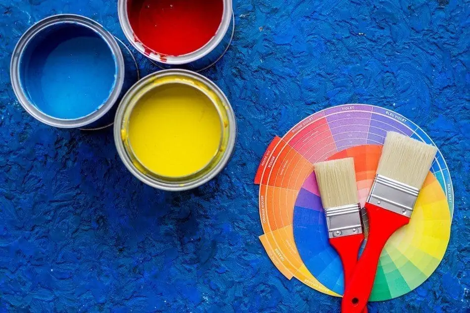
Image Source: malerfachbetrieb-zimmermann.de
The biggest and the most tragic mistake when choosing house painting colours is not choosing at all!
This is one of the major mistakes people frequently commit. Other mistakes include using the wrong equipment and failing to do the detailed preparation required to achieve a professional finish.
Below is a list of 10 most common yet avoidable wall paint mistakes:-
Choosing the paint colour before other elements of the room
Take a look at the decor of the room you want to paint for colour inspiration. For instance, your green-coloured sofa might not pair well with the shade of red you were to plan to use on the walls. Or maybe your pink rug will actually look great against a grey wall?
Finding a colour combination to match the elements of your room is far easier and cheaper than finding fabrics, furniture, and furnishing to match your wall colours. Therefore, first, decorate and design your room and keep the painting for last.
Creating an all-bold or all-monochrome look
If you opt for a bold, bright wall, let the rest of the room breathe. Adorn it with lighter, more neutral colours to balance the mood, and to let the wall take the limelight. Similarly, if you choose a more muted colour combination for your walls, it is logical to brighten up the environment with accents in stronger, contrasting colours. Ultimately, you want the room to have an effortlessly put-together vibe.
Being unsure about the mood
Every room has a mood. If not, you want to particularly create one. For instance, if you want a relaxing environment in your master bedroom, it makes sense to go for calming colours like blues, lavender, and cool greys. But, browns and reds won’t be ideal. Forgetting the mood you want the room to signify and choosing a colour just because it’s your current favourite proves to be a recipe for disaster.
Not letting one theme flow throughout the home design
Every room of your home can be done in a different style and colour palette if it pleases you. However, to avoid any hectic vibe and create a more peaceful vibe, consider creating a cohesive plan.
Not necessarily using the exact colour palette in every room makes a statement. Adding an accessory in a primary colour from another room is a smart way of letting one theme flow. Create harmony so that your home feels like a total package and not just a few disconnected parts.
Not testing the paint colours
The colours & combinations that look good in the store may not look the same on the walls of your home. Therefore, when you have a couple of shades in mind, get samples from the paint store. Next, paint a few sections on the wall you wish to paint and see how they look. Take a few days to get a real sense of the colour as the colour keeps changing through the entire drying process.
This will give you a good idea of how the colour will look and perform on the walls of your home and whether you actually like it or not.
Neglecting the finishes/sheens
Matte and flat paints are water-based and come off easily when touched too often. So, they are suitable for ceilings and walls that are rarely touched.
Although a little better, an eggshell finish may show off any imperfections. Hence, it is ideal for areas like the living room and the dining room, where not too many people are likely to touch the walls.
On the other hand, a satin finish can withstand cleaning and light scrubbing. Hence, it can be used for high traffic areas like your kitchen, bathrooms, halls, and bedrooms. That said, high gloss is best suited for decorative corners like mouldings, trims, doors, and cabinets.
Deciding too quickly
Take a few days before deciding between paint swatches. Don’t finalize too quickly. Not because you may change your mind over time, but because the colour will change with the light throughout the day. Also, every paint colour will look different on a cloudy day versus a sunny day.
“Apply multiple colours and sit with them for a few days,” recommends Erika Woelfel, Behr colour expert. “Test them in multiple different parts of your room with different lighting to help you to better visualize what the colour will look like in your space at any time of day.”
After spending a fair amount of time with the swatches, make your final choice. This saves you a lot of frustration and money in the long run.
Completely disregarding natural light
People often think darker colours make bold statements, but they fail to consider whether there is enough natural light in the room. Without the natural light, the room closes into a compact space. Therefore, what starts out looking dramatic ends up feeling somewhat depressing.
Going overboard with matching elements
Trying to match paint colours to furniture creates a clash in the room. If your colours blend in too well with the room, there is nothing interesting or eye-catching in the room. Choose a shade much lighter or darker to complement the furniture and furnishings and create a contrast.
Painting every room a different colour or the same
This is a mistake each one of us has struggled with. The availability of so many wall colours & combinations makes you want to incorporate them all in your house.
On the flip side, don’t fall into the trap of painting everything the same in the entire house. Colour differences don’t have to be extravagant, but even subtle changes of wall colour in combination with accent pieces in your home can make a huge statement.
Experimenting with painting colour on an accent wall or even the house’s ceiling can give a room a beautiful design statement.
6 things to keep in mind while selecting a wall paint
When we think of wall paints, we typically consider distemper, emulsion, texture, and so on. However, your walls deserve more than just varieties of paint colours that provide them aesthetic value. So, here are some useful paints that can do more than just make your walls appear pretty. Depending on the brand, each functional paint can have multiple functions. For example, child-friendly wall paint is typically non-toxic, washable, and safe to touch.
Following are 6 crucial factors to consider while choosing paint for your home:
Washable
Emulsion paints are the most common type of washable paint. Due to very high plasticity, typically, these wall paints have a glossy finish. The shinier the finish, the easier to clean it will be. In fact, they’re sometimes referred to as plastic paints.
Washable paints are a must for children’s rooms, as small children are prone to getting their walls dirty. You can also use them in the kitchen, where spills and stains are a possibility.
Non-toxic & odourless
Choose paints with silver ion technology. These wall paints prevent bacterial growth on the walls. Also, be sure the wall paint doesn’t include any Volatile Organic Compounds (VOCs), which are harmful chemicals responsible for paint fumes.
The obvious choice for such paints will be the child’s room or nursery. However, you can use this type of paint in places like narrow passages where you or your child are more likely to come in contact with the wall.
Moreover, fresh paint has a distinct odour that is difficult to ignore. Formaldehyde, an industrial chemical that is also an air pollutant, is mainly responsible for such odour. Formaldehyde-free paints have no odour and are non-toxic. These varieties of wall paint use active carbon technology to keep hazardous fumes out of your home’s air.
Crack bridging ability
For a variety of reasons, walls can develop cracks over time. Heat and moisture are the most common causes. Crack-bridging high-performance wall coatings, on the other hand, can successfully protect your walls from such issues. Crack bridging is a unique property in paints with a flexible epoxy coating membrane. Solvent-free paints are common in this category.
This paint should be used on walls that are frequently exposed to sunlight or heat, for example, on the balcony walls.
Stain and dust resistant
To begin with, stain-resistant paints are not usually the same as washable paints. In painting language, stain resistance is the paint’s ability to withstand discolouration. In other words, it is a type of paint that doesn’t absorb dirt and stains. Whether you prime first and then paint or use a paint with a built-in primer, this layer of paint creates a less porous finish, which blocks stains from getting into the paint. The gloss of the paint determines its durability. Eggshell, semi-gloss, and high gloss paints have a higher sheen and are easier to clean than matte or flat paints.
Moreover, many modern wall paints include dust guard technology, which prevents dust particles from settling on the walls. These particles gather on your walls over time, reducing the paint’s strength and making it appear dull and old. So, choose paints with a glossy finish when looking for dirt-resistant paint. Flat and matte finish paints have larger pores, which provide ideal conditions for dust and dirt to settle.
Anti-microbial and anti-bacterial
These paints contain an active ingredient that makes them effective against bacterial and fungal growth. Antimicrobial paints are often selected for spaces that are prone to moisture like bathrooms or laundry rooms to help prevent the growth of mold and mildew.
Additionally, in a normal world, this type of paint is ideal for children’s rooms. However, in a post-COVID-19 world, you’d want to utilise this everywhere.
Fire resistant
Fire retardant paint, sometimes referred to as flame retardant paint, slows down the spread of fire if such an emergency occurs. Being an inflammable substance, paint can hasten the spread of fire. So, when exposed to extreme heat, fire retardant paint releases a flame-dampening gas, delaying the spread of flames by 30-120 minutes, giving you enough time to put out the fire or flee.
Due to its proximity to fire sources, the kitchen is an obvious choice for this type of paint. In addition, use this type of paint on walls with a lot of electrical wiring.
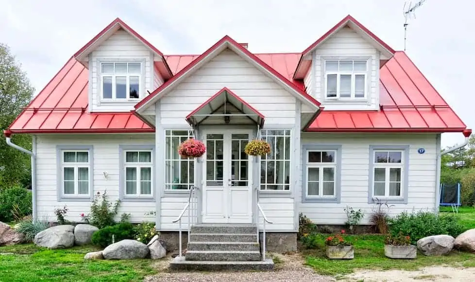
House exterior paint colours
Well-thought paint colour for your home’s exterior majorly affects the mood of your house. Moreover, it becomes a reflection of your surroundings and your personal style.
Unlike the interiors, painting the exterior of your house is fairly expensive. Therefore, the objective remains doing it once only, which makes choosing the colours all the more important. Whether you wish to highlight the architectural details of your house design or contribute to the peppiness of your neighbourhood, there are endless reasons to amplify your curb appeal.
Find a list of colours suitable for your home exterior below.
Grey
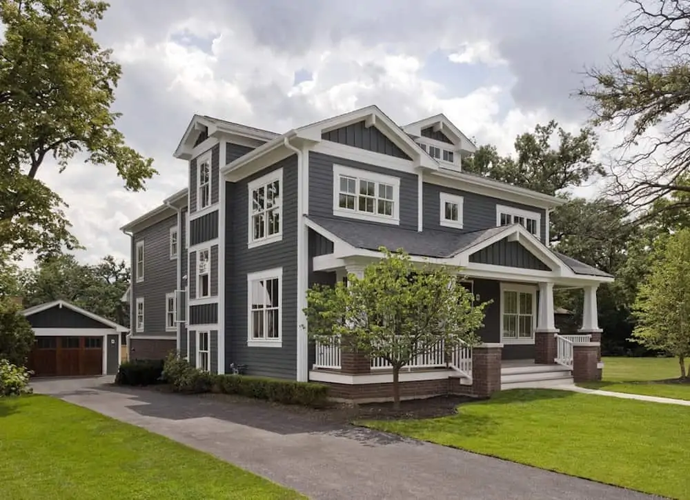
Image Source: Bob Vila
Without a doubt, this look seldom goes wrong.
Exterior paint colour for homes can certainly make a difference. Given the cost incurred, experts recommend opting for classic, non-trendy colours for the exterior.
Grey, both classic and timeless, serves your home aesthetically. Additionally, for a traditionally styled home having plenty of trims, medium-grey hues create a contrast to emphasize the overall look.
Beige
Image Source: Pinterest
When opting for a traditional look, you can never mess up the classic beige. It bears the perfect amount of white, not too stark, remaining one of our topmost choices.
Beige, as a paint colour, creates a well-balanced look that is neither blinding when outside nor too warm. It not only enlivens any space instantly but also is sophisticated and elegant.
Combined with any deep shade of green, brown, or even black, it results in a rich exterior. It does not overpower the lighter shade of beige around it but acts as an accent.
Brown
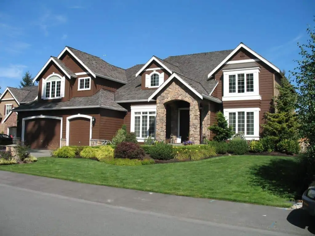
Image Source: CertaPro Painters
Experts advise not to be afraid of darker hues and colours. To work with a classic wall paint colour like brown, brighten up the trims by painting them in contrasting colours. This produces an ageless effect that’s very easy on the eyes and adds a touch of luxury to the house.
Yellow
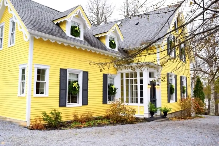
Image Source: Follow The Yellow Brick Home
Enjoy the finesse of a modern and chic exterior with the stable and classic monotones of yellow. In addition, consider pairing it up with a bright colour to make an eye-catching statement.
The yellow exterior of a house adds a mellow vibe and strikes joy into the hearts of passersby. Therefore, make use of this buoyant shade as part of your exterior wall paint ideas and designs.
Pastel wall paints
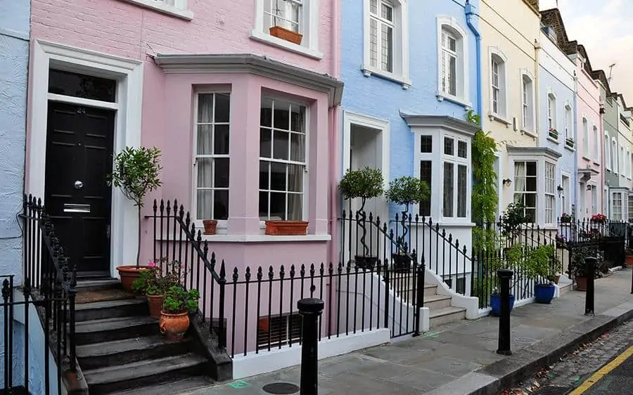
Image Source: dulux.co.uk
Set a fancy tone with exterior house paint colours in soft pastel hues. A muted green that blends effortlessly into the landscape, a powder blue that creates a cool and playful vibe, or a soft pink that results in a plush look are some great options.
However, to avoid an overwhelming effect, choose less saturated shades of bright colours and balance their starkness with white trims.
In addition to the colours mentioned above, consider adding lavender as well to the exterior colour scheme. When paired with an equally vivid and vibrant door design, this colour has the potential to take your curb appeal a notch higher. However, to mitigate the hue, choose a pastel paint colour with cool undertones.
Moreover, the neutralized colour palette will modernize your home’s exterior.
Interior wall paint colours
The key feature of wall paint that makes it suitable for interior application is that it should feel both comforting and grounding.
Creating a faint environment that reflects our fascination to align our lifestyle, colours help us express our personal style.
‘The selection of two independent colours highlight how different elements come together to express a message of strength and hopefulness that is both enduring and uplifting, conveying the idea that it’s not about one colour or one person, it’s about more than one’, says Leatrice Eiseman, Executive Director of the Pantone Colour Institute.
Since there is an abundance of options, the selection of wall paint colours and the right wall paint idea narrows down to your personality and preferences.
Therefore, find below a list of the most exciting paint trends in the year ahead.


Blue with grey undertones
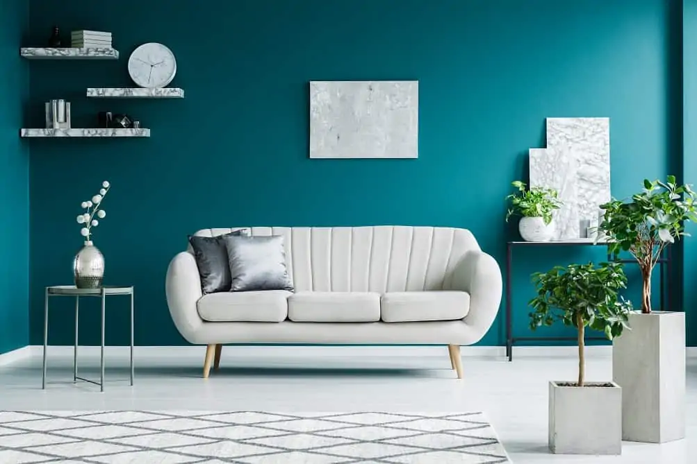
Image Source: Indigo Paints
A warm blue-green shade with grey undertones remains on top of the list. Due to its distinct qualities, it imparts a fresh, crisp feel to a scheme and creates a relaxed and soothing atmosphere at the same time. Moreover, this colour adds balance and calm to your interior space.
Beautifully complementing wood accents and woodwork, blue adds a chic and luxe vibe.
The amount of natural light hitting the walls also impacts the colour. It switches from a fresh, cool hue in bright light to a richer, muted hue in dim lighting.
Earthy brown
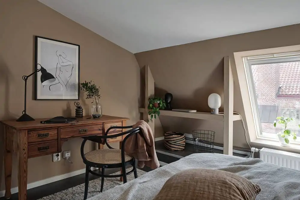
Image Source: The Nordroom
Painting your walls the traditional brown colour is not in trend anymore. Rather go for a rich, textured caramel-toned brown.
Elevate it from just another brown and make your walls a distinguishable element of the house. Moreover, it adds a surprisingly tranquil and earthy touch to your interior space, particularly in bedrooms.
The earthy shade eliminates the overwhelming vibrancy in colours such as peony pink and apple green. In addition, it amplifies the classic hues of stone and white.
Dark inky blue
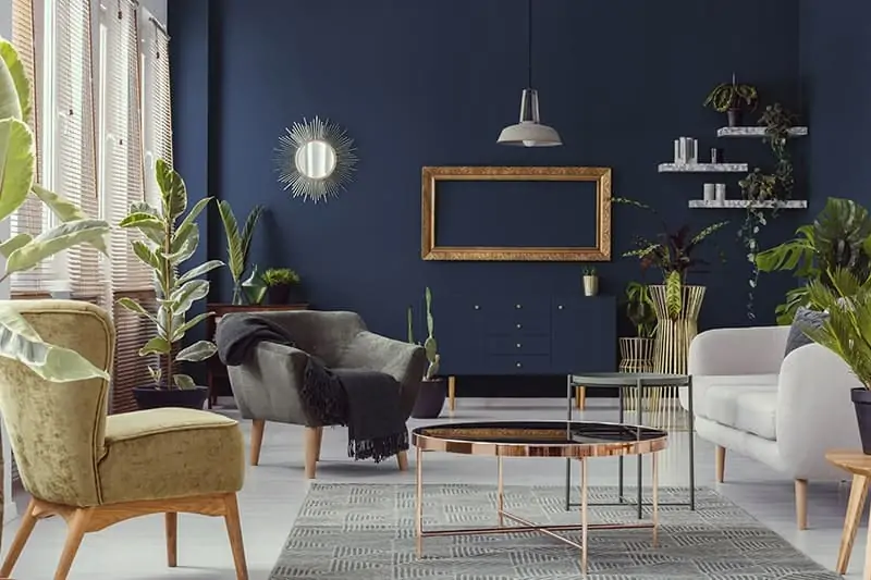
Image Source: NEROLAC
Nothing compares to the grandeur and the timeless appeal of an inky blue wall.
The colour itself has a velvety look and feel. This rich hue provides the perfect backdrop to jewelled colours and print. In addition, for an understated and chic look, mix and match your house painting design with wood and white accents.
If you want to go all out, consider adding soft green pieces of decor to lift up the scheme and create an unexpected, sophisticated look.
Tuscan pink
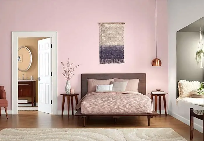
Image Source: Lowe’s
Being inviting, uplifting, and effortless to decorate with, it is no surprise that pink makes it to our list.
However, with choices ranging from pastel to neon, selecting the right shade can be a tricky quest. As the name suggests, there’s an earthiness that gives the colour a distinct warmth and depth.
This modern hue adds freshness when used alongside classic furniture. Moreover, it elevates a contemporary setting due to its versatile nature. Hence, in simple terms, it is a pink for adults as well as kids.
Forest green
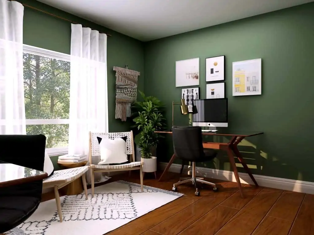
Image Source: Collov Home Design
With the expansion of the green colour palette, 2021 will be the year of green house painting colour trends.
The shade reflects the colour of the forest in synergy with nature. It evokes the therapeutic, restorative, and regenerative power of wellbeing.
With increasing urbanity and a digital world, green paint colour makes your home a space of solace. Moreover, combining it with low-level furniture and an uncomplicated décor further conveys a sense of calm.
Never boring, though, with shades ranging from soft mint to earthy tones of khaki green, paint your interior walls to grab the gaze.
Deep mulberry
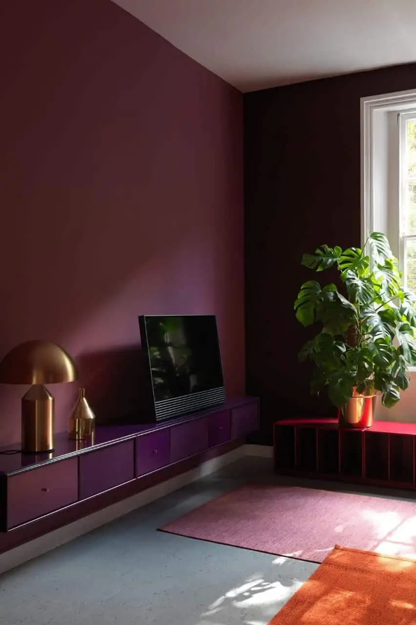
Image Source: Pinterest
Dark shades of wall paint give the interior space a classy, intimate, and luxurious appeal. For instance, dark purple or a deep mulberry is a rich and classic wall colour for a semi-formal or formal living room.
When decorating with a monochrome palette, pick a base colour, and look for shades of the same colour that complement your overall look. Choose a dark colour that will give your home a tucked-away appeal. In addition, furniture in dark wood adds depth to the space, while the white ceiling gives it breathing space.
Bright orange
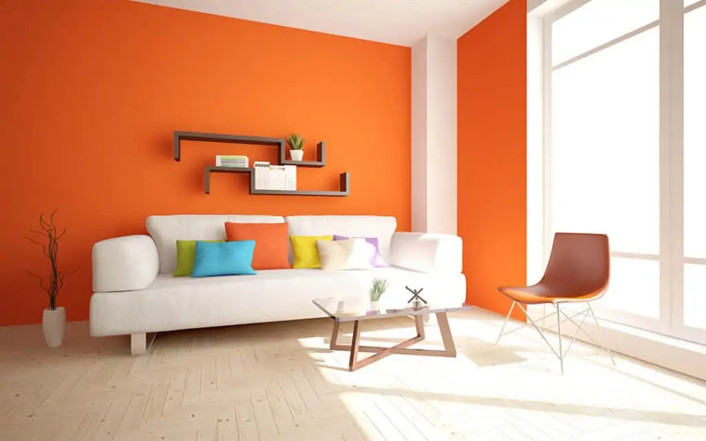
Image Source: Nippon Paint
Speaking of warm hues, a bold and bright shade of orange remains one of the best interior paint colours to date. Although a little tricky to work with, it uplifts the mood of the space and adds a bright pop.
It promotes a welcoming feeling and inspires interpersonal conversation.
However, if you are not a big fan of bold, bright colours, pick a shade with grey undertones.
Green with a hint of blue
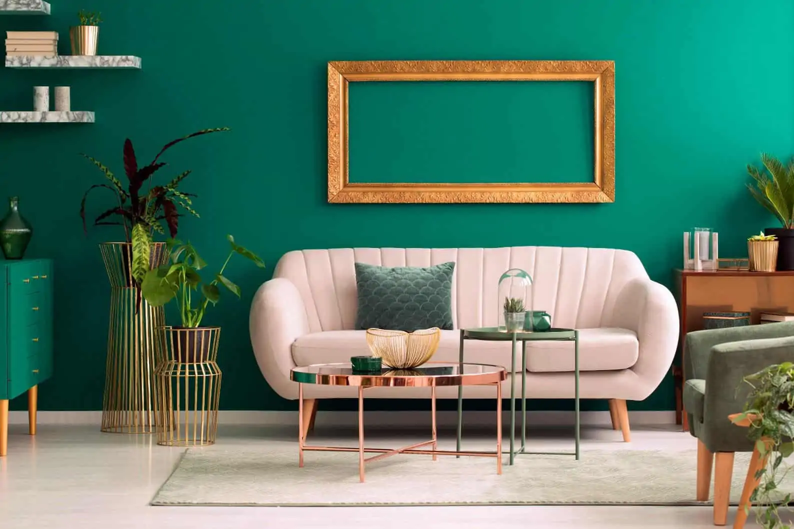
Image Source: 21OAK
Who doesn’t love an aqua green wall? It feels like the perfect harmony of sophistication and fun.
Depending on the natural light, this shade will appear more blue or green and will add a lot of depth to your interior space. Hence, if you think green is too trendy for you, think twice! This lovely shade proves that green can be a traditional as well as a modern hue.
Rich red
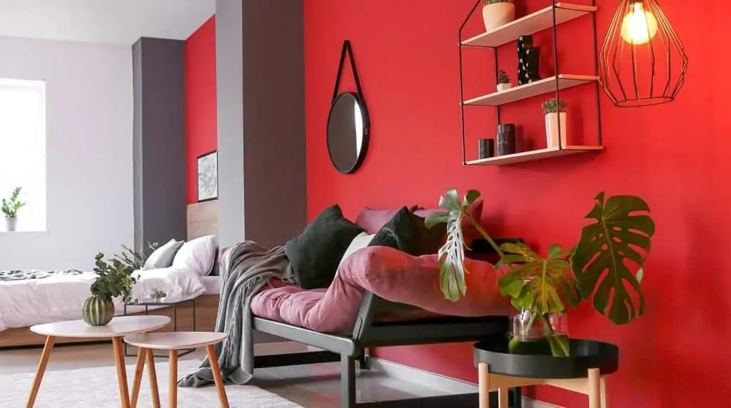
Image Source: NEROLAC
Red is another great pick for house painting. Being a colour of energy, its darker shades are great for areas where you want to stimulate conversations. Moreover, it pairs beautifully with wooden flooring.
Opt for this warm shade as it looks beautiful in a room that gets ample natural light. Like sparkling jewels, a red colour wall draws the eye and is best used as a focal point.
Amber yellow
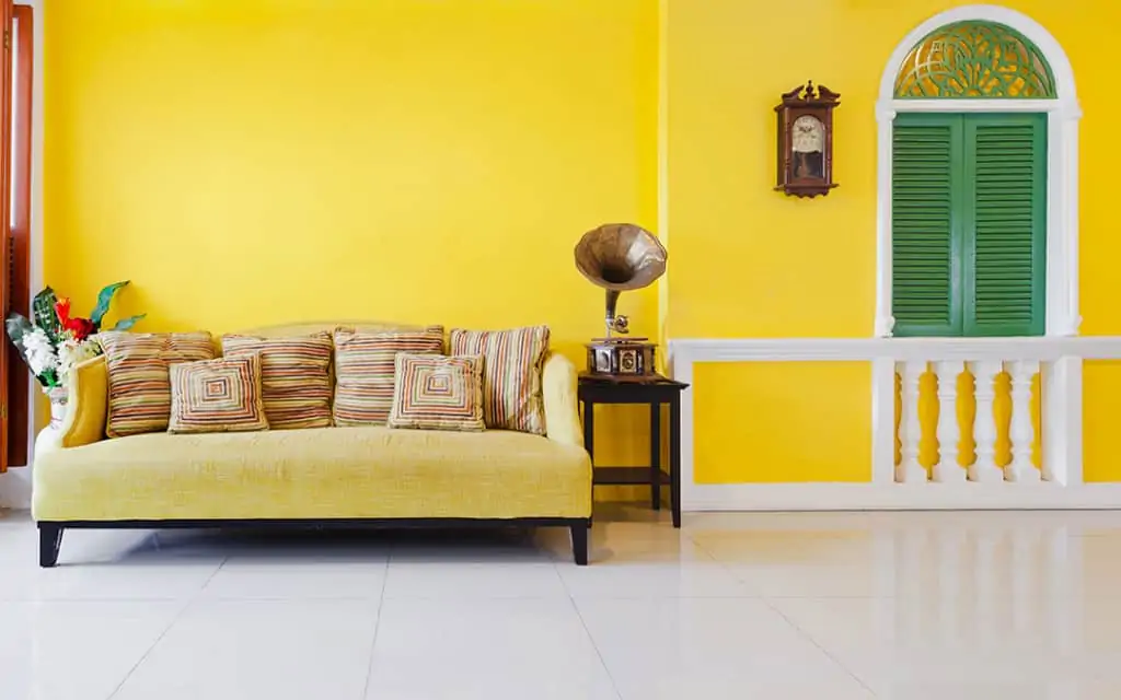
Image Source: Nippon Paint
Yellow is the latest trend in wall paint colours. This lively and cheerful shade brings a calm and relaxing feel into modern interior design, creating harmony and balance.
Paint schemes with a hint of yellow colour enhance the liveliness and add a touch of playfulness. Additionally, the yellow tones blend perfectly with modern interiors and combine perfectly with blue furniture and statement pieces.
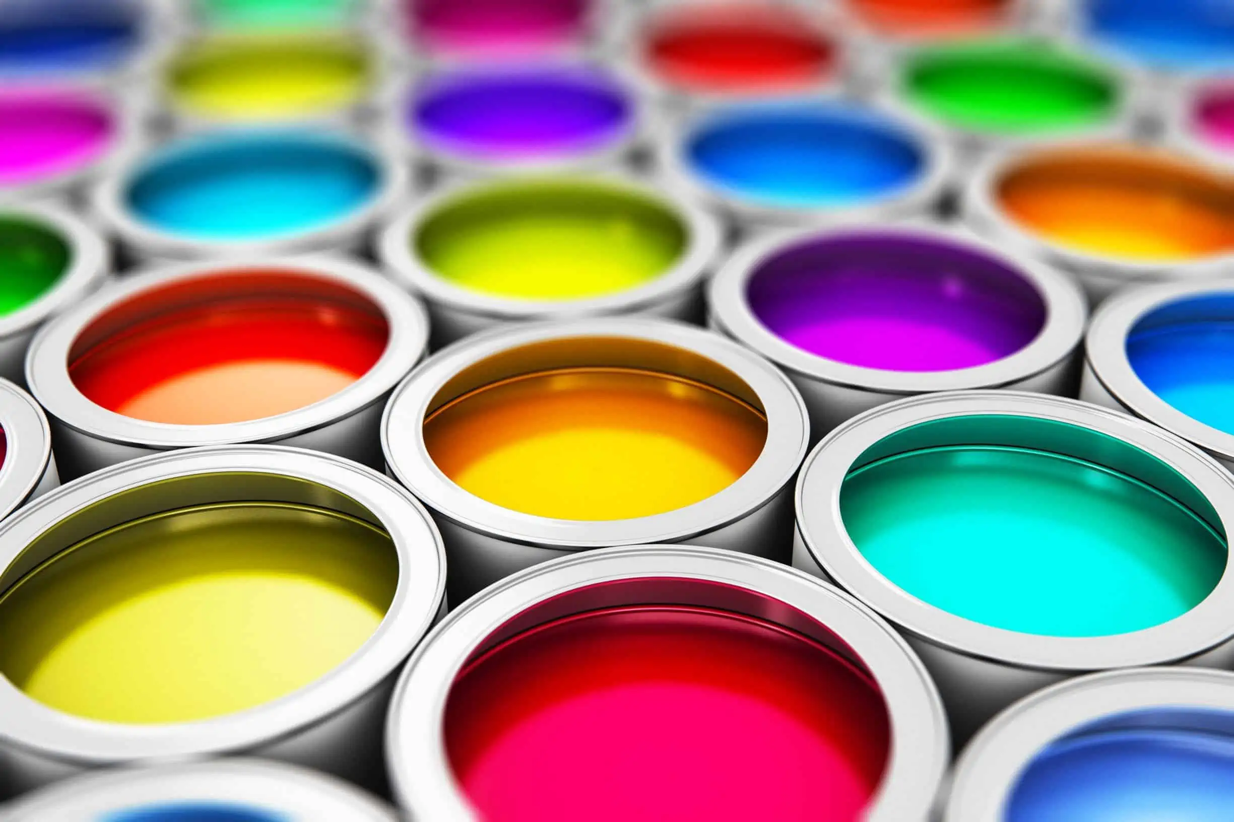
Wall paint brands & prices
When it comes to wall paints, the Indian market is currently dominated by four major brands: Dulux, Berger Paints, Nerolac, and Asian Paints.
Following are the product ranges and their respective cost from these brands:
Asian Paints
Asian Paints offers high-quality, all-weather exterior finishes as well as a diverse range of interior paints for both residential and commercial areas. Depending on your budget and needs, you can choose from Royale, Tractor, and Apcolite emulsions for the interiors and Ace, Apex, and Ultima emulsions for the exteriors.
| Type / Application | Product Range | Price Range |
| Interior paints & finishes
|
Royale | ₹ 418 – 1,088 / L |
| Apcolite | ₹ 269 – 315 / L | |
| Tractor | ₹ 64 – 134 / L | |
| Exterior paints & finishes
|
Ace | ₹ 161 / L |
| Ultima | ₹ 356 / L | |
| Apex | ₹ 266 – 356 / L |
Berger Paints
Depending on the finish you desire for your interiors and exteriors, you can choose from a number of Berger Paints products, such as Berger Paints Acrylic Paint, Silk Glamor, and Bison. These house painting colour ranges offer durability and protection to your interior and exterior walls.
| Type / Application | Product Range | Price Range |
| Interior wall coatings
|
Interior Emulsions | ₹ 130 – 600 / L |
| Designer Finishes | ₹ 756 – 1,014 / L | |
| Acrylic distemper | ₹ 65 / L | |
| Exterior wall coatings
|
Exterior Emulsions | ₹ 160 – 450 / L |
| Exterior Textures | ₹ 260 – 350 / L | |
| Undercoats for house painting
|
Interior Primers | ₹ 144 – 220 / L |
| Metal Primers | ₹ 180 – 420 / L | |
| Exterior Primers | ₹ 159 – 260 / L |
Nerolac Paints
Nerolac Paints offers a wide range of paints, textures, patterns, and styles to find the one that accentuates your home’s beauty. Moreover, they have an extensive range of exterior paints and emulsions as well.
| Type / Application | Product Range | Price Range |
| Interior wall coatings | Luxury range | ₹ 485 – 574 / L |
| Premium range | ₹ 194 – 315 / L | |
| Popular range | ₹ 74 – 137 / L | |
| Exterior wall coatings | Luxury range | ₹ 130 – 440 / L |
| Premium range | ₹ 125 -210 / L | |
| Popular range | ₹ 92 – 180 / L |
Dulux Paints
The brand has a reputation for producing high-quality wall paint for both residential and commercial settings. Dulux Diamond Glo for a high sheen level and washability, Dulux Rainbow colours for a matt finish and value for money, Dulux Smoothover for a smooth texture on walls, and Dulux Velvet Touch for a luxury finish are among the various options available for house painting.
| Type / Application | Product Range | Price Range |
| Interior wall paint | Velvet Touch | ₹ 429 – 1,035 / L |
| SuperClean | ₹ 230 – 277 / L | |
| SuperCover | ₹ 212 – 235 / L | |
| Promise | ₹ 107 – 204 / L | |
| Exterior wall paint | Weathershield | ₹ 193 – 350 / L |
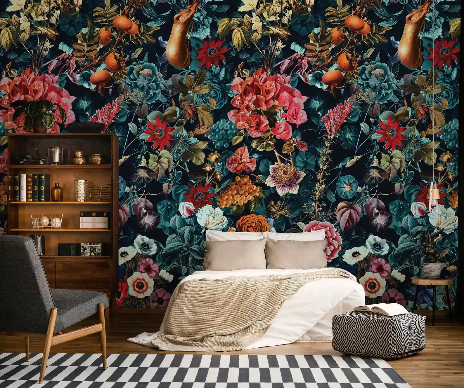
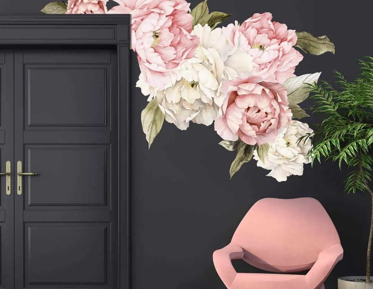
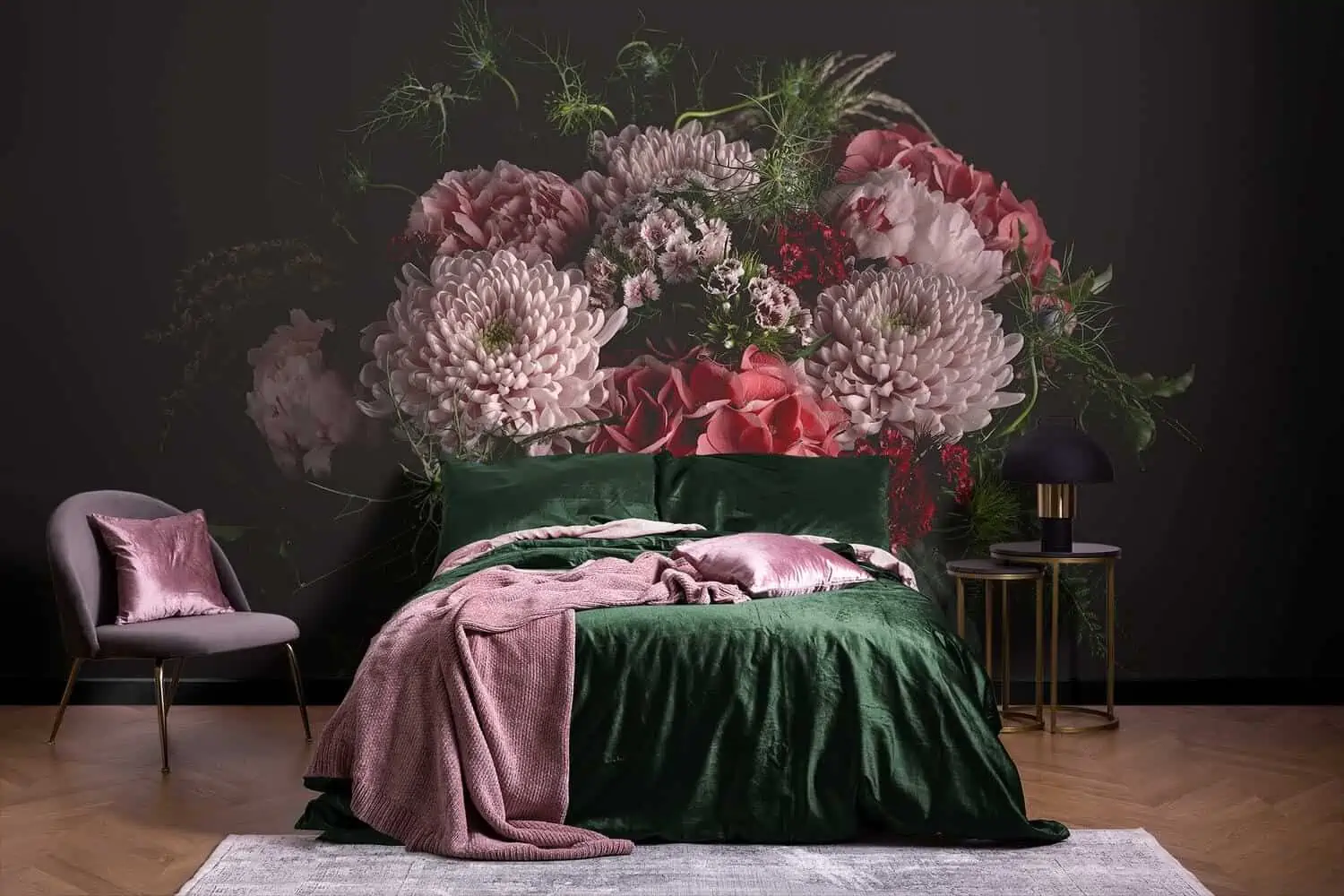
In-trend wall paint images to inspire you
Wall paint image #1
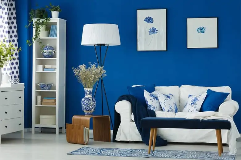
Image Source: The Seattle Times
Wall paint image #2
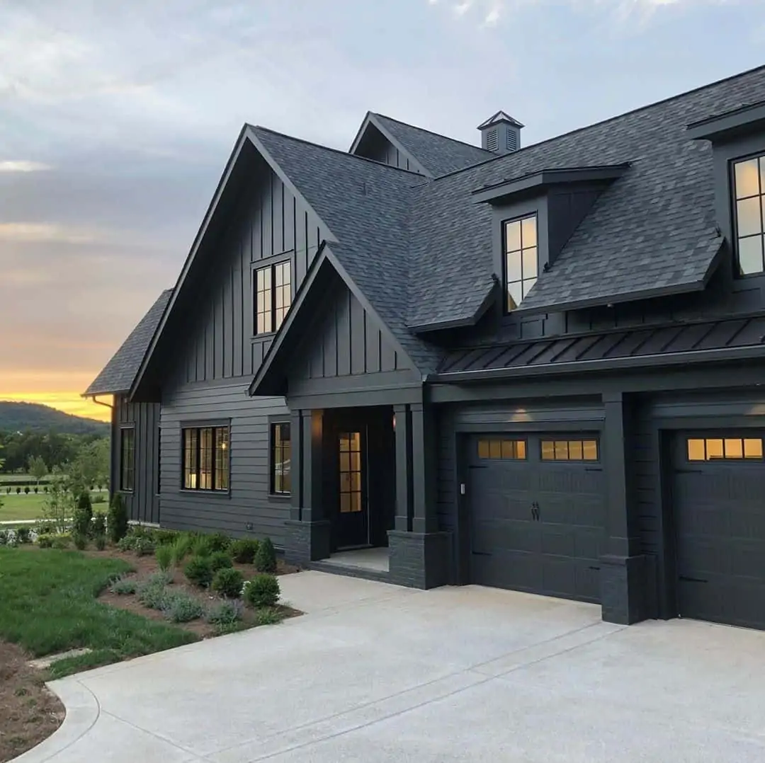
Image Source: Hunker
Wall paint image #3
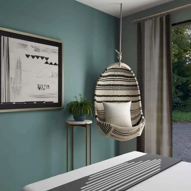
Image Source: Collov Home Design
Wall paint image #4

Image Source: Sam Beasley
Wall paint image #5
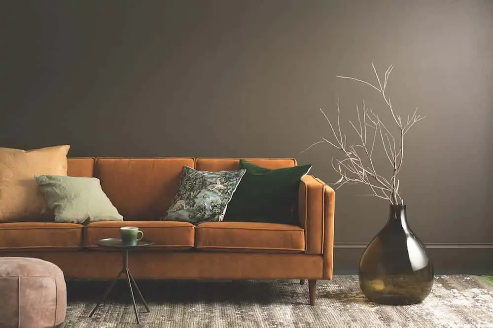
Image Source: Johanna Davies
Wall paint image #6
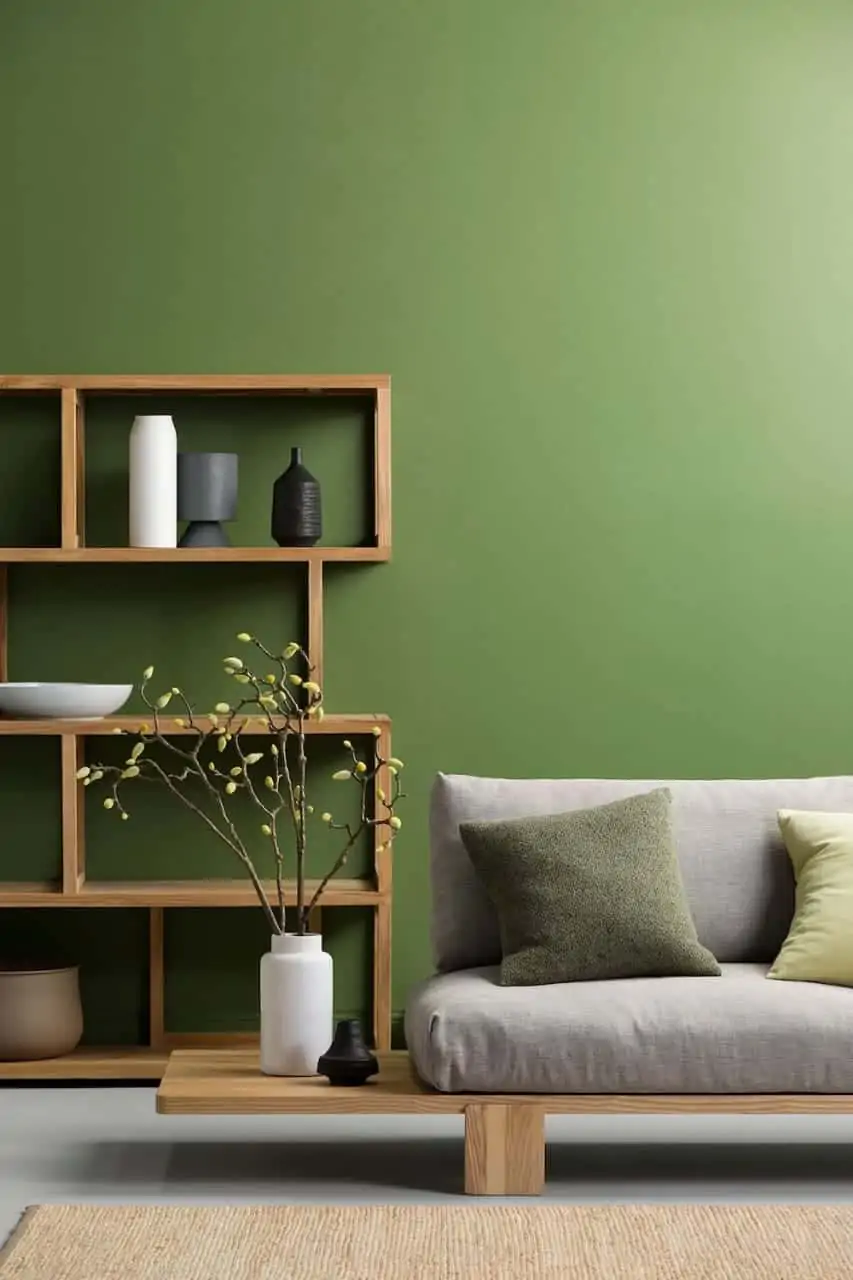
Image Source: Big Bucks India
Wall paint image #7
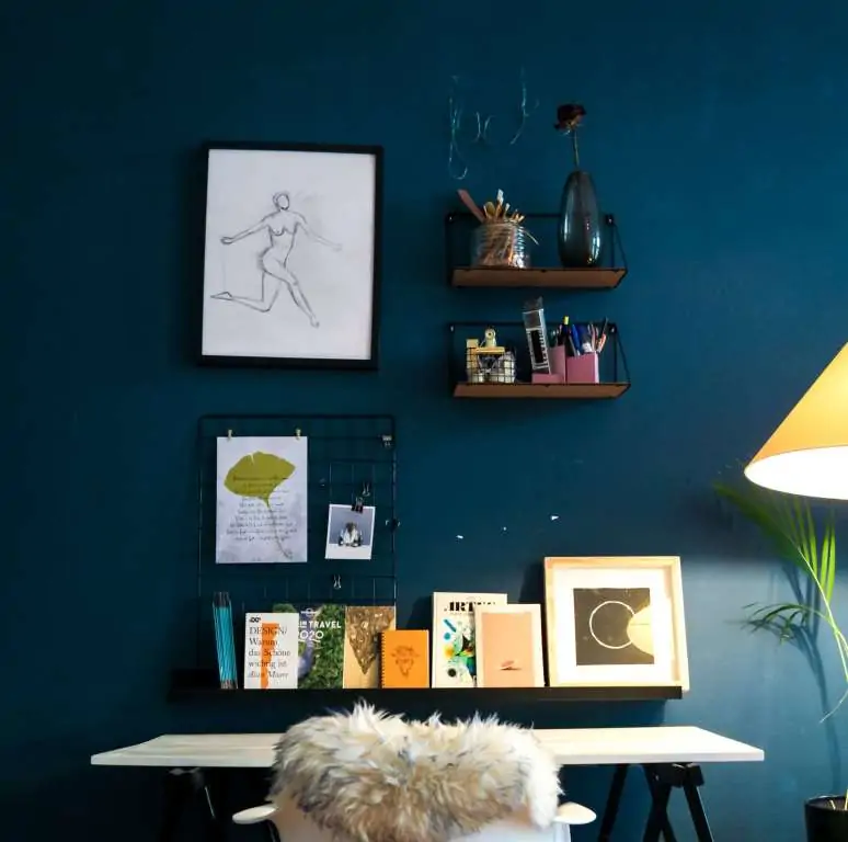
Image Source: Beazy
Wall paint image #8
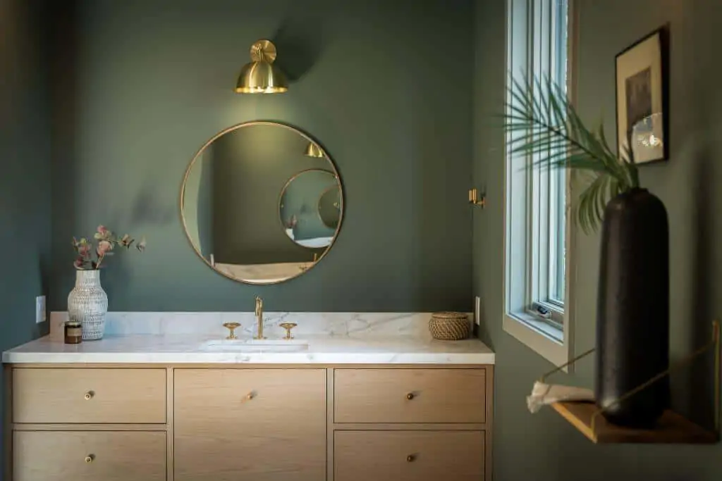
Image Source: watermark-designs
Wall paint image #9
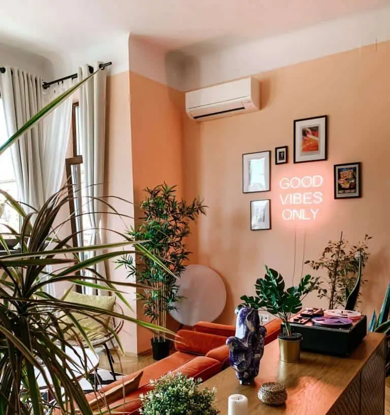
Image Source: toa-heftiba
Wall paint image #10
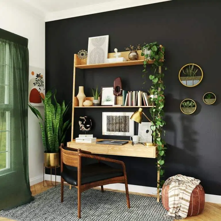
Image Source: Space Joy
Wall paint image #11
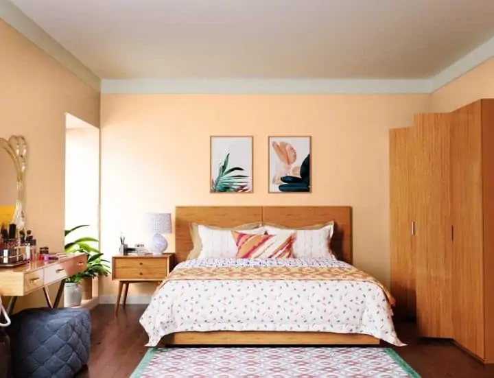
Image Source: Asian Paints
Wall paint image #12
Image Source: Nippon Paint
Wall paint image #13
Image Source: Asian Paints
Wall paint image #14
Image Source: Asian Paints
Wall paint image #15
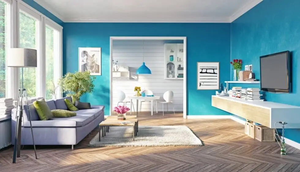
Image Source: Metzler Home Builders
Wall paint image #16
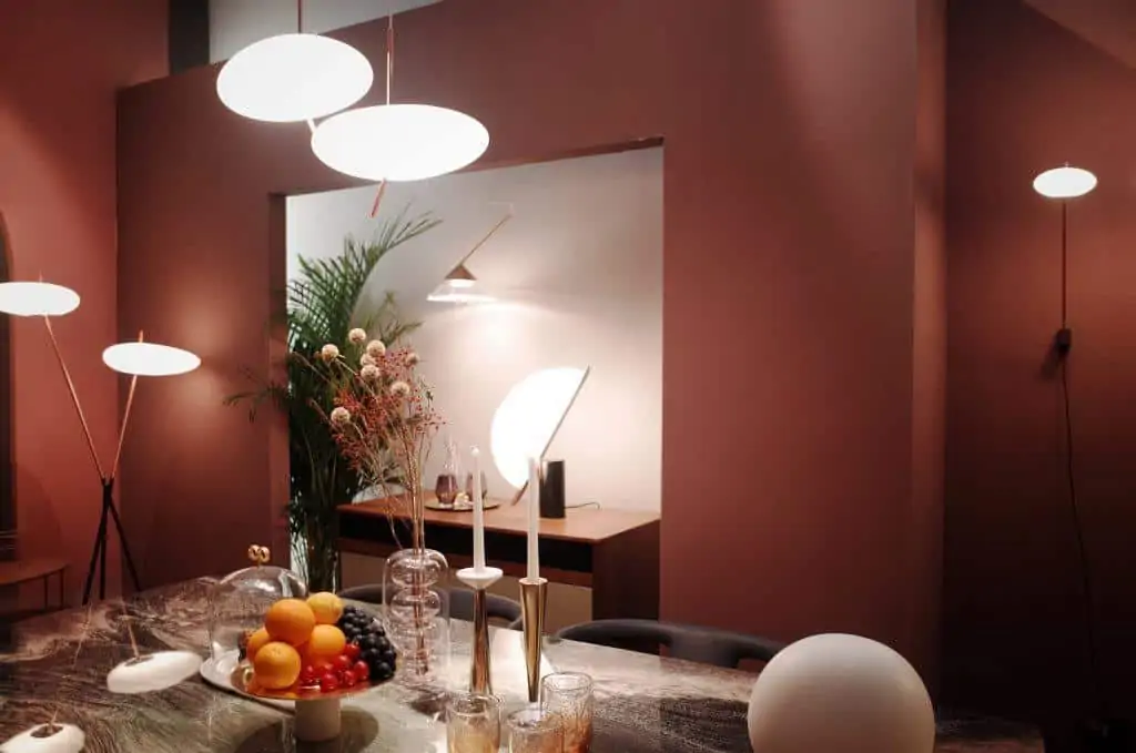
Image Source: Siyan Peng
Wall paint image #17
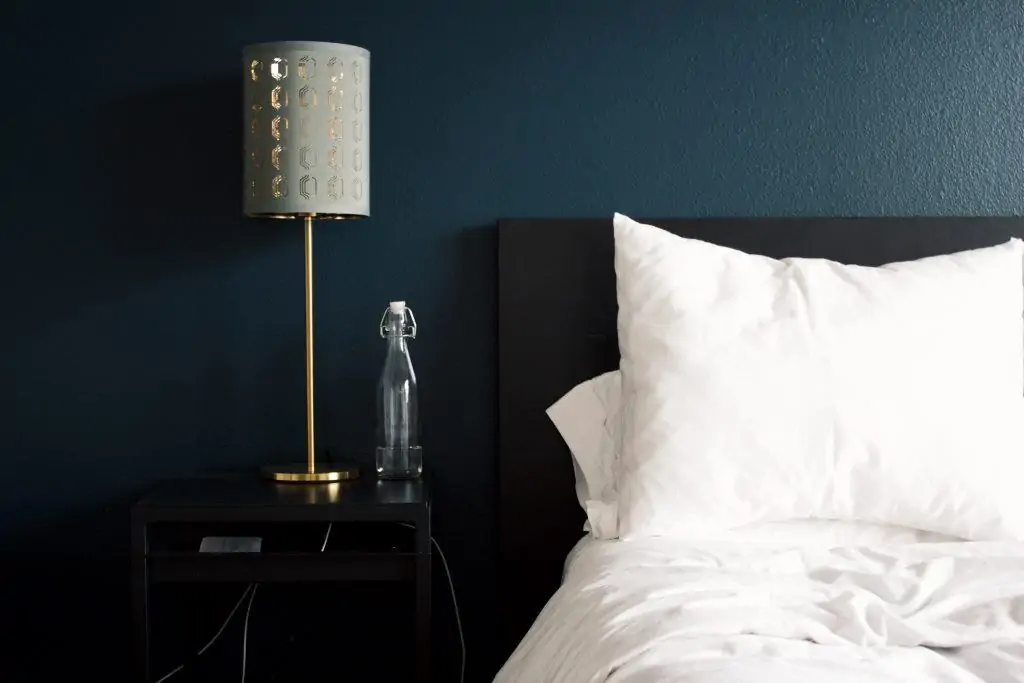
Image Source: Rhema Kallianpur
Wall paint image #18
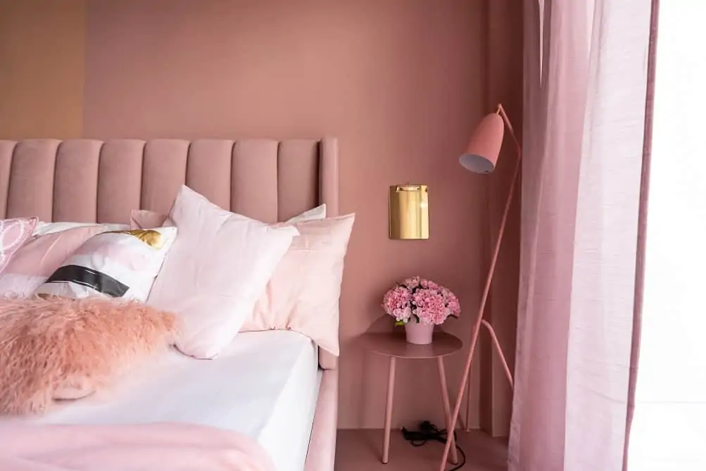
Image Source: Indigo Paints
Wall paint image #19
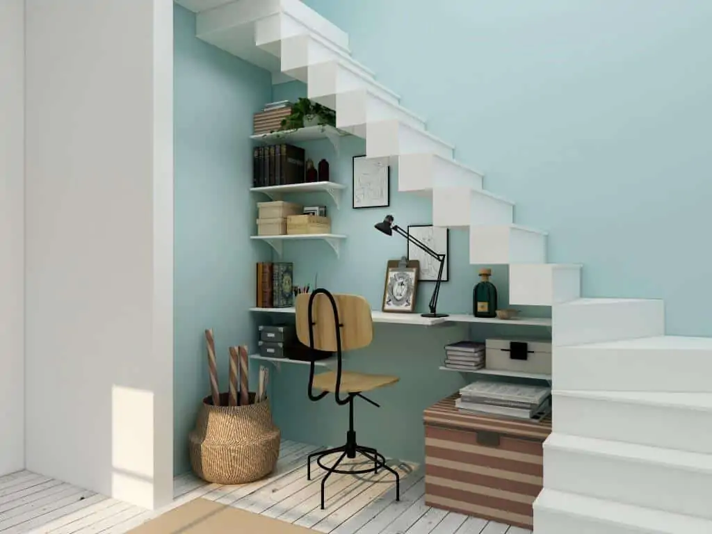
Image Source: Collov Home Design
Wall paint image #20
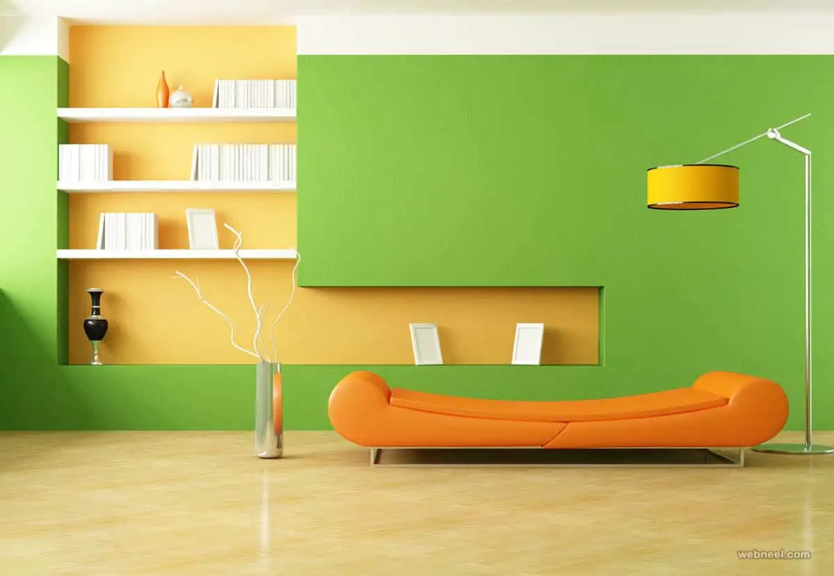
Image Source: webneel
Wall paint image #21
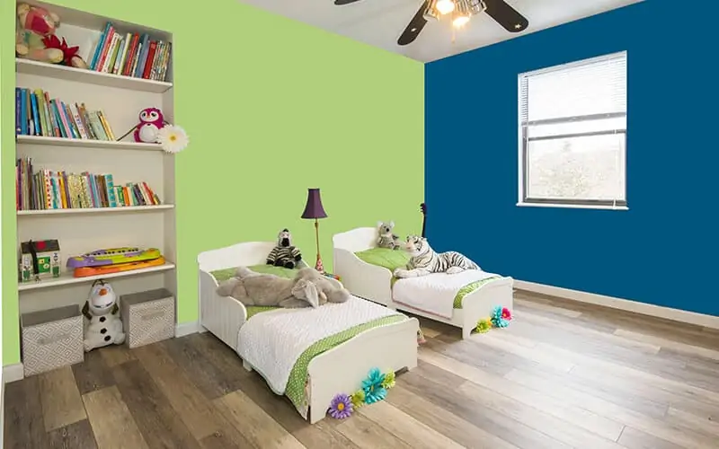
Image Source: Aapka Painter
Wall paint image #22
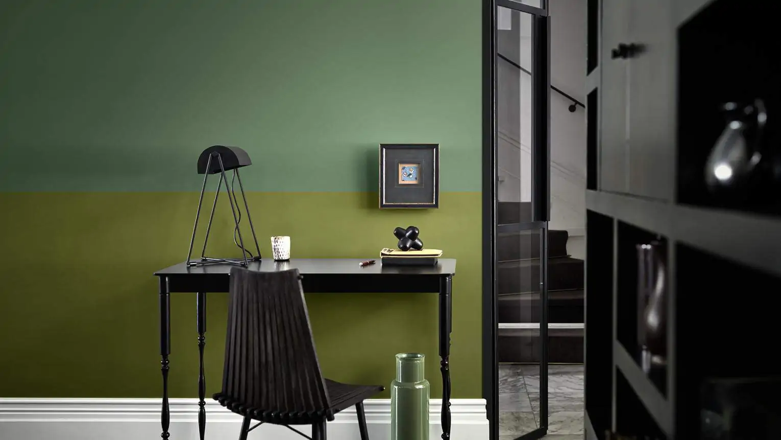
Image Source: Dulux India
Wall paint image #23
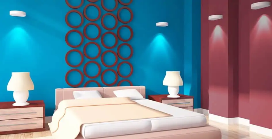
Image Source: Berger Paints
Wall paint image #24
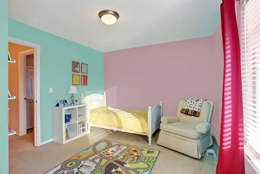
Image Source: Indigo Paints
Conclusion
Whether you are somebody who follows every trend or just sticks with their personal style, there is a unique wall paint colour for you. Take some time to sit back and analyze the new, rich, solid, and earth-inspired wall paint colours for house painting. Moreover, evaluate what will work best for your aesthetic plans.
The best way to choose a wall paint colour is to try out all its permutations & combinations first. However, you can never make a good decision based on just looking at the colour swatch in the store.
Take it home and tape it to the wall to see how it works within the space and with your room’s lighting. Additionally, the swatches don’t always reveal the actual house painting colour when it dries. Therefore, test a few colours of paint on a spare piece of wood and place it against the wall.
Hopefully, being aware of the common pitfalls will help you avoid them in your upcoming house painting projects.
For a radiant interior space, go for shades of yellow, blue, red, or green whereas, for exterior house painting, grey and brown hues still remain a popular choice.
Lastly, take inspiration from the pool of trendy wall paint ideas and wall designs to take your project to the next level.