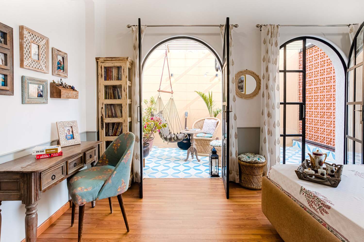

The easiest and least expensive upgrade to your room is paint colours. Unlike furniture, paint colour is not a long-term commitment; so now is the time to start working on your “dream room’’ project! When we talk about room colour, we don’t just mean room walls, the room colour scheme encompasses all small design accents like curtains, cushions, sofas, and wall decor. However, making a colour scheme that is smooth and easy on the eyes can be overwhelming. To save you the research, we have created a one-stop room colour combination guide for the living room, dining room, and bedroom (with super aesthetic images). Keep reading to find your favourite room colour ideas and fantastic combination.
Contents
- 1 Unique colour combinations for your rooms
- 1.1 Two colour combinations #1 – Cobalt Blue and White
- 1.2 Two colour combinations #2 – Yellow Sands and Sunshine Red
- 1.3 Two colour combinations #3 – White and Peach
- 1.4 Two colour combinations #4 – Grey and Green
- 1.5 Two colour combinations #5 – Brown and White
- 1.6 Two colour combinations #6 – Pink and Green
- 1.7 Two colour combinations #7 – Brown and Orange
- 1.8 Three colour combinations #8 – Green, Brown, and White
- 1.9 Three colour combinations #9 – Navy Blue, Orange, and White
- 1.10 Three colour combinations #10 – White, Brown, and Red Rust
- 2 Living room colours
- 3 Dining room colours
- 4 Bedroom colours
- 5 Ultimate 2024 room colour lookbook: Latest colours and designs!
- 6
- 7 FAQs
- 7.1 Which colours should I avoid in my bedroom?
- 7.2 Which colours promote relaxation in the bedroom?
- 7.3 What colours make a living room feel bigger?
- 7.4 What are the different colour schemes for home interiors?
- 7.5 What is the rule for accent walls?
- 7.6 What colour should I paint my small dining room?
- 7.7 How does light affect colour?
- 7.8 Should accent walls be lighter or darker?
- 7.9 What colour is best for an accent wall?
- 8 Wall paint design: 55 ideas for bedroom, living room & hall
Unique colour combinations for your rooms
Two colour combinations #1 – Cobalt Blue and White
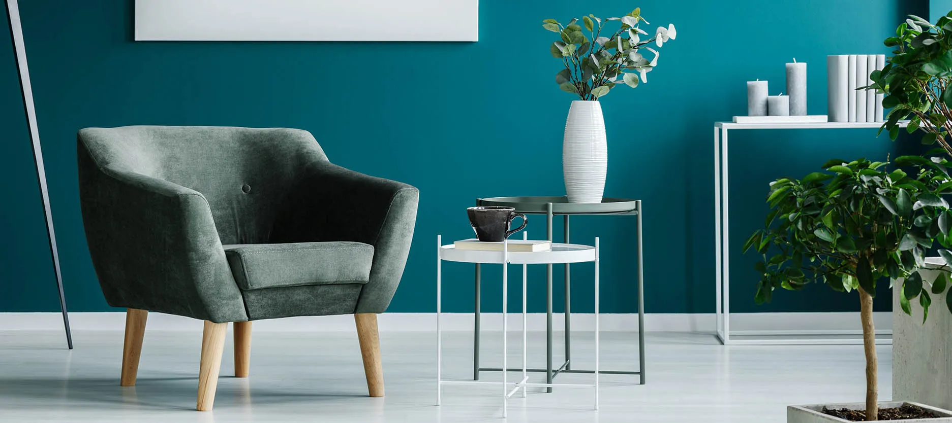
Image Source: Nerolac.com
White is the most popular colour used in home interiors because of its classic, timeless appeal. When paired with cobalt blue, it instantly enlivens the space. This versatile colour combination can be used to create a modern as well as a traditional feel depending on the furniture and accessories used to decorate the room.
Two colour combinations #2 – Yellow Sands and Sunshine Red
Image Source: Nerolac.com
This beautiful rich colour combination looks upscale and sophisticated. Ideal for living rooms, this combination gives the room an inviting vibe that will help create a cosy environment for your guests.
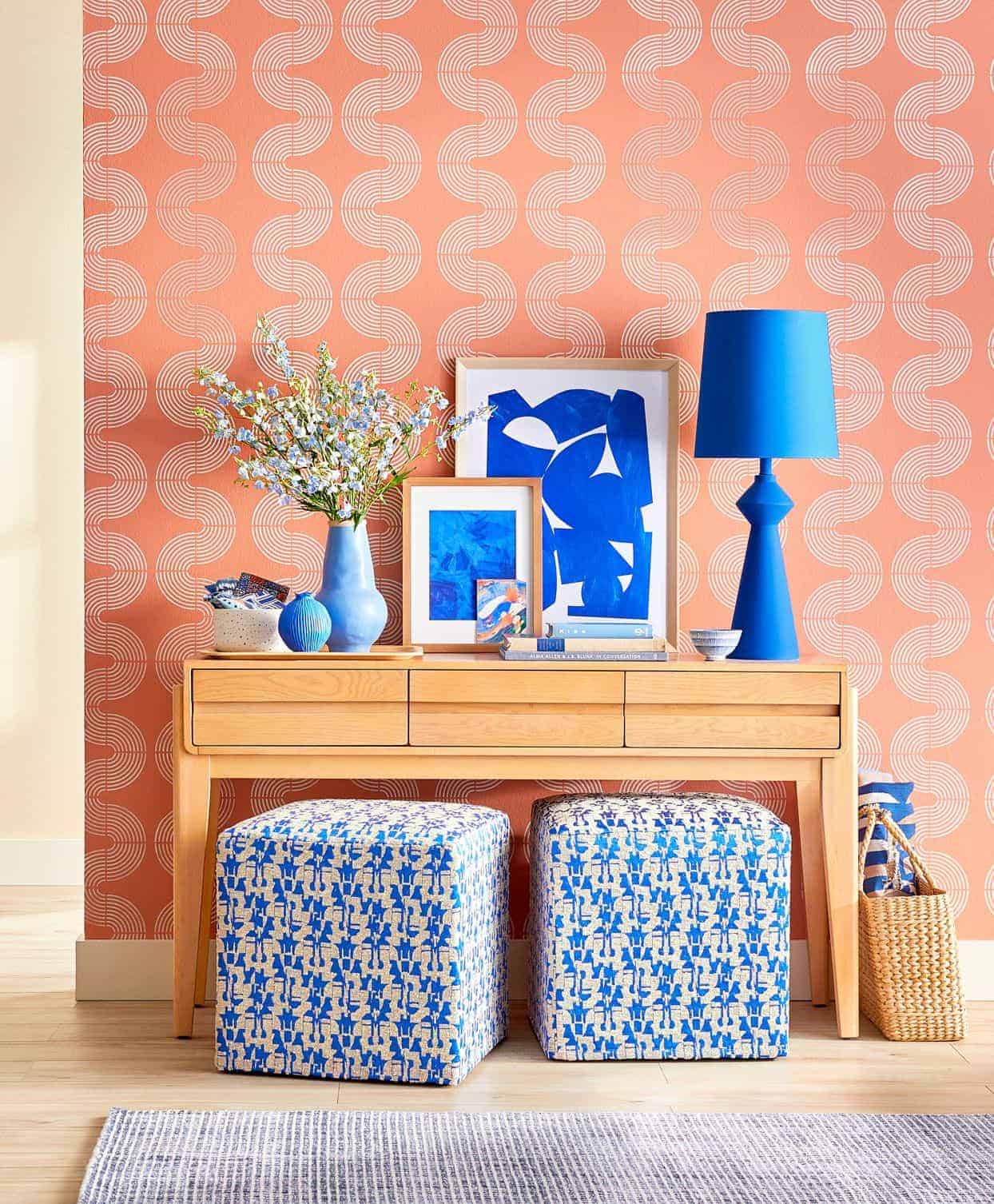
Two colour combinations #3 – White and Peach
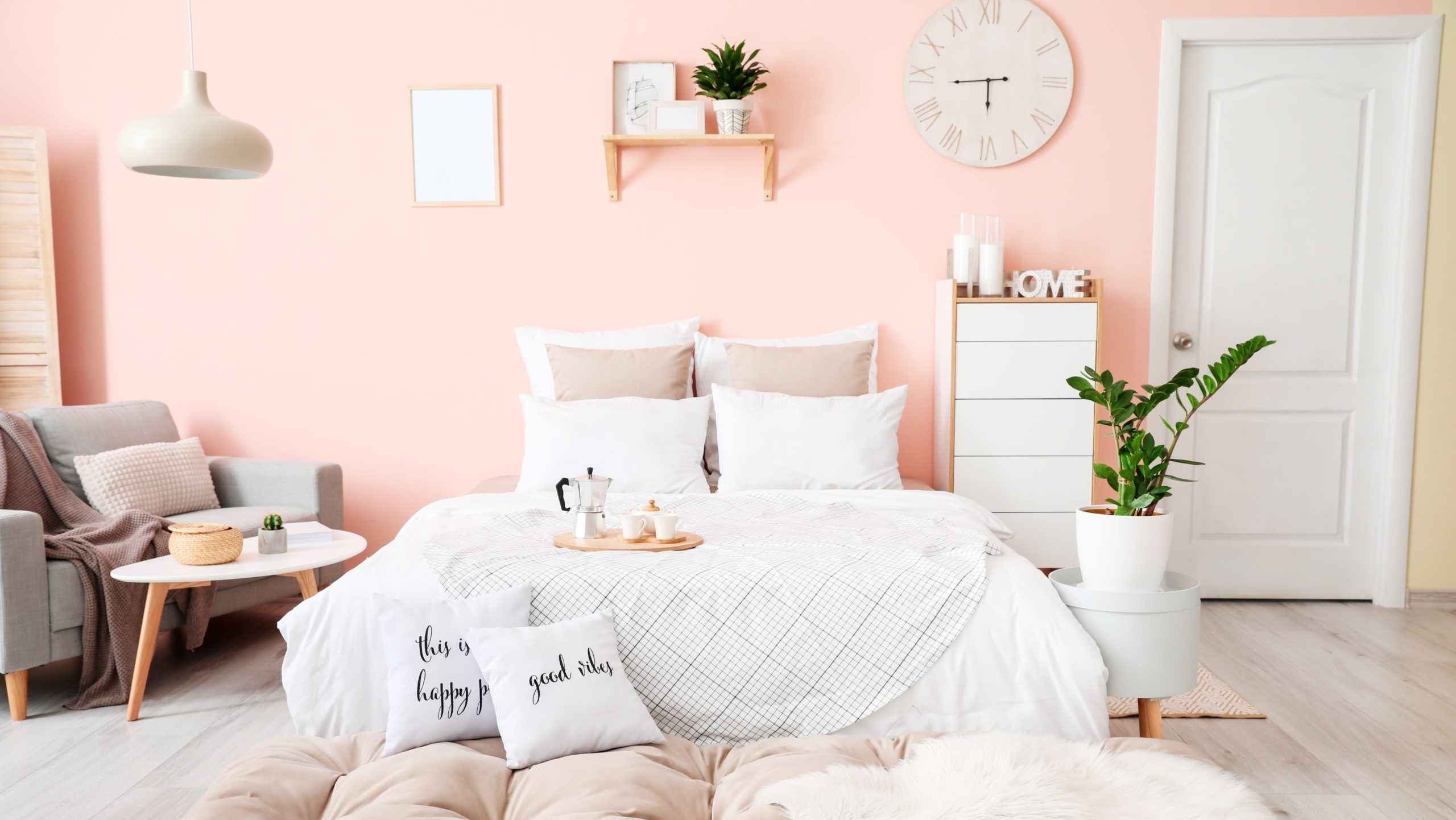
Image Source: Fadedspring.co.uk
Peach exudes a sense of sophistication, grace, and softness. Create a modern and appealing space by using peach and white colour schemes in your home. This light colour combination provokes an atmosphere of peace and calm.
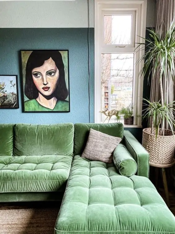
Two colour combinations #4 – Grey and Green
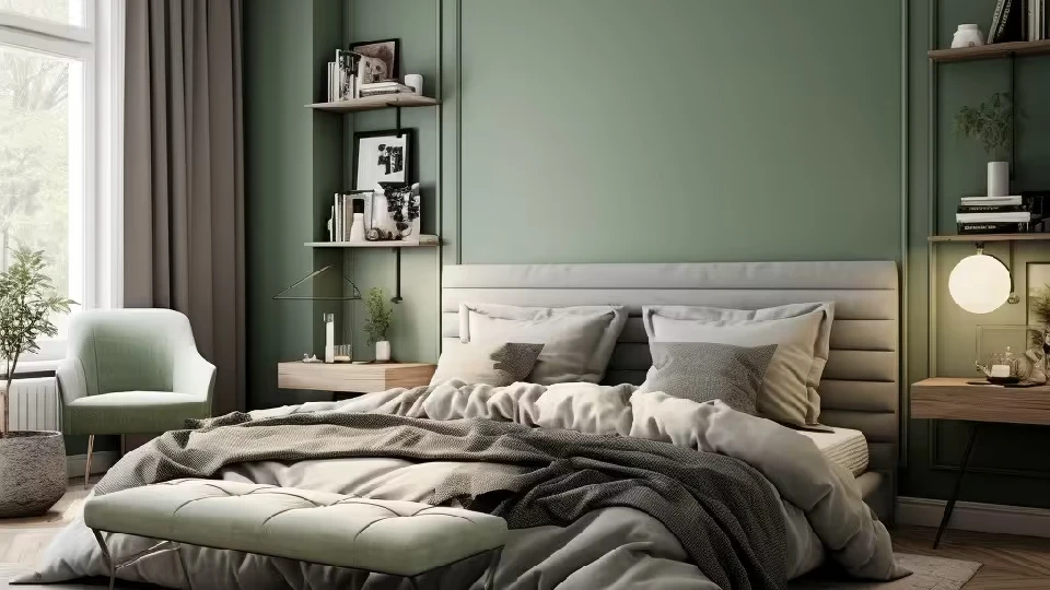
Image Source: interiorcompany.com
Green is an exceptionally soothing colour that reminds the viewer of nature and greenery. It perfectly ties into any room decor and has the effect of enlivening any space it adorns. The noteworthy combination of green with grey creates a welcoming environment.
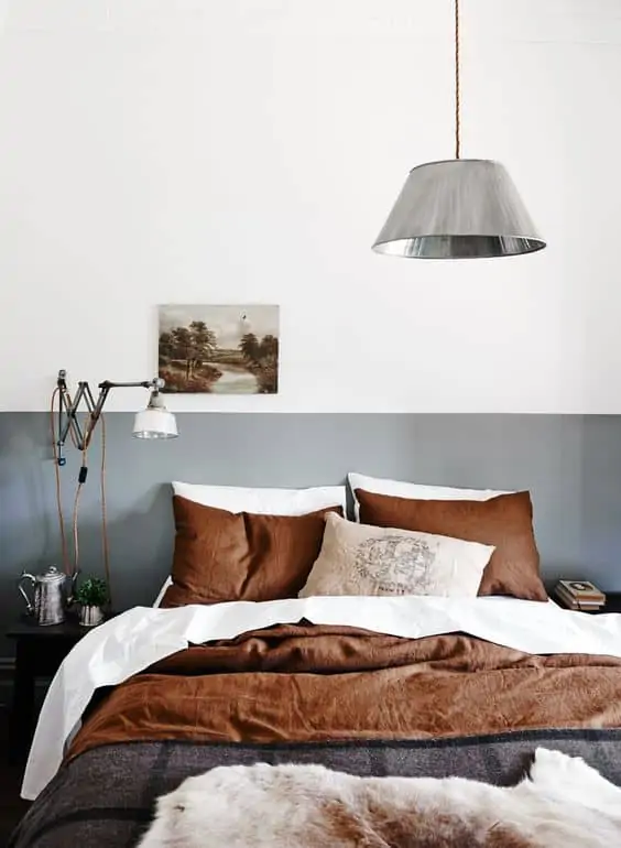
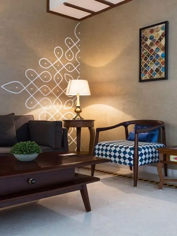
Two colour combinations #5 – Brown and White
Image Source: Tricopainting.com
The right shade of brown and white together can create a magical tranquil and composed atmosphere. This combination acts as a versatile base and allows the owner to experiment with accessories, furniture, and textures.
Two colour combinations #6 – Pink and Green
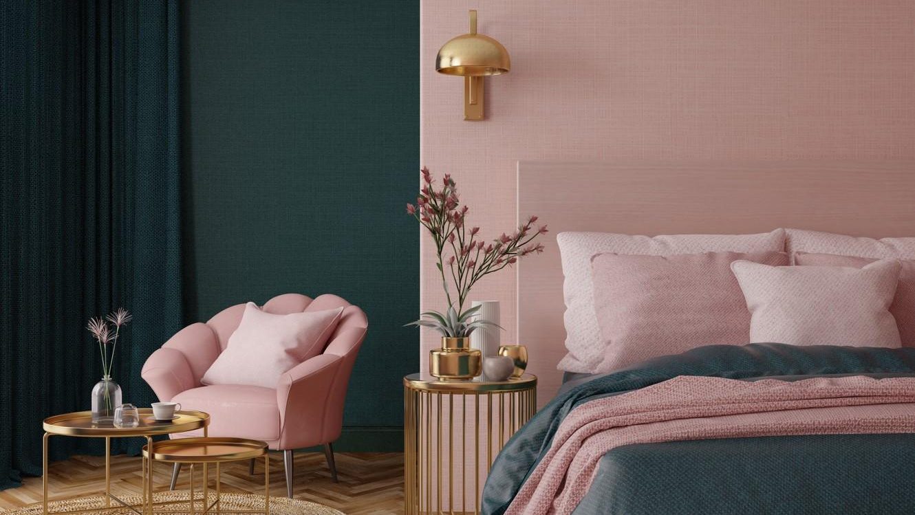
Image Source: Thesun.co.uk
This colour combination provides the perfect contrast, filling the room with interest and character. It is slightly unconventional to go for pink and green tones. However, it gives a put-together and upscale vibe to this bedroom.
Two colour combinations #7 – Brown and Orange
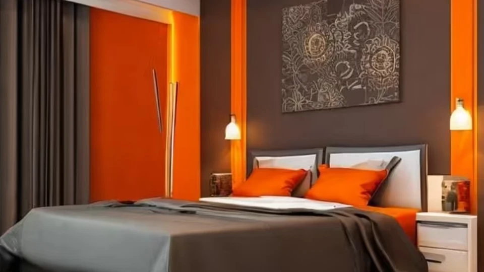
Image Source: fabricsandpapers.com
Brown and orange colours work beautifully when paired together. These warm hues lend a welcoming vibe to any room making this combination ideal for the living room and the bedroom.
Three colour combinations #8 – Green, Brown, and White
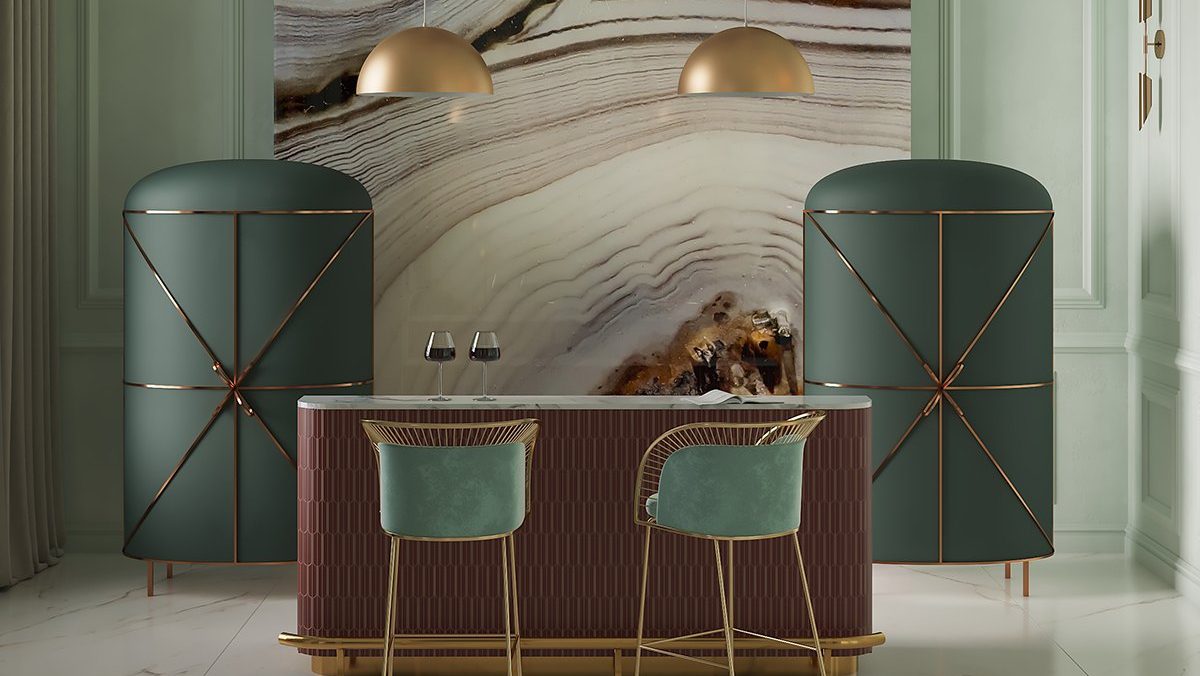
Image Source: scarletsplendour.com
A beautiful blend of green, brown, and white can give the space an extravagant appearance. Adding different shapes, textures, and finishes to the colour scheme can instantly level up your home decor.
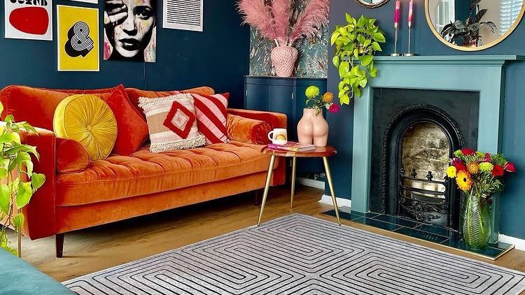
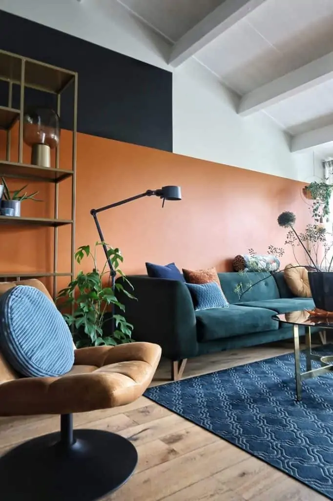
Image Source: @The_shoestring_home on Instagram
Navy blue and orange, when paired together, give a slight contrast, and the introduction of white into the mix ties the whole look together. It is especially helpful to have a difference in texture or finish between the different colours because it maintains interest.
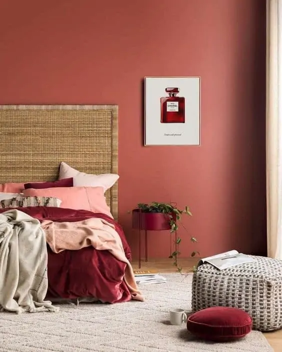
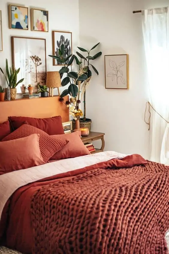
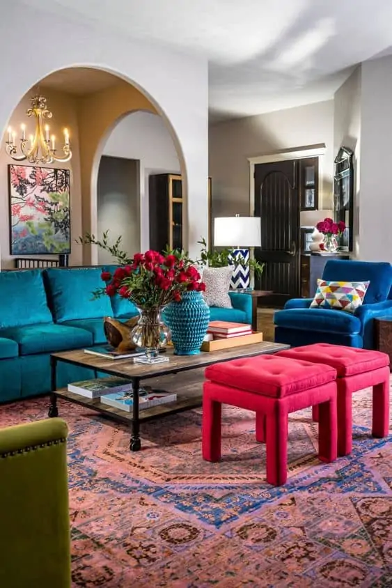
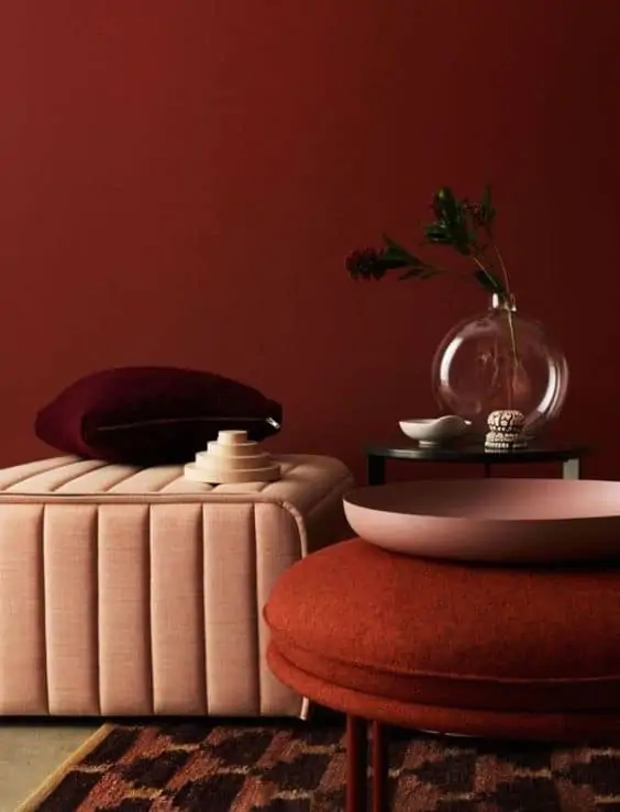
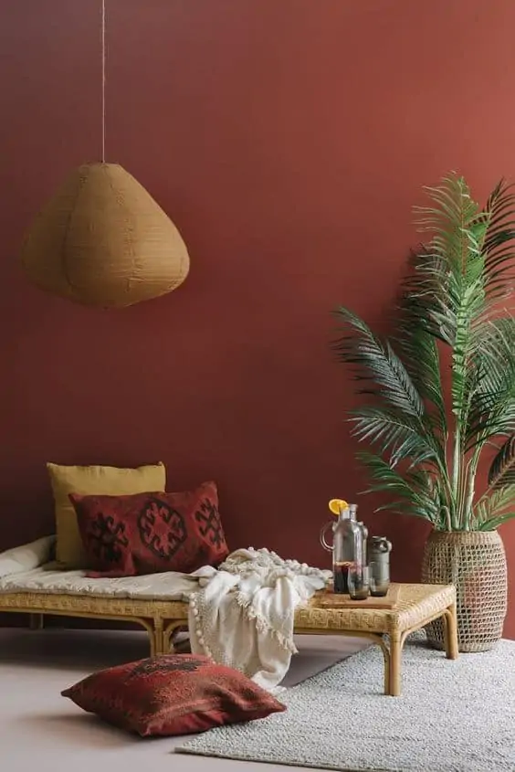
Three colour combinations #10 – White, Brown, and Red Rust
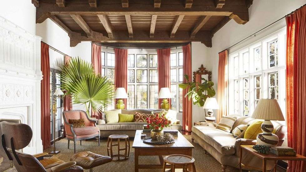
Image Source: Davidtsay.com
This colour scheme beautifully follows the 60-30-10 rule. According to this rule, the primary colour should make up 60% of the space, the secondary colour or texture should make up 30%, and the accent should make up 10%.
| Also see:17+ colour combinations for room: Selecting a versatile scheme |
Living room colours
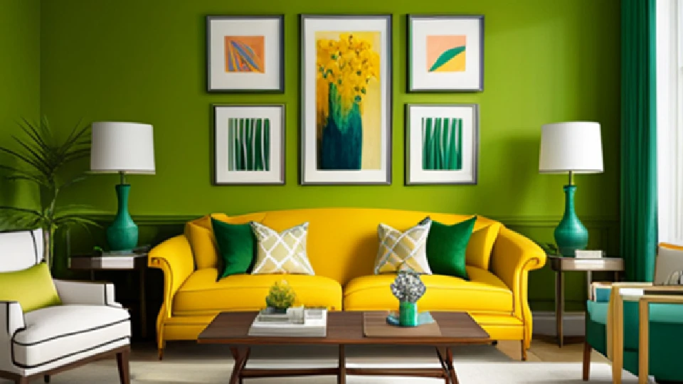
Image Source: asianpaints.com
The living room is the mirror to your home. This is the room that hosts all your guests, social activities, and leisure. Thus, this room needs to be at its best always. Your choice of colour and design for the living room might determine the vibe of the space- comfortable and inviting or dull and gloomy. A spectacular living room deserves happy, warm colour combinations or rich, sophisticated darker colours of drama. Warmer colours can add energy and passion to your room, while darker shades add elegance. Now let’s take a look at the best 5 living room colours for the year 2024.
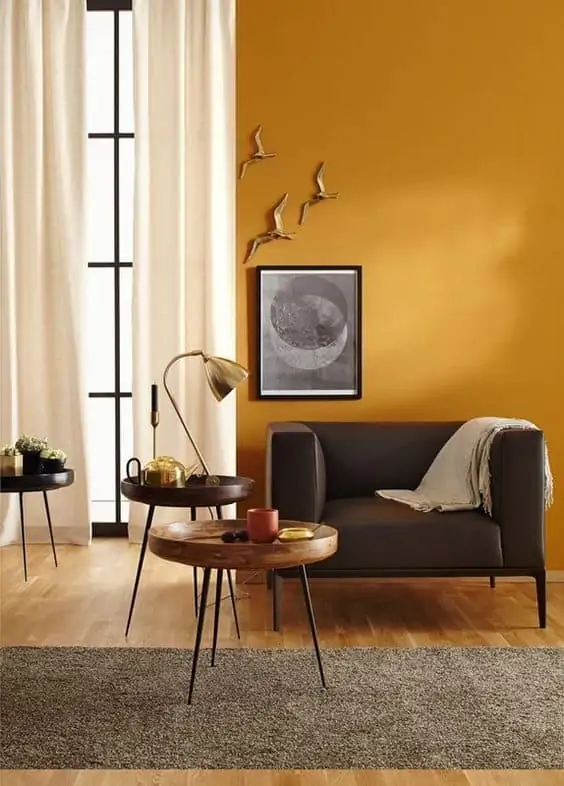
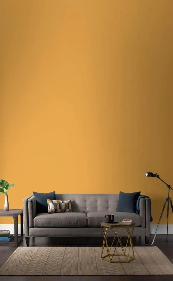
Living room colour ideas #11 – Mango Yellow
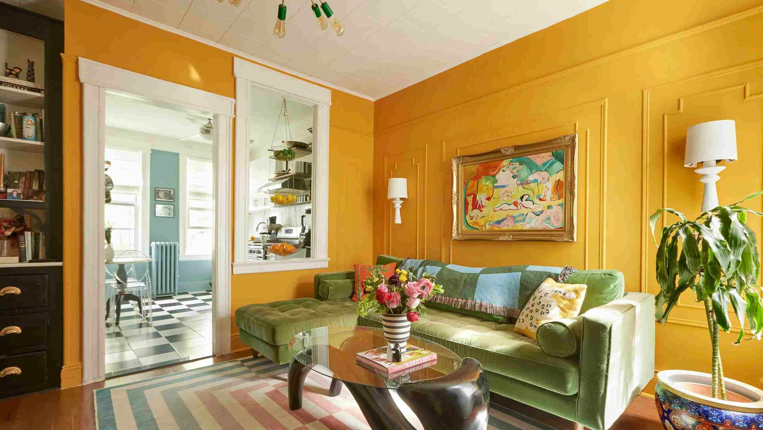
Image Source: designndekho.com
When it comes to the ideal warm living room, the colour yellow is your best friend. Out of all yellow shades, this year is all about mango yellows comprising shades like mustard and ochre. A bright yellow room gives you the same energy as a beautiful sunny day. The sunshine colour is also perfect because it plays well with a lot of different colours- blue, pink, and green. A mango yellow wall with design accents of royal blue in furniture and accessories is the perfect room colour scheme.
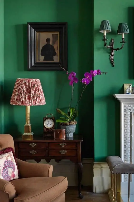
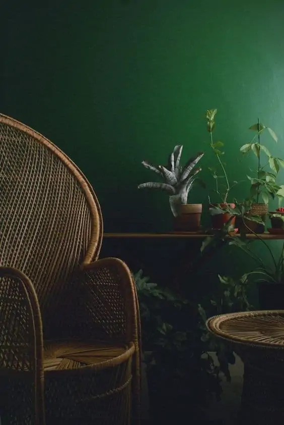
Living room colour ideas #12 – Jewel Green
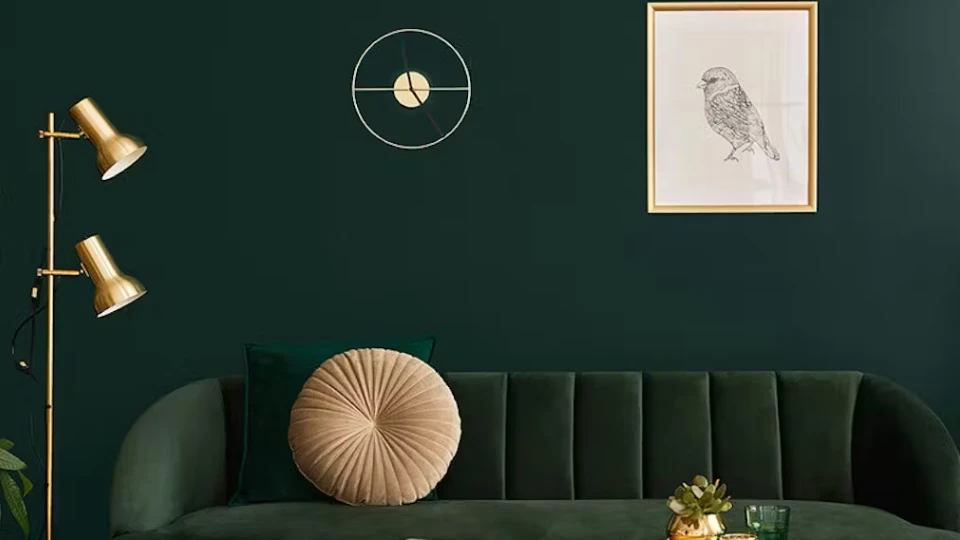
Image Source: tikkurila.com
This colour is for all those who love everything dark and royal. Jewel green colour refers to shades of moss, forest, emerald, and beryl. The green colour has a natural calming effect. It is also a colour that helps in stress relief. Thus, jewel green can induce a sense of comfort which is an essential character for any living room. You can also layer your green by adding plants of different green shades. Jewel green looks so royal with gold, yellow, and beige, try this colour combination for your living room to make a statement.
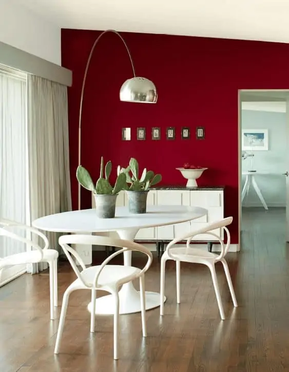
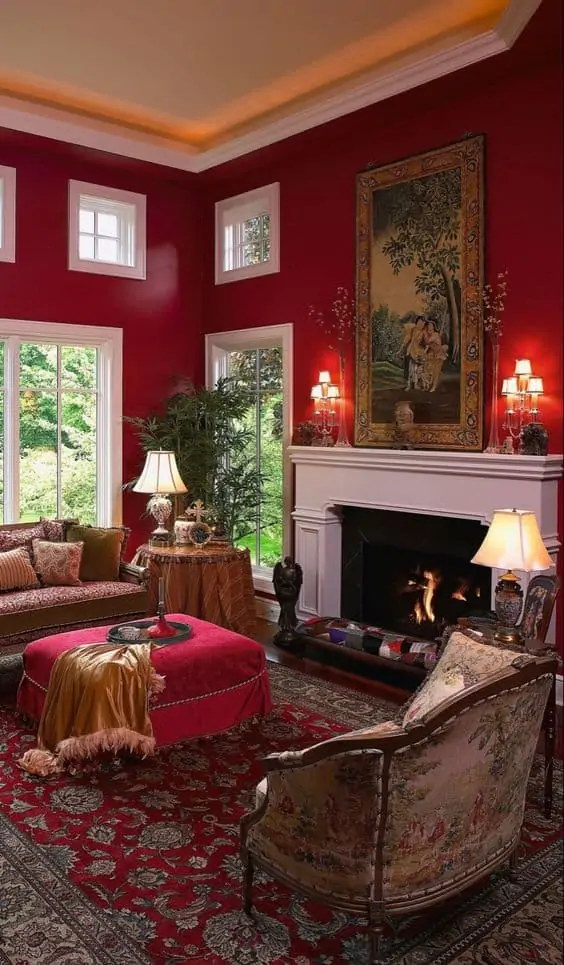
Living room colour ideas #13 – Scarlet Red
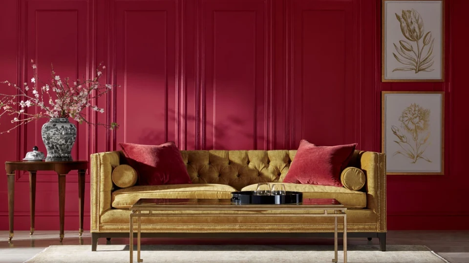


Image Source: ethanallen.com
Let your room reflect your bold, adventurous personality with the spectacular scarlet red. Now, scarlet red is not an easy colour, but with the right colour combination, it can make heads turn. Scarlet red is an intense and powerful shade of red. Thus, it makes the space seem charged up and energetic with a sense of sophistication. The colour is best suited for a living room with a Victorian theme. Balance the bold red in the living room with colour blocking with hues of white and a combination of grey. So, stir up excitement with a beautiful scarlet red living room.
Living room colour ideas #14 – Feather-light Blue
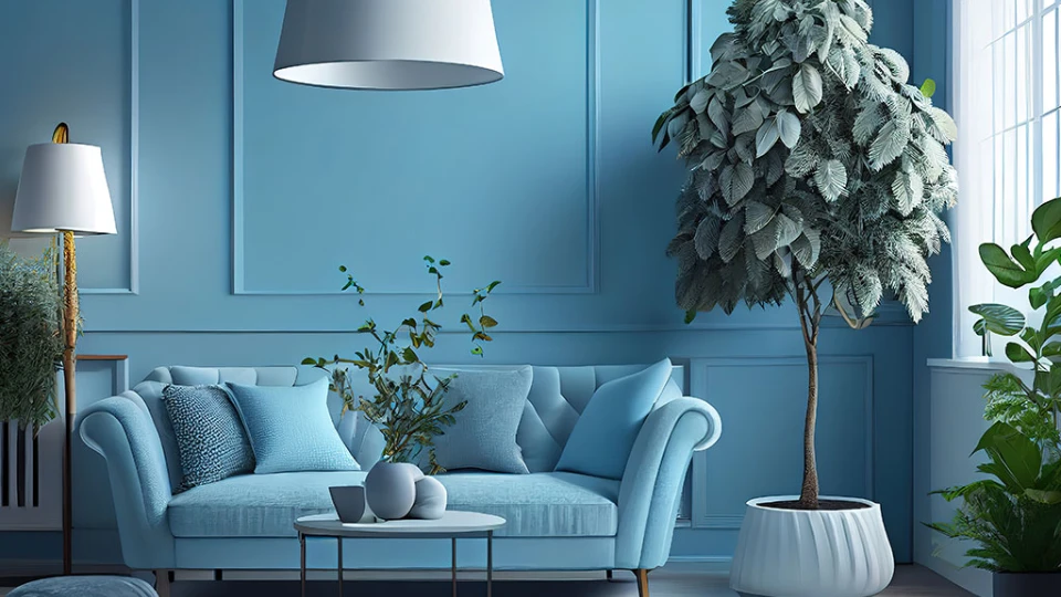
Image Source: checkatrade.com
What possibly can go wrong with a feather-light shade of blue in your living room? Nothing! So if you are someone who likes to keep it cool, then, simple feather-light blue is the colour for your living room. Since the colour is very soft, it leaves out the possibility of many mixes and matches. This colour tone is perfect for a soft aesthetic or a creative look with colour blocking of other pastels like pink, yellow, and green. The light colour also makes the room look spacious and clutter-free.
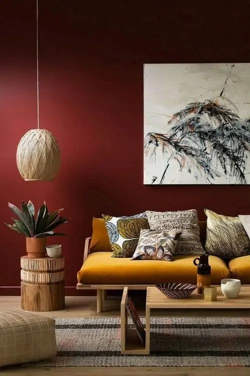
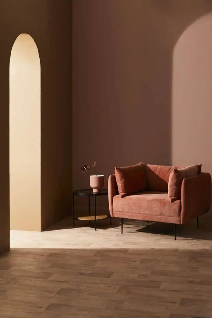
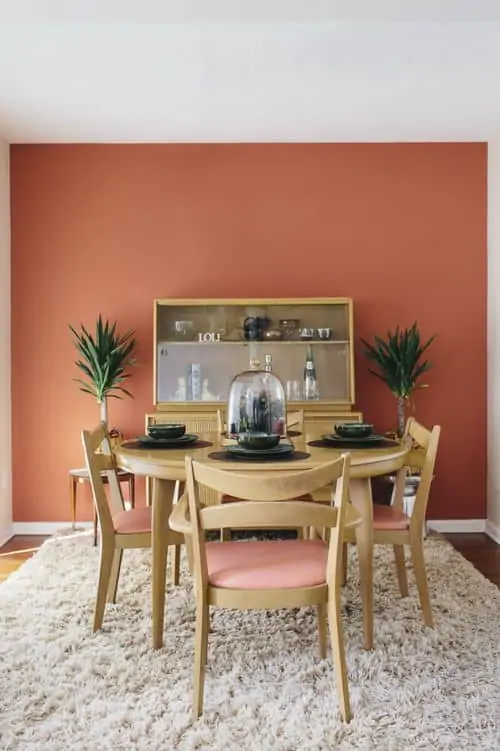
Living room colour ideas #15 – Terracotta Brown
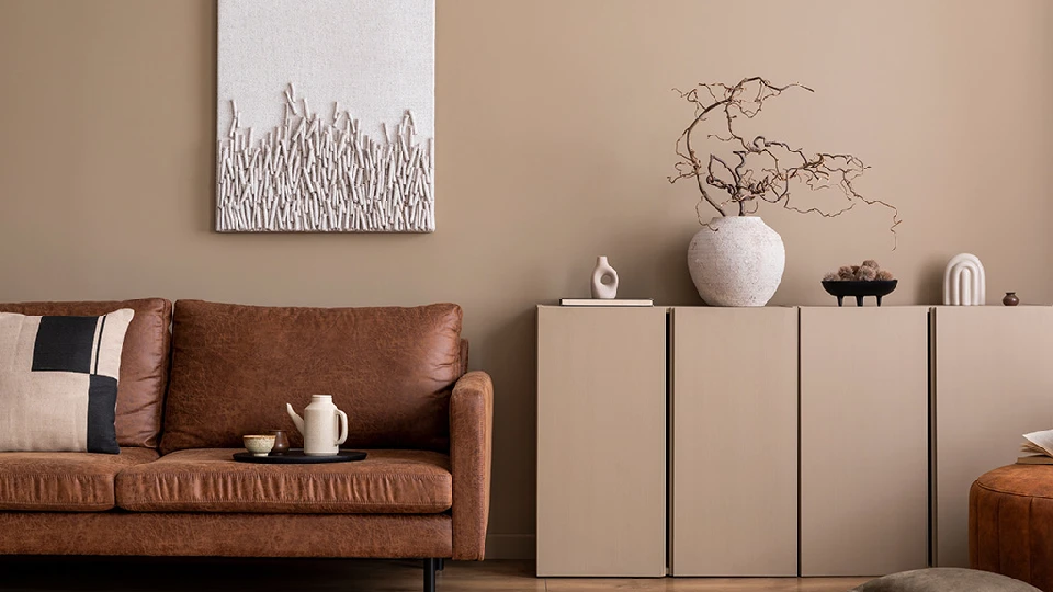
Image Source: checkatrade.com
A versatile colour with a variety of hues and tones- Terracotta brown is one of the most trending colours of the year 2024. This autumn colour is perfect for those who want to follow a natural or earthy aesthetic. Terracotta brown adds a warm earthy feel to the space and works well with colours white, beige, and neutrals. The colour combination of brown, white, and beige is the perfect recipe for an elegant indie living room.
| Also see: Hall colour combinations: 25+ simple ideas for Indian living room walls |
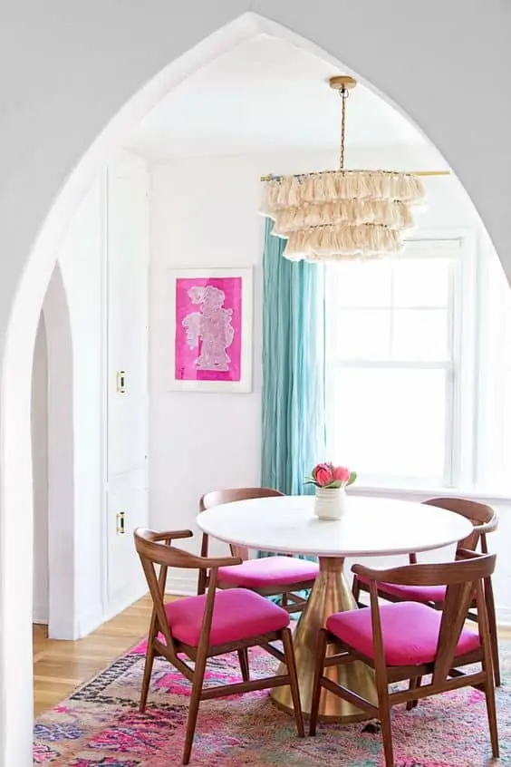
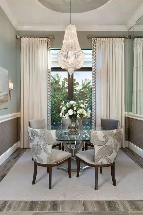
Dining room colours
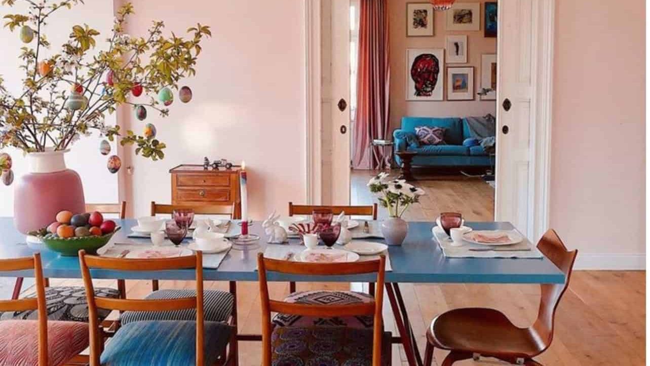
Image Source: bemvestir.com
A dining room is all about sharing food and creating sweet memories with family and guests. Thus, this room’s design and colour require attention and care. The right colour scheme for the room can instantly turn it into a happening hub. There are no watertight rules for dining room colour, so you can let go of your inhibitions and play around with your favourite colours. Following are 5 dining room colours that are exciting and on-trend.
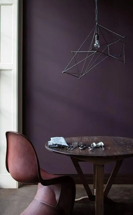
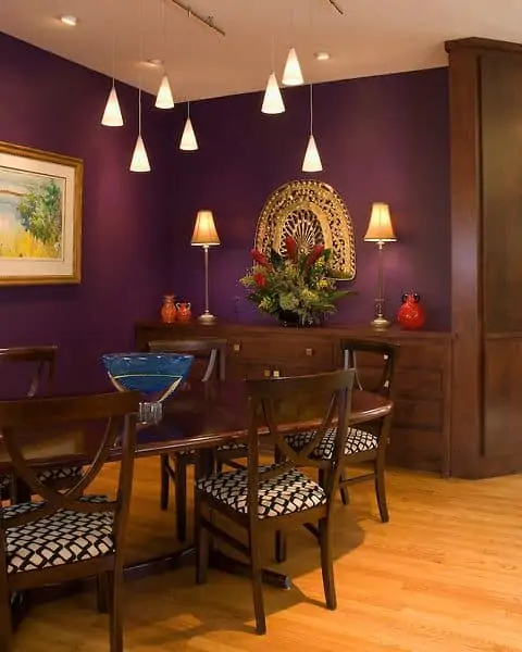
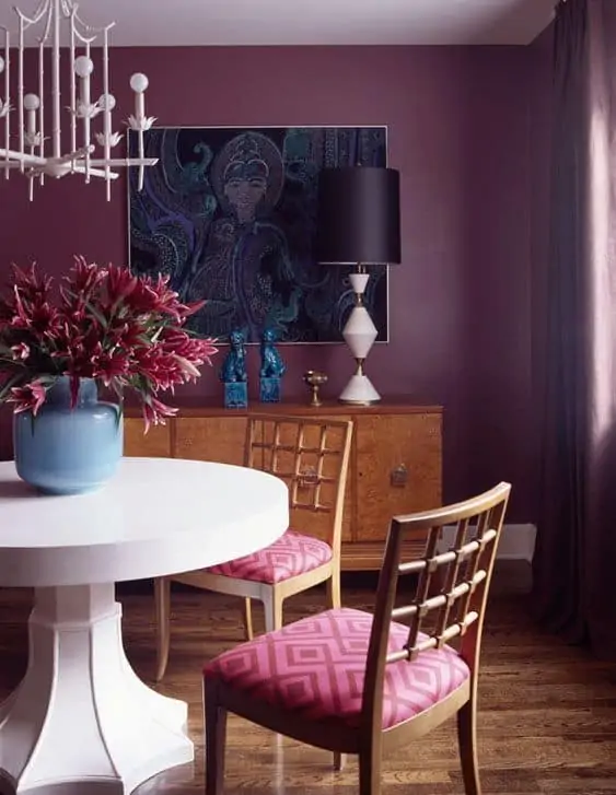
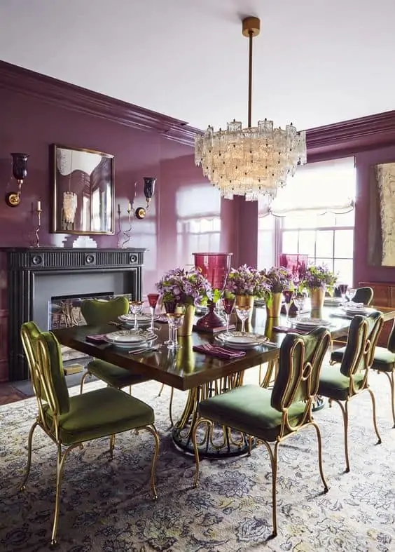
Dining room colour #16 – Eggplant Purple
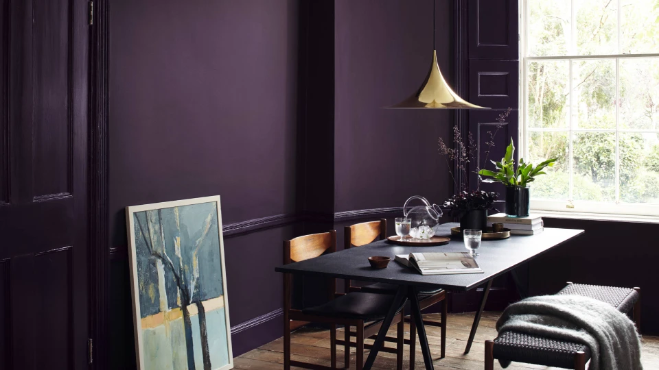
Image Source: houzz.com
Now, this colour is not for everyone. The rich vibrant eggplant purple is for those who do not shy away from experimenting. Purple has also been proven to improve your appetite. Also, it looks chic and regal. Blend in some beige and neutrals to balance the dark colour. Adding ornate candlesticks and a warm light chandelier can make your dining room extremely attractive and furnished.
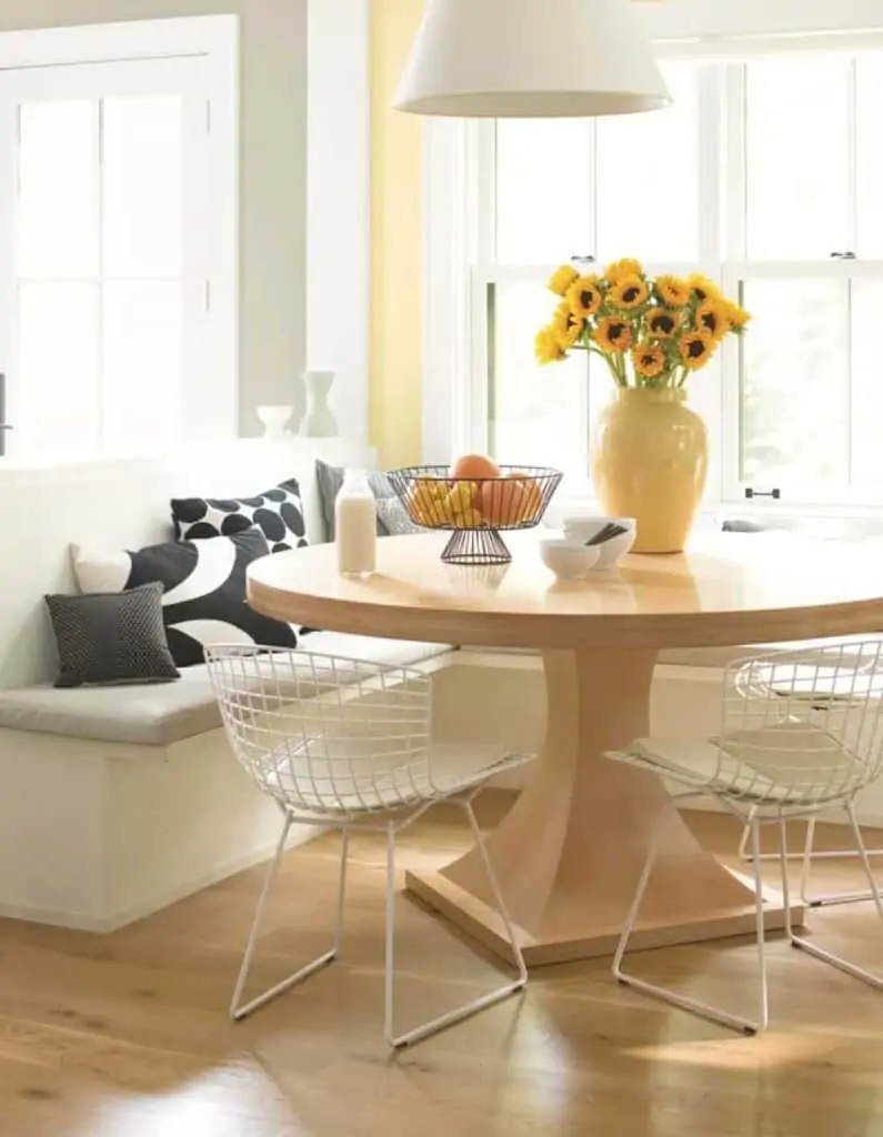
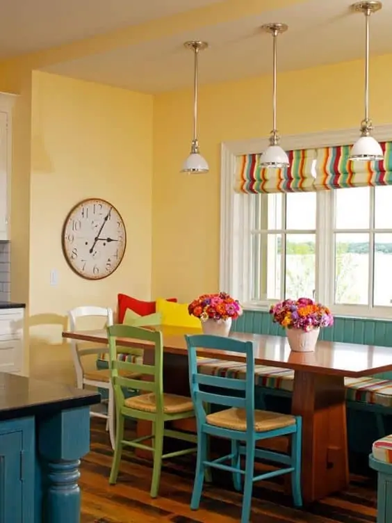
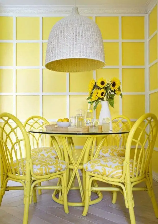
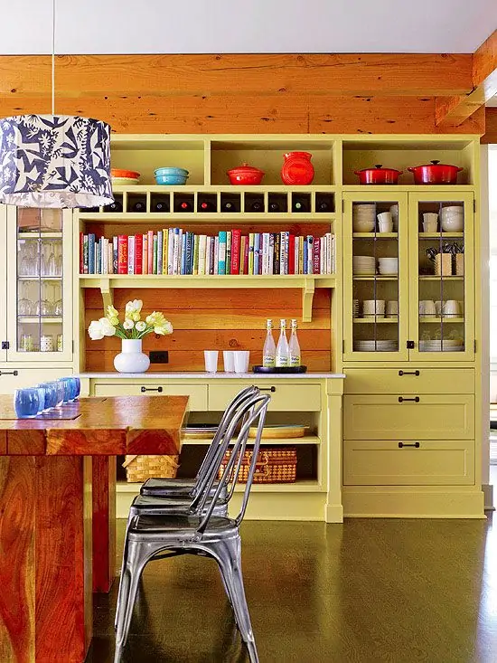
Dining room colour #17 – Lime Yellow
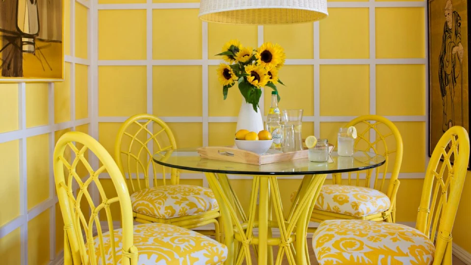
Image Source: en.idei.club
Yellow is an optimistic colour that can make any space seem refreshing. A light shade of yellow or lime yellow colour is a very popular choice for a modern kitchen setting. However, the versatility of this colour makes it equally appealing in a dining room. The colour makes the space seem positive and spacious. Lime yellow’s best friend is green, so add beautiful indoor plants to create a cosy dining space.
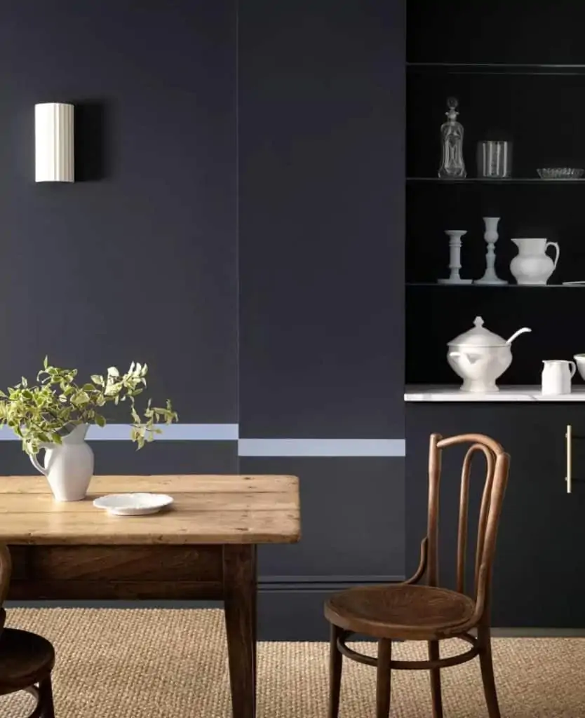
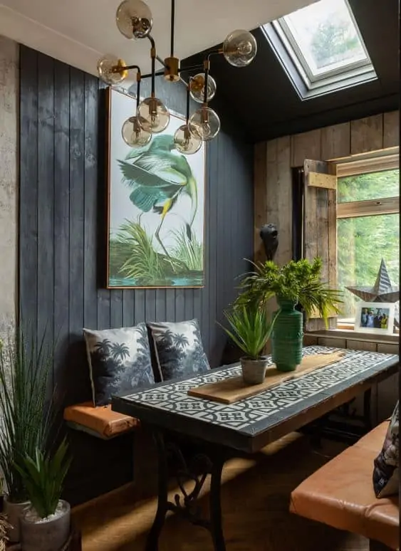
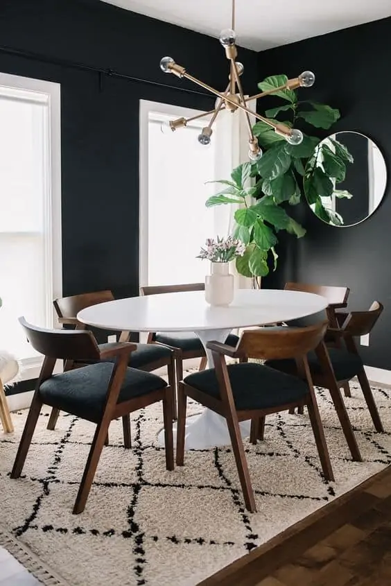
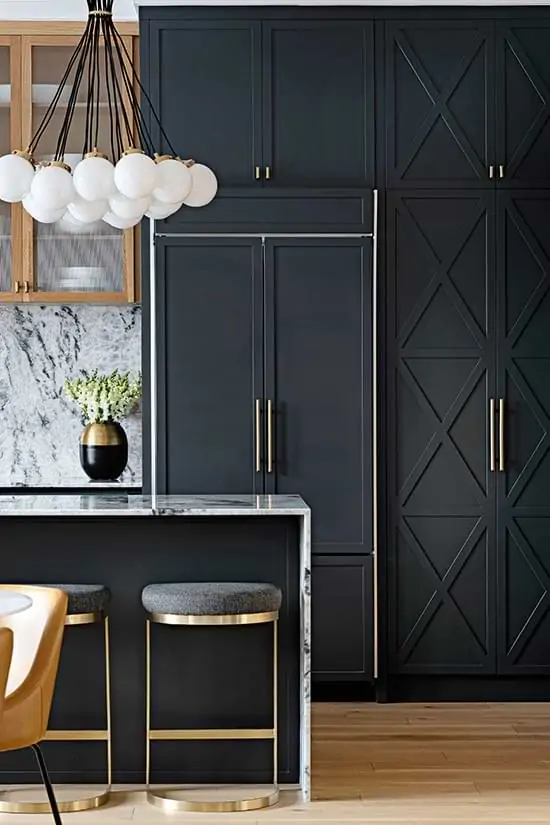
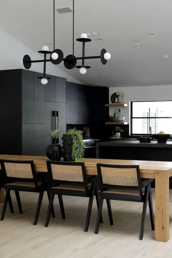
Dining room colour #18 – Charcoal Black
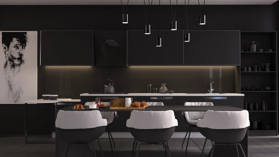
Image Source: homedesigning.com
Many modern high-end restaurants are hopping on the all-gothic black trend, and we are loving it. Charcoal black is the perfect colour for your dining room to add drama and class. There are infinite ideas to add charcoal black to your dining space – accented or panel wall, cutlery display rack, giant black dining table, or classing chequered black and white floor tiles. Charcoal black walls with mahogany wood furniture and white cutlery- voila! A classy modern dining room is served.
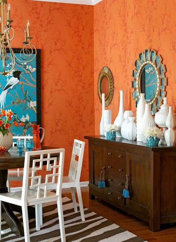
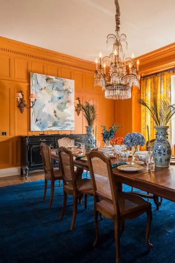
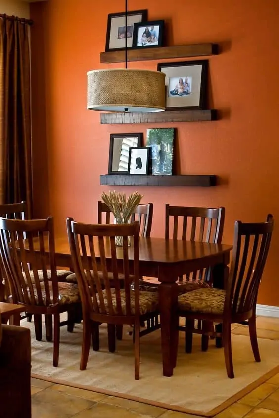
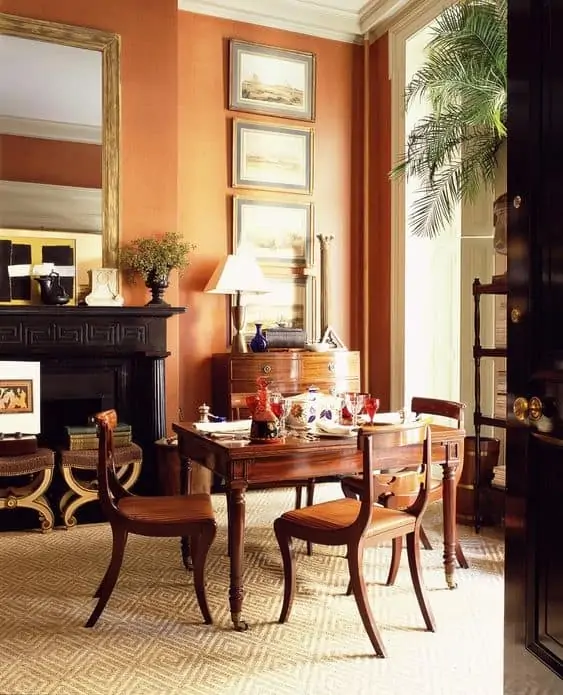
Dining room colour #19 – Tangerine Orange
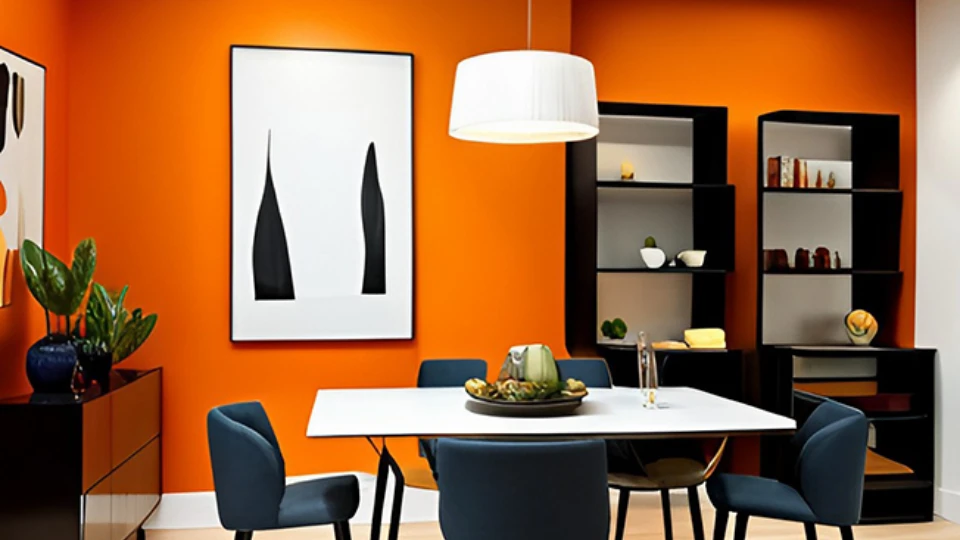
Image Source: asianpaints.com
A deep tangerine colour translates well for all-day social space. In ancient culture, vibrant orange colours were associated with good health and healing, making it a desirable colour for dining. The colour is fresh, optimistic and welcoming, thus creating an overall friendly mood. Combine tangerine orange with hues of teal, light blue, and yellow for a well-adjusted dining room.
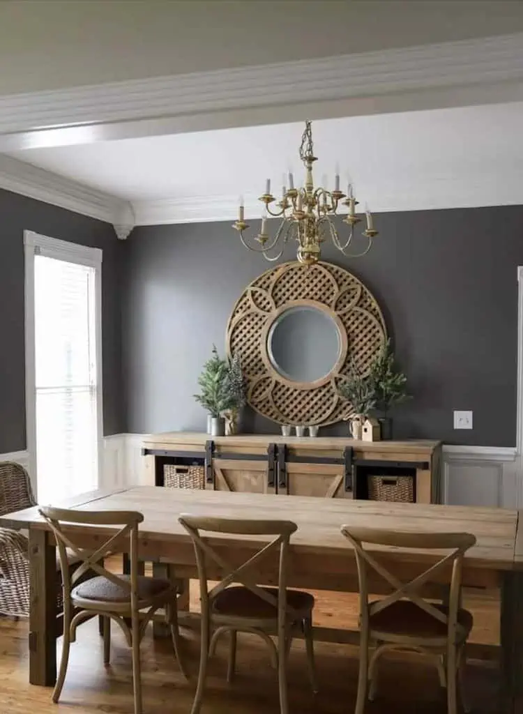
Dining room colour #20 – Fossil Grey
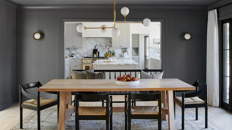
Image Source: livingetc.com
Well, this is one of the most versatile neutral colours. This colour can be both cool and warm depending on the other colours in the room. This tranquil colour is ideal for a contemporary design dining room. Pair this colour with lush maroon, navy blue, or yellow for elegance, or go monochrome with other shades of grey to attain the ultimate luxurious vibe.
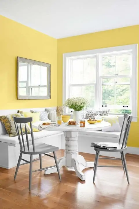
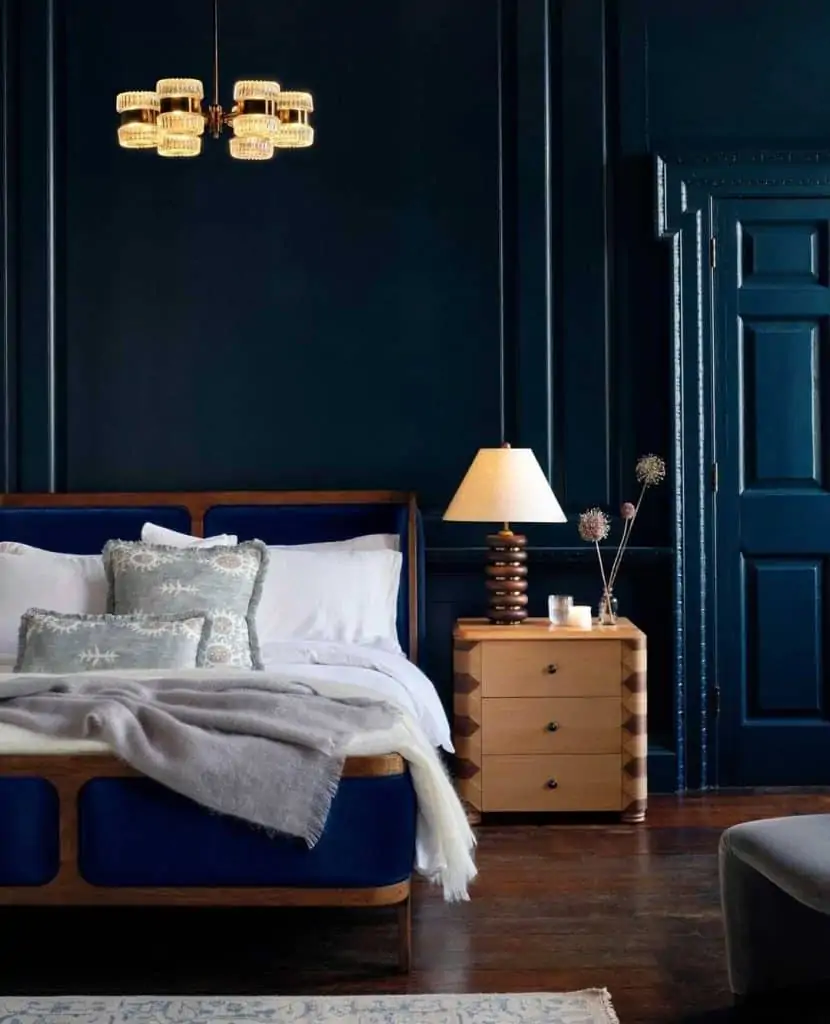
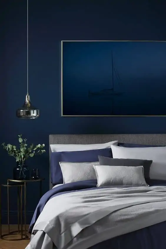
Bedroom colours
Image Source: jkcement.com
Whilst deciding on a colour scheme for your bedroom there are certain questions that need attention like- How much daylight does your bedroom experience? How will the colour of choice look in daylight and lamplight? Do you want the bedroom to look cosy or lavish? Therefore, bedroom colour needs real thought, but worry not, we got you. Below are 5 practical bedroom colour shades to amplify your bedroom aesthetics.
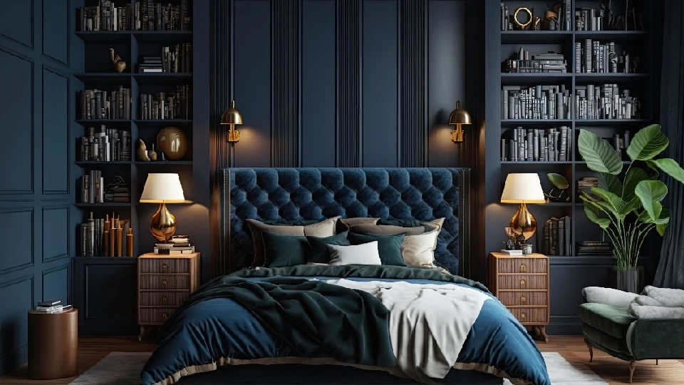
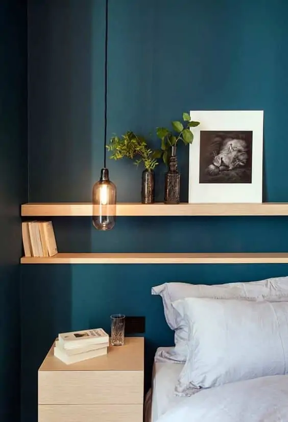
Image Source: kallista.com
Navy blue is a great colour for a bedroom, and it’s royal and rich. It is a calming colour that is also proven to be effective on blood pressure. Thus, ideal colour for inducing sleep, not to mention its impeccable appearance. Nothing is classier than navy blue walls and crisp white linen bedsheets. So, use lighter colours for bedroom furniture and accessories to manage overcrowded tones.
Bedroom colour #22 – Powder Pink
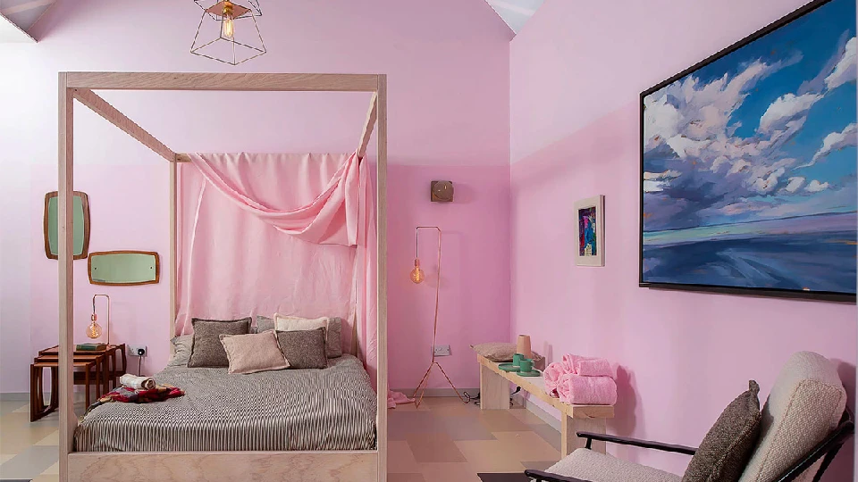
Image Source: homedesigning.com
Pink is known to be the softest colour of all, and it is also a mood-lifting colour that goes well with all colour palettes. The colour is versatile and thus can be used as the primary room theme or as accents like on pillowcases, beddings, and bedframes. Powder pink and cotton candy pink are the “lit” colours for Pinterest theme bedrooms. Use slate blue, grey, and white for a beautiful bedroom setting.
Bedroom colour #23 – Neutrals
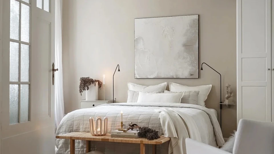
Image Source: thebritishblanketcompany.com
Neutrals are evergreen bedroom colour choices. One can never go wrong with crisp whites, beiges, and pale browns. These colours provide flexibility to opt monochrome theme or mixed hues. Neutrals make your space look bright and airy, so if you like to keep it basic, then neutrals are your colour.
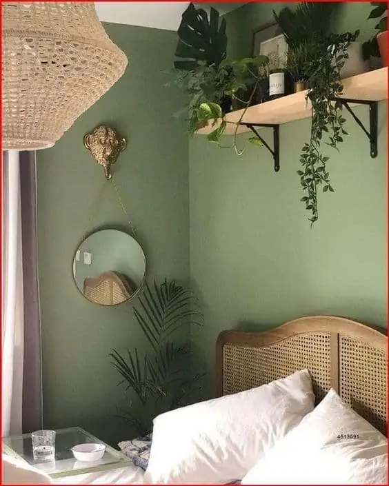
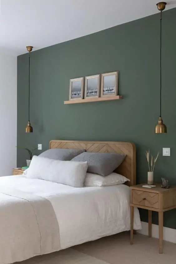
Bedroom colour #24 – Sage Green
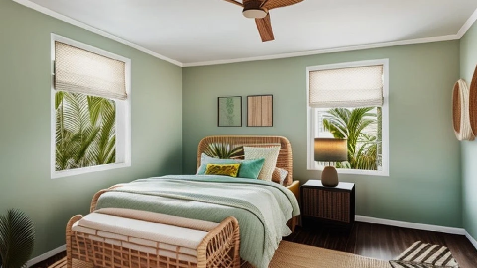
Image Source: medium.com
No colour is as calming and soothing as sage green. Sage green is a beautiful light green colour with grey tones. This colour is a fine choice for designing or decorating a bedroom. Muted green can be paired with rustic gold accents or other pastel tones for a beautiful slumber effect. The colour is simple yet creative.
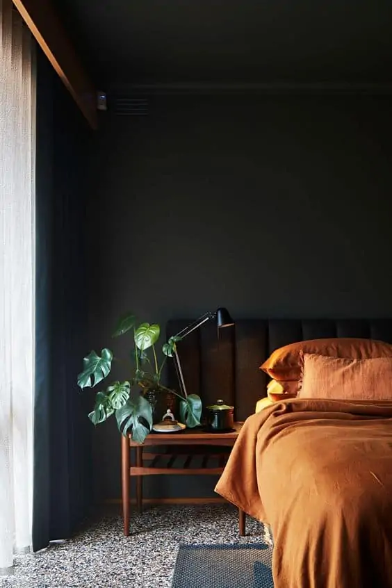
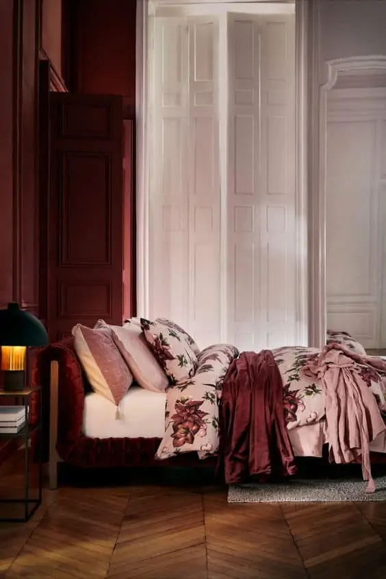
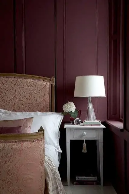
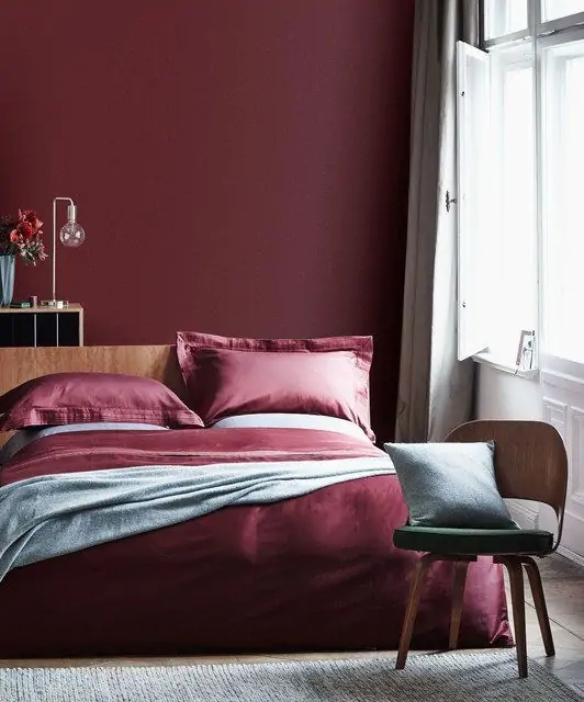
Bedroom colour #25 – Burgundy
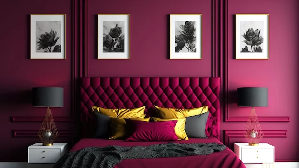
Image Source: freepik.com
Burgundy is a bold choice but an extremely gorgeous colour for accent walls in the bedroom. This regal colour can make your room look unique and charming since it is not as common. The burgundy colour goes well with all shades of cream, gold, and greys. However, it is important to use only light combination tones for other accessories in the room to avoid colour chaos.
| Also read: Bedroom colours: Use this formula to get designer results (49+ ideas) |
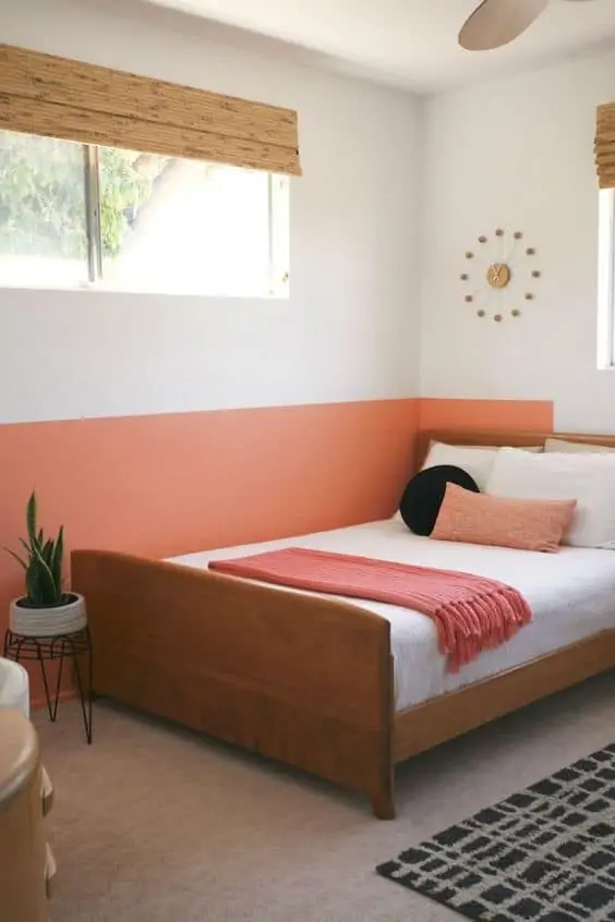
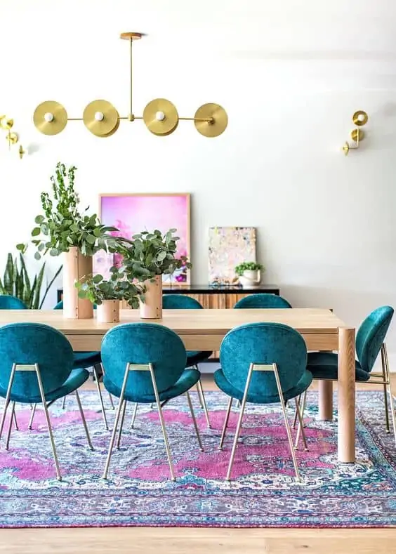
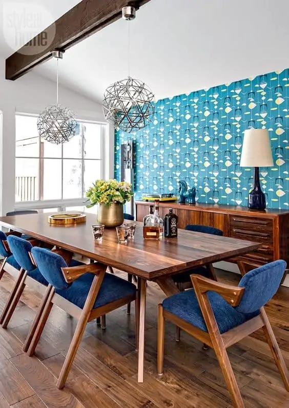
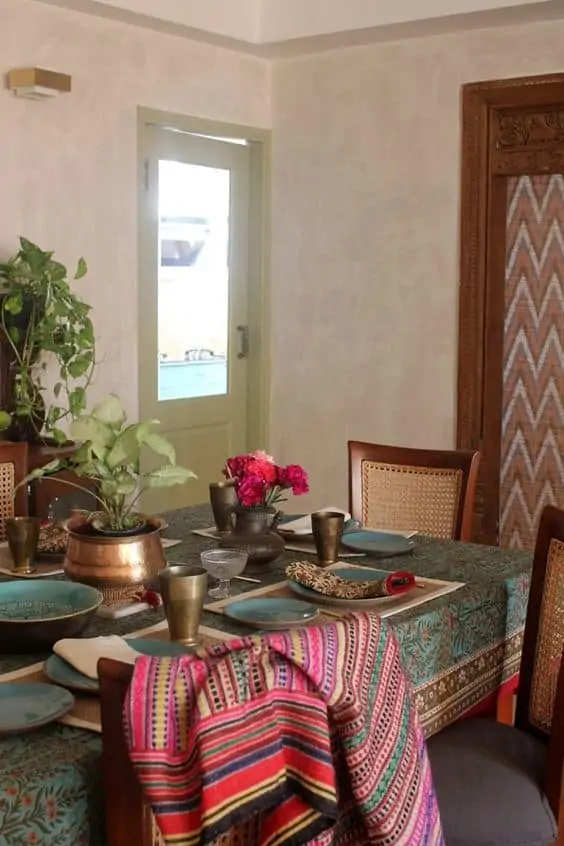
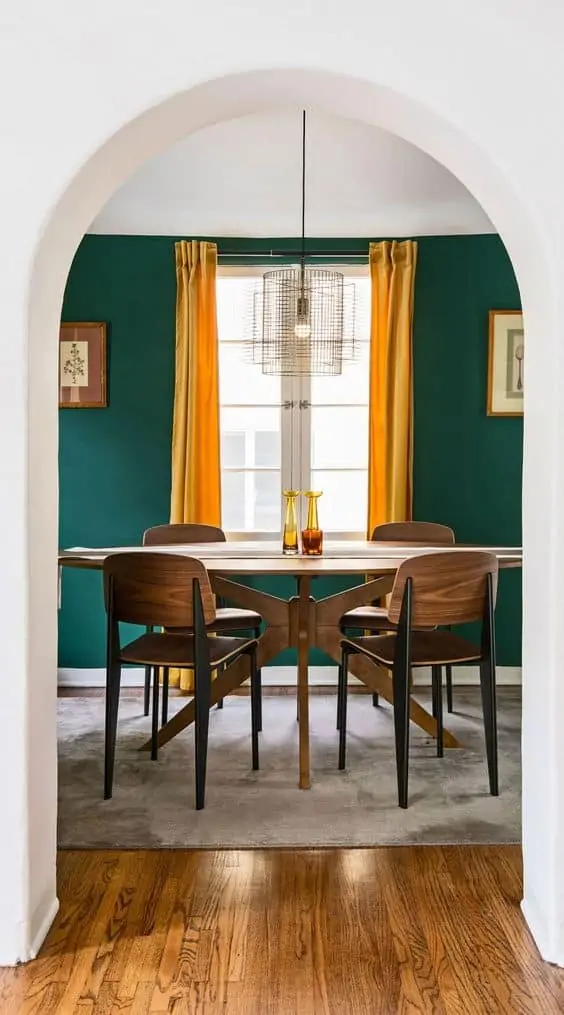
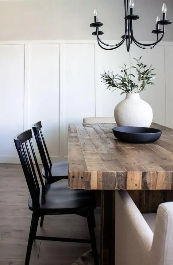
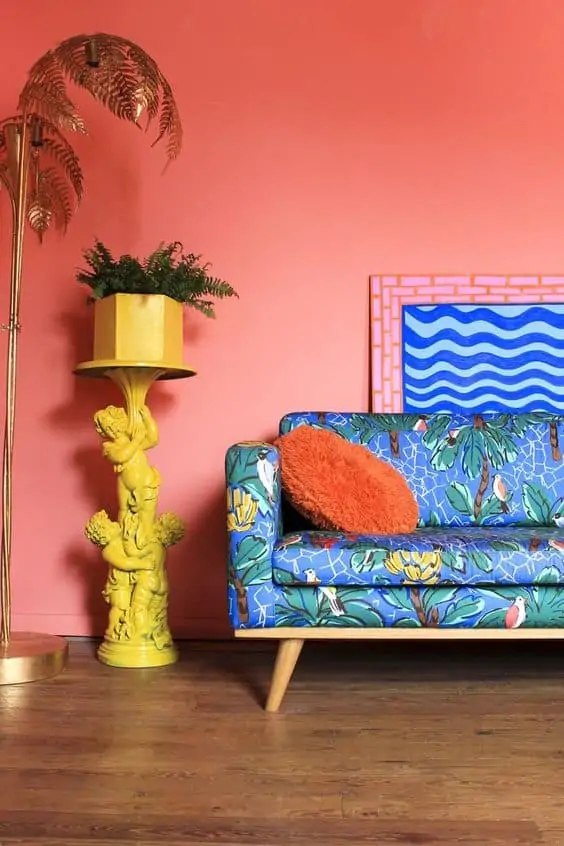
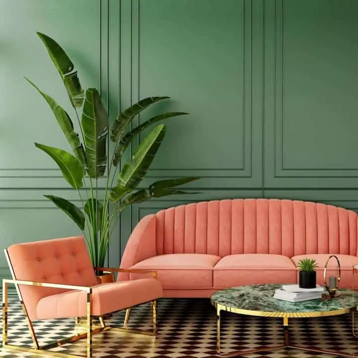
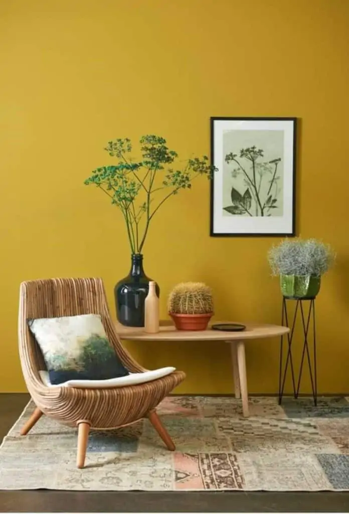
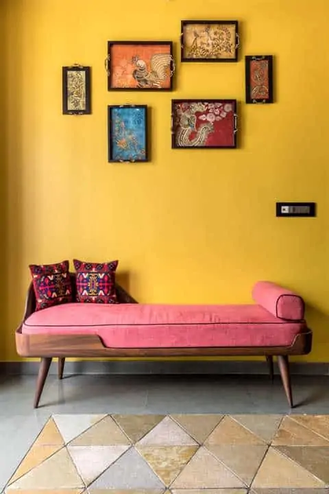
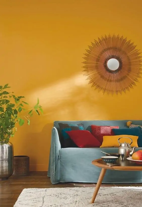
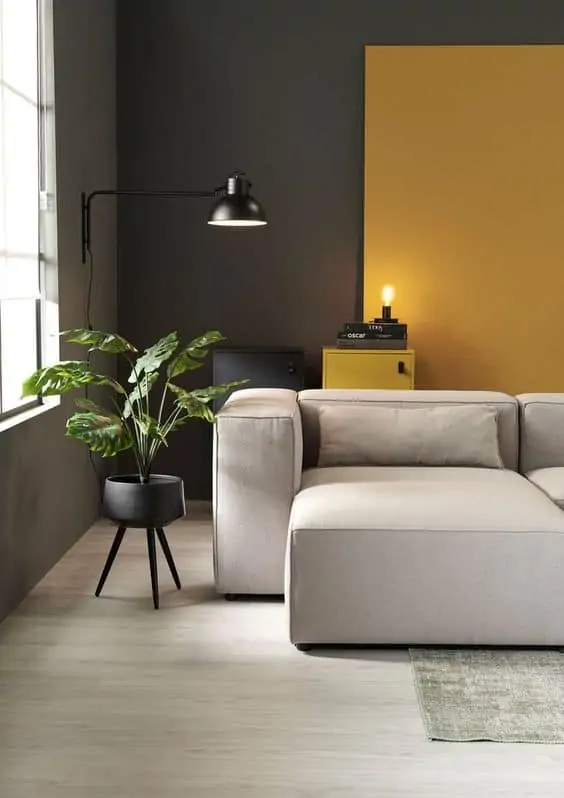
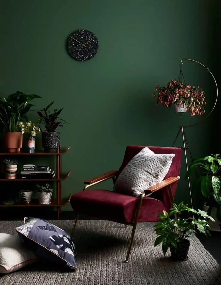
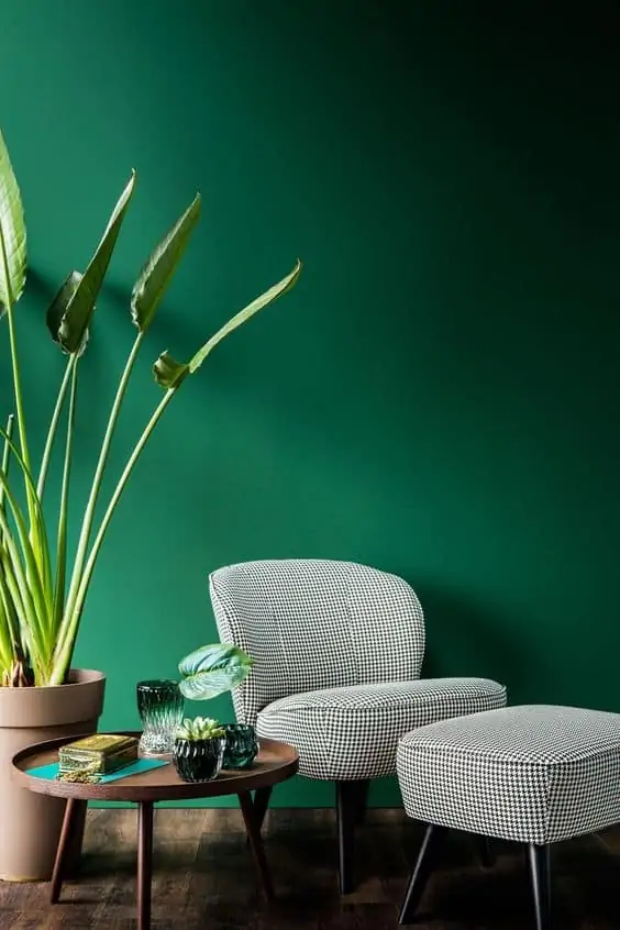
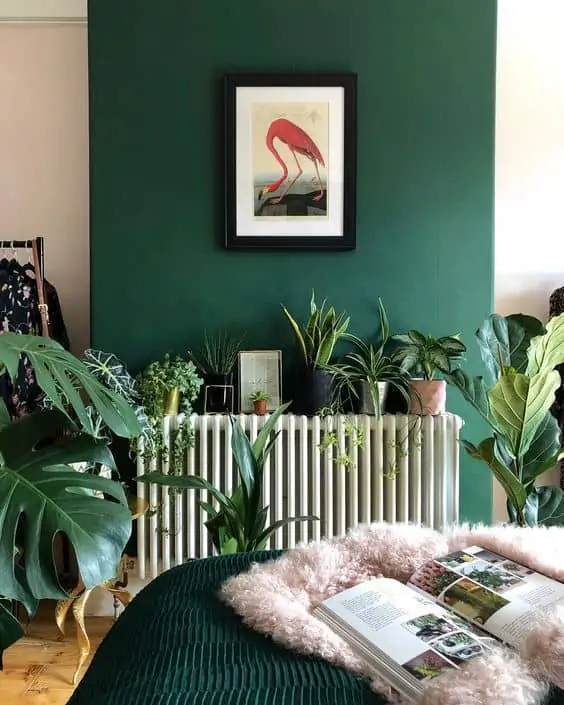
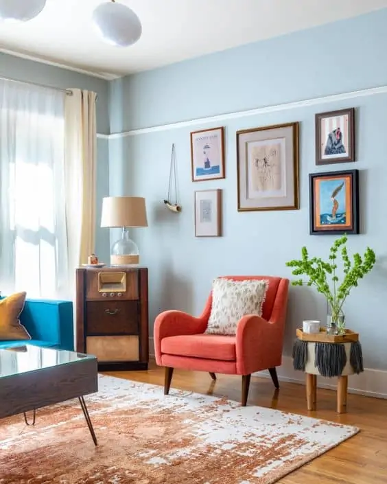
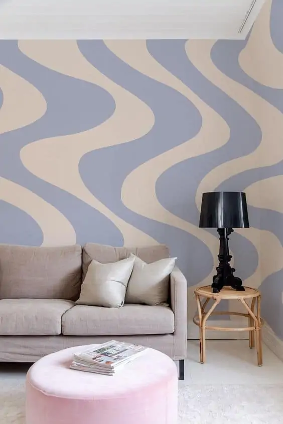
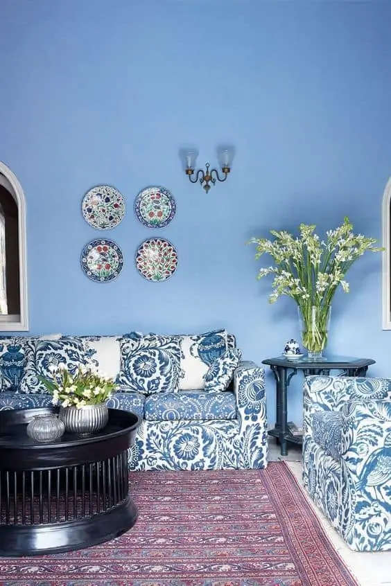
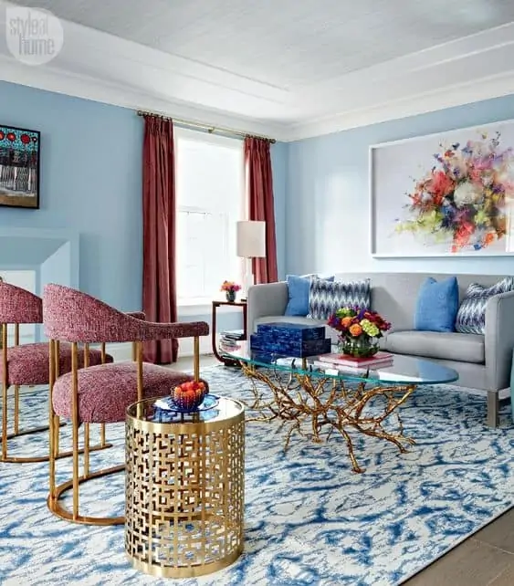
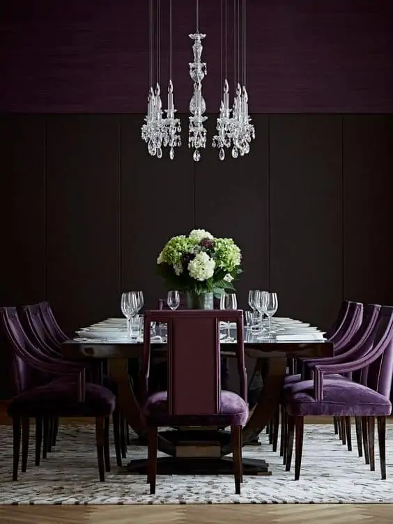
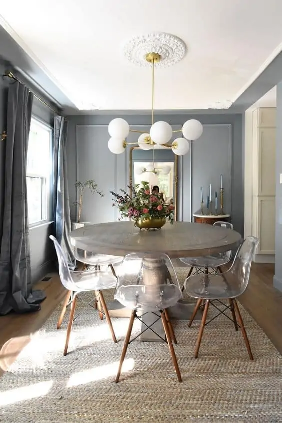
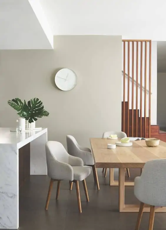
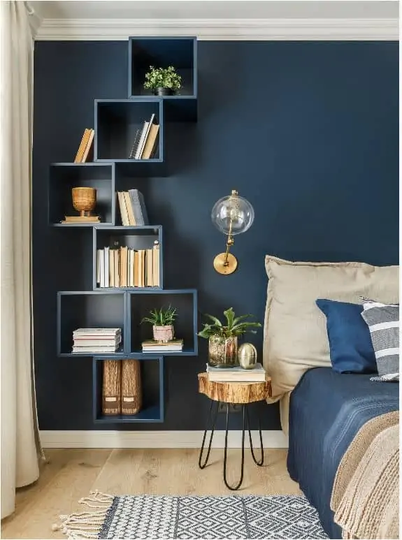
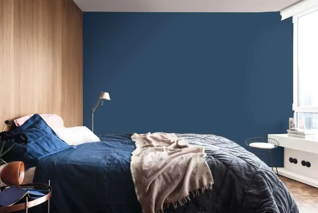
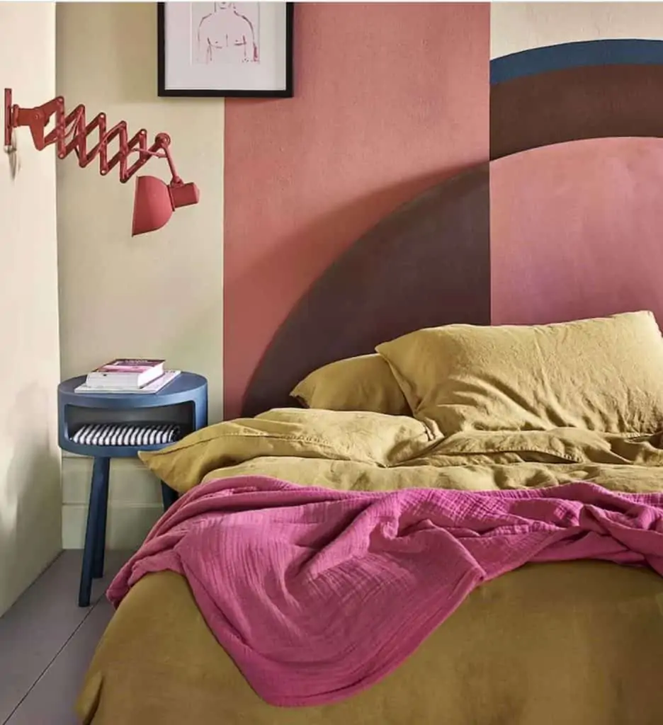
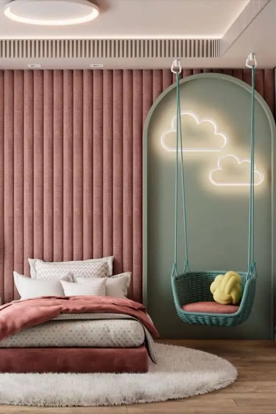
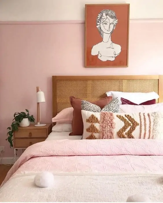
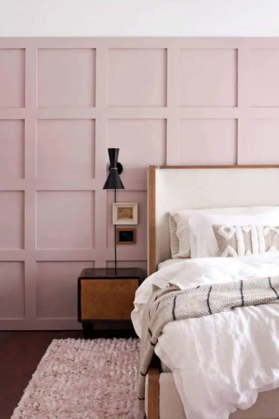
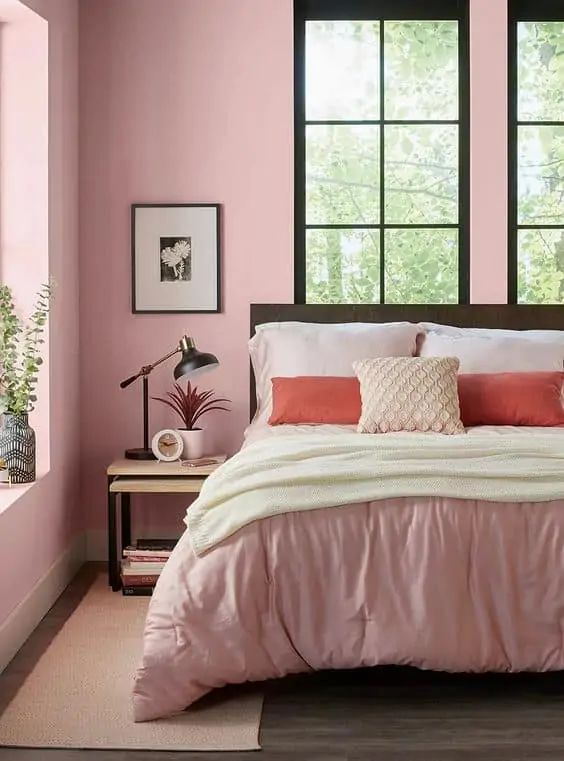
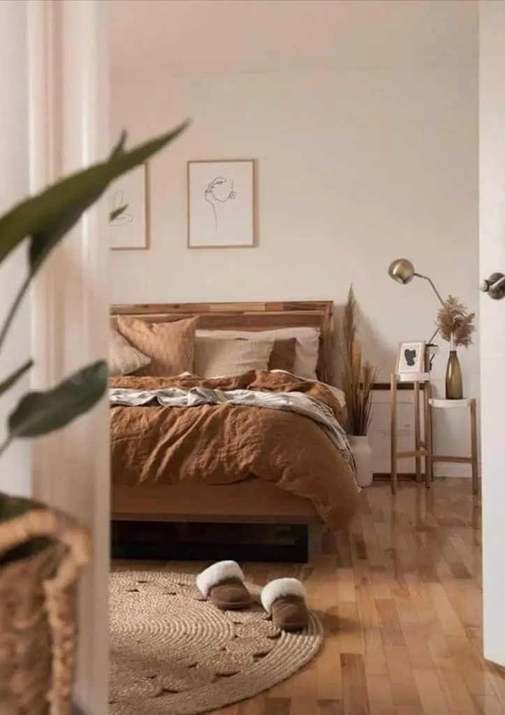
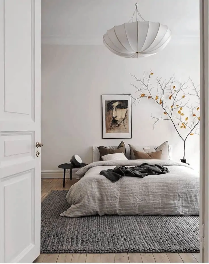
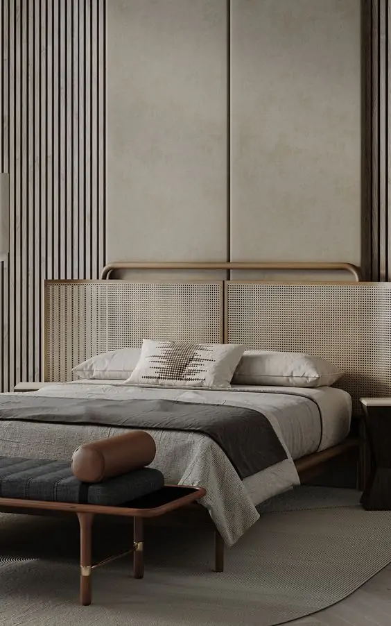
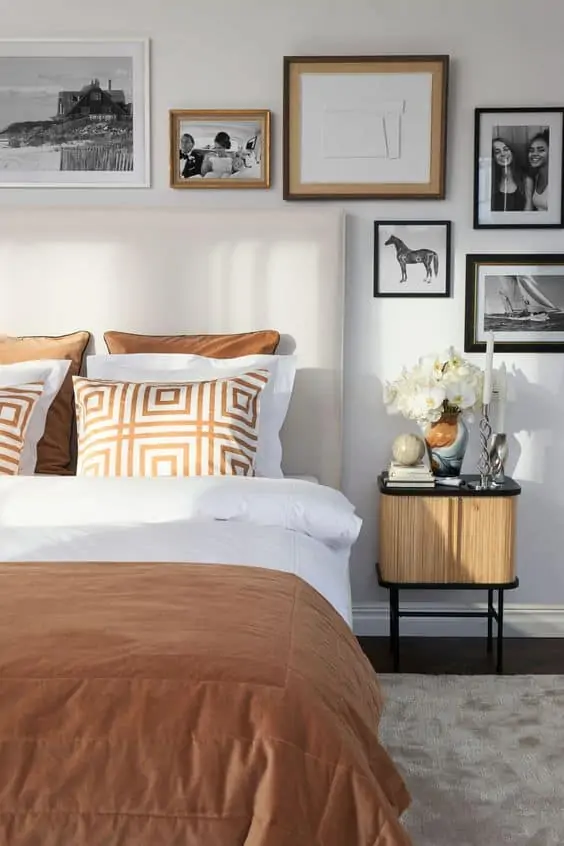
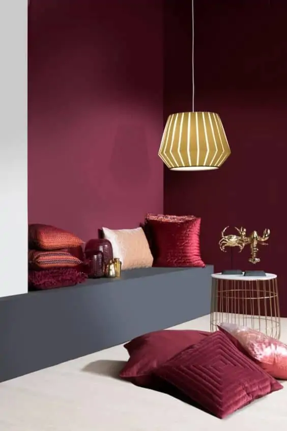
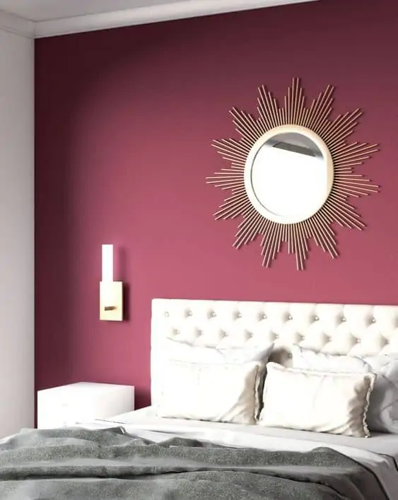
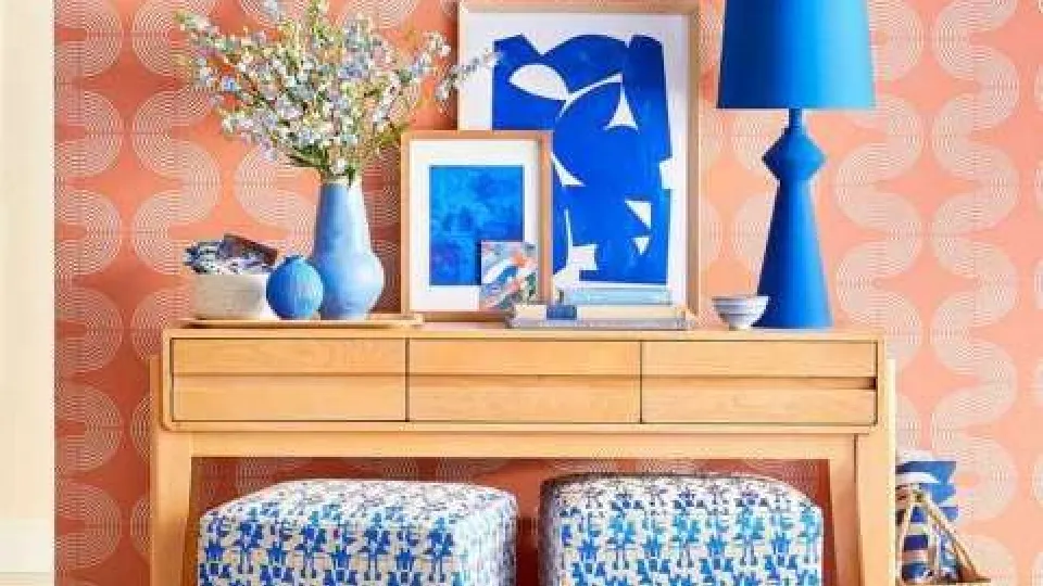
Ultimate 2024 room colour lookbook: Latest colours and designs!
-

Image Source: Pinterest (Mrscarlissa)
-

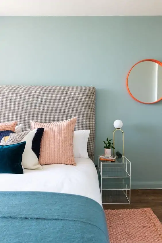
Image Source: fabricsandpapers.com
-

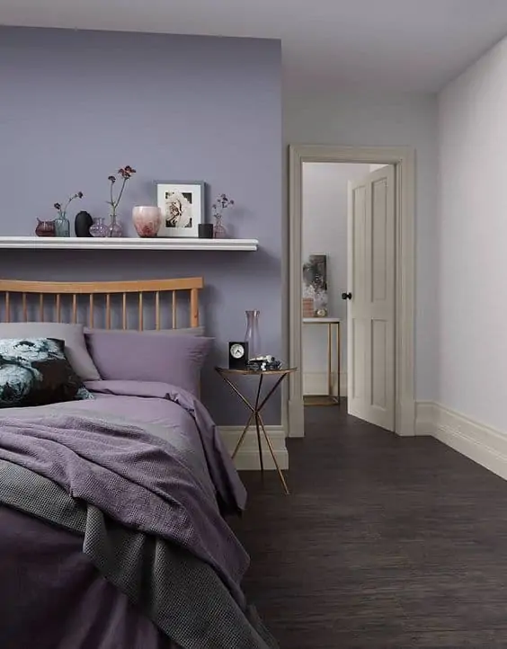
Image Source: planete-deco.fr
-

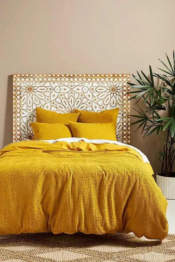
Image Source: solebich.de
-

Image Source: livingetc.com
-

Image Source: thelocalproject.com.au
-
Image Source: suburbanpop.com
-
Image Source: topologyinteriors.com
-

Image Source: crownpaints.co.uk
-
Image Source: anthropologie.com
-
Image Source: people.com
-
Image Source: remodelista.com
-

Image Source: stylemepretty.com
-
Image Source: artifactuprising.com
-
Image Source: studiodiy.com
-

Image Source: mydomaine.com
-

Image Source: styleathome.com
-

Image Source: kylieminteriors.ca
-
Image Source: anindiansummer.in
-

Image Source: backsplash.com
-

Image Source: designedsimple.com
-

Image Source: Pinterest (besthomedecor)
-

Image Source: finntage.nl
-

Image Source: houzz.com
-

Image Source: Trishanadesign.com
-

Image Source: idealhome.co.uk
-

Image Source: goodhomes.co.in
-
Image Source: houseofhackney
-
Image Source: pinkhouse.co.uk
-

Image Source: renovatingforprofit.com.au
-

Image Source: Wonenonline.com
-

Image Source: Anganarchitects.com
-

Image Source: Benjaminmoore.com
-

Image Source: Deco.journalesfemme.com
-

Image Source: Flicker.com
-

Image Source: Thedesignfiles.com
-
Image Source: Essentialhome.eu
-
Image Source: Pinterest.uk.com
-
Image Source: Thehousethatlarsbuilt.com
-

Image Source: Refinery29.uk
-

Image Source: Sevtak coker(pinterest)
-

Image Source: thenordroom.com
-

Image Source: twitter.com
-

Image Source: sadecor.com
-

Image Source: jrlinteriors.com
-
Image Source: realhomes.com
-
Image Source: apartmenttherapy.com
-
Image Source: belartestudio.com
-
Image Source: houseandgarden.com
-

Image Source: stylehome.com
-

Image Source: lifeinteriours.com.au
-
Image Source: goodhousekeeping.com
-

Image Source: Pinterest (shake)
-
Image Source: passionshake.com
-
Image Source: etsy.com
-

Image Source: inspirationpaints.com
-
Image Source: Pinterest (mariaterasapoletti)
-

Image Source:photoshelter.com
-

Image Source: houseandhome.com
-

Image Source: Verandamagazine.com
-

Image Source: livingetc.com
-
Image Source: countryliving.com
-
Image Source: eatwell101.com
-

Image Source: homedesignerlover.com
-

Image Source: bhg.com
-

Image Source: homesandgarden.com
-

Image Source: realhomes.com
-
Image Source: 204park.com
-

Image Source: styleathome.com
-
Image Source: meandmrjone.com
-

Image Source: bhg.com
-
Image Source: skinyourworld.com
-
Image Source: houseandhome.com
-

Image Source: elledecor.com
-

Image Source: habituallychic.luxury
-

Image Source: theturqoisehome.com
-

Image Source: thesavvyheart.com
-

Image Source: danetti.com
-
Image Source: backsplash.com
-
Image Source: backsplash.com
-

Image Source: tlcinteriors.com.au
-

Image Source: mydomaine.com
-

Image Source: wookey.com
-
Image Source: furniturechoice.co.uk
-

Image Source: architectureartdesign
-

Image Source: dulux.co.uk
-

Image Source: livingetc.com
-
Image Source: circu.net
-

Image Source: tfdiaries
-

Image Source: sfgirlbybay.com
-

Image Source: bhg.com
-

Image Source: magiclinen.com
-

Image Source: cococozy.com
-

Image Source: behance.net
-
Image Source: seasonsincolour.com
-

Image Source: fifimcgee.co.uk
-

Image Source: livingetc.com
-

Image Source: originalbed.com
-
Image Source: Inbedstore.com
-
Image Source: realhomes.com
-
Image Source: cozyhome101.com
-
Image Source: Pinterest (anna07)
-

Image Source: eyefordesignlfd.blogspot.com
-

Image Source: Pinterest (amazinginteriors)
-
Image Source: living.corriere.it
-

Image Source: roomdesign.com
A lot of factors are involved in making the “perfect room”, and the colour combination ideas and scheme are some of the greatest factors that determine the vibe of the space. While a lot of people stick with the old all-white interiors, 2024 is the year of colours. Since colours are believed to have a dramatic impact on mood, they are much more essential. However, colours can make or break a space, so pick warm tones for an energetic and playful aura or cool tones if you prefer a quiet atmosphere. We have discussed the latest and most unique room colour combination, ideas, and designs for bedroom, living room, and dining room, so go out there and transform your home!
FAQs
Which colours should I avoid in my bedroom?
Avoid using dark or bright colours that can inspire creativity or evoke energy, as they will disrupt your sleep. These include colours like red, dark purple, dark brown, black, and orange.
Which colours promote relaxation in the bedroom?
The bedroom colour scheme can have an impact on your quality of sleep. Therefore, incorporate colours like white, blue-grey, sea blue, dusty pink, natural beige, or sage green into your colour scheme to get better sleep.
What colours make a living room feel bigger?
Pale tones that reflect light make spaces appear larger. When working with neutrals, lean towards off-white colours rather than stark whites since they have more personality and draw the eye away from size and more onto the colour. Carrying the wall colour into your woodwork or painting your ceiling in an off-white colour that contains tones that are similar to your wall colour will give the illusion of space. Bright colours matched with mouldings, trims, and ceilings in light contrasting colours fool the eye into believing that the walls are farther apart.
What are the different colour schemes for home interiors?
There are broadly four colour schemes –
- Monochromatic colour scheme: This scheme utilizes different tints and shades of the same colour to create a seamless and consistent look.
- Analogous colour scheme: This scheme pairs one main colour with two colours sitting right next to it on the colour wheel, like yellow, yellow-green, and green.
- Complementary colour scheme: This scheme employs two colours that are on opposite sides of the colour wheel and incorporates relevant tints of those shades. Red and blue are great complementary colours.
- Triadic colour scheme: This scheme is created by picking three colours that lie at equal distances in the colour wheel. Yellow, green, and blue together form a triadic scheme.
What is the rule for accent walls?
For accent walls, it is advised to follow the 60-30-10 rule, which suggests that 60% of space should be the primary colour, 30% should be the secondary colour, and 10% should be an accent colour. Thus, to make your colour choice stand out, choose something other than the 60% and 30% hues. Check out the video below for more details:
What colour should I paint my small dining room?
Generally speaking, light neutrals like white and grey will keep the room feeling as spacious and open as possible. Therefore, lighter shades are the way to go for tiny dining rooms. To make your dining room look larger, experts suggest neutral tans, light greys, classic white, or cream.
How does light affect colour?
Light plays an important role in the colour you choose for your room. A room which has an abundance of light will make the colours appear brighter and more saturated while rooms that receive less sunlight, appear dull and stagnant. Thus, it is helpful to choose colours depending on the amount of natural light that a particular room receives. Your aim should be to balance the ambient and natural lighting to achieve a truer colour.
Should accent walls be lighter or darker?
If you wish to create a cosier space, then you must go for an accent wall in a darker but complementary colour. However, if you want to give the illusion of more space, paint the accent wall in a lighter hue. Therefore, the colour choice depends upon what kind of look you want to create.
What colour is best for an accent wall?
One of the best colour ideas for an accent wall of a room is a contrasting or complementary colour that will make the wall stand out and grab the attention of the viewer. The right hue will depend upon the colour scheme, style, and aesthetic you are looking to achieve.
*The featured image used in the article is from renovatingforprofit.com
Wall paint design: 55 ideas for bedroom, living room & hall
Modern homes are a testimony to the fact that people love colours and there are enough reasons to justify it! Fresh wall pain