
Colours have the ability to influence our mood and significantly change the look of a space. A famous example of this phenomenon can be seen in movies where the screen turns dark and sombre for a dark scene. As a result, colours are considered to be an important part of home decor. They play a major role in creating the look you want to achieve. Firstly, there are two types of colours, warm and cool, which affect the mood and ambience differently. For example, warm colours create a calm and inviting vibe, while cool colours tend to be pleasing and soothing. Therefore, while selecting the right colour combination for your bedroom, drawing room, hall or living room walls, it becomes important to consider the aesthetic you wish to create.
We have curated this article to guide you through the process of colour selection. Here, we have talked about room colour combination schemes and Vastu tips for the same. Furthermore, we have given an inspiration lookbook containing colour combination ideas for the bedroom, living room, drawing room, and hall. So, feel free to use the article for your next home update.
Contents
- 1 Colour combination schemes according to the colour wheel
- 2 Bedroom combinations
- 3 Three colour combinations for bedroom walls
- 4 Living room or drawing room combinations
- 4.1 Wall colour combination for living room or drawing room #1 – Orange & Beige
- 4.2 Wall colour combination for living room or drawing room #2 – Red & Ivory
- 4.3 Wall colour combination for living room or drawing room #3 – Black & White
- 4.4 Wall colour combination for living room or drawing room #4 – Burgundy & Chalk White
- 4.5 Wall colour combination for living room or drawing room #5 – Coffee Brown & Grey
- 5 Wall colour combinations for hall room
- 6 How to select and style the right colour combination for your home?
- 7 Choosing a wall colour that aligns with your floor tiles
- 8 Conclusion
- 9 FAQs
- 9.1 What is the most popular colour choice for living room walls?
- 9.2 What are the top paint brands in India?
- 9.3 Which colours make the room appear bigger and brighter?
- 9.4 Which colours should be avoided for bedrooms?
- 9.5 How many colours should a bedroom have?
- 9.6 What is the best two-colour combination for a living room?
- 9.7 What are the criteria for choosing a paint finish for my home?
- 9.8 What are the Vastu tips to keep in mind for home colour combinations?
- 10 Home colours guidebook: 50 classic combinations, ideas and tips
Colour combination schemes according to the colour wheel
Contrasting
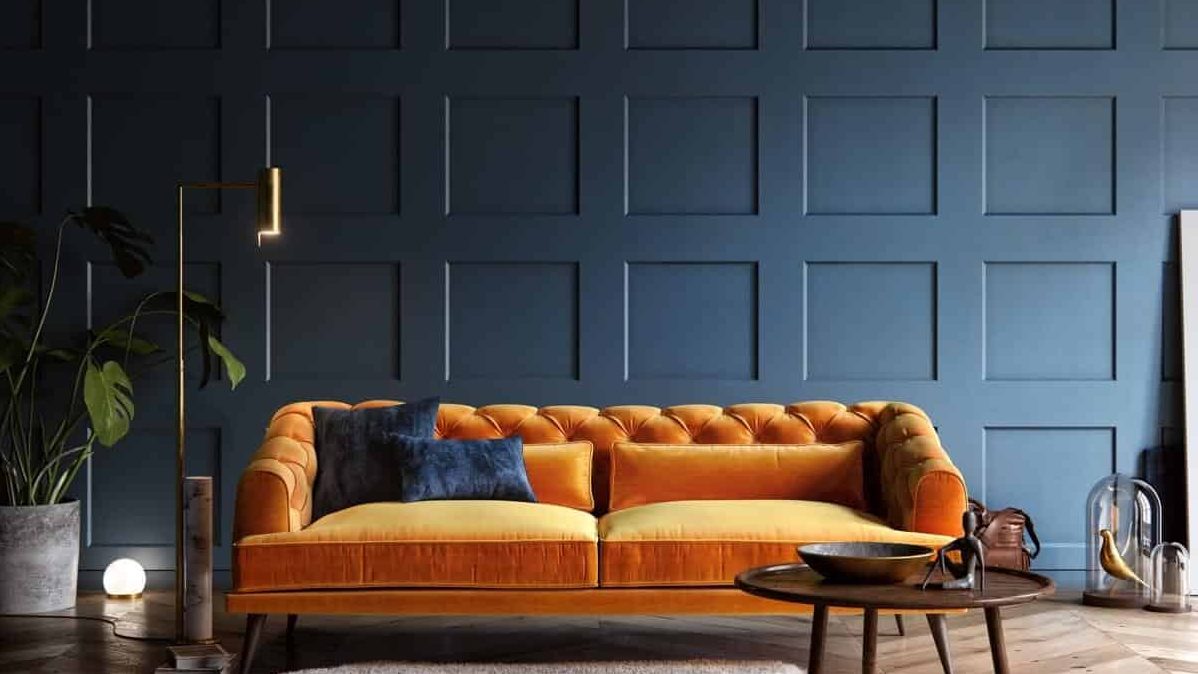
Image Source: Aleksey Krivosheyev On Behance
A contrasting colour scheme uses two colours sitting opposite each other on the colour wheel. This is one of the primary colour schemes derived from the colour wheel. Also, it is very effective in attracting the eye of the viewer. Therefore, painting an accent wall in contrasting colours increases its chances of standing out as the focal point of the room.
| Also see: Hall colour combination: 15 ideas & tips for amazing transformation |
Monochromatic
Image Source: Andrey Vladimirov on Behance
A monochromatic colour scheme incorporates all the different shades, hues, and tints of the same colour. If you wish to create an elegant space, a monochromatic colour combination may be your safest bet. Again, you can experiment with texture and pattern within a monochrome scheme to add subtle interest.
Triad
Image Source: Marcel niedzielski on Behance
In a triad scheme, three colours, which are evenly spaced in the colour wheel, are picked up to create an alluring combination. The most popular triad combination is comprised of the primary colours red, yellow, and blue.
| Click here to learn about the colour wheel in detail and how to use it for interior design projects! |
Bedroom combinations
Wall colour combination for bedroom #1 – Purple & Grey
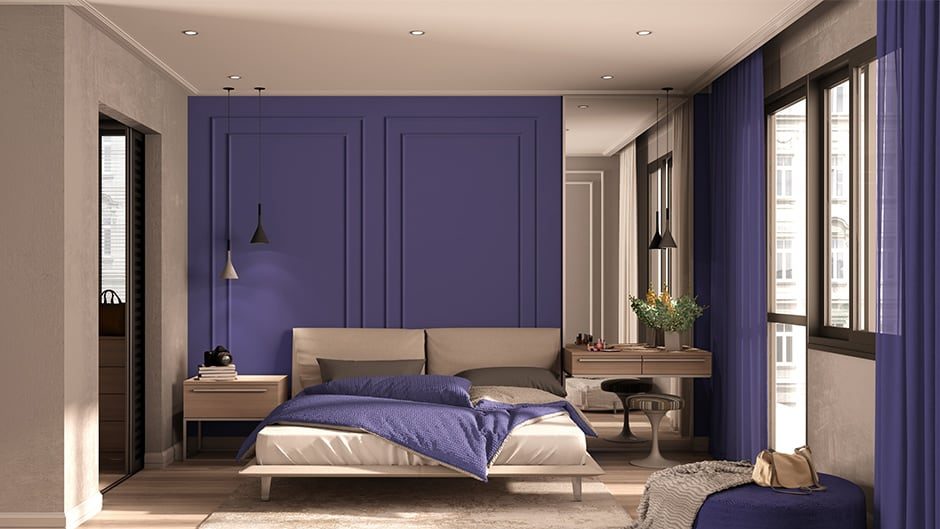
Image Source: Media.designcafe.com
While the colour purple is a tough one to pair, it works perfectly in combination with grey. The colours give a slightly eccentric vibe to an otherwise traditional bedroom setup. Also, the purple-painted accent wall is very effective in catching the eye of the viewer.
| Also see: 67+ Wall paint design ideas, colours & patterns for trendy interiors |
Wall colour combination for bedroom #2 – Red & Prussian blue
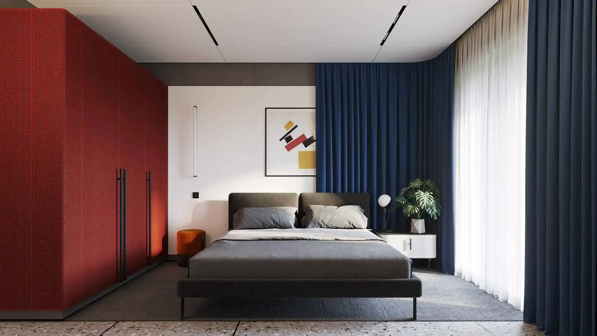
Image Source: Alexandr Aranovich on Behance
The deep red and gorgeous Prussian blue combination is great for creating contrast in the room. The combination adds a lot of visual appeal to the bedroom setup and takes away from the otherwise basic design. Overall, it shows how the right colour combination can make a room pop!
Wall colour combination for bedroom #3 – Blue & Soft Pink
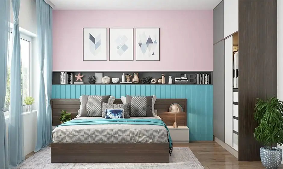
Image Source: Media.designcafe.com
A bedroom has to have a relaxing and calming vibe which calls for a soothing colour scheme. The blue and baby pink combination of this bedroom creates the perfect ambience of peace and tranquillity. This combination is a testament to how a certain look can be achieved with the right colour combination.
Wall colour combination for bedroom #4 – Teal & Mink
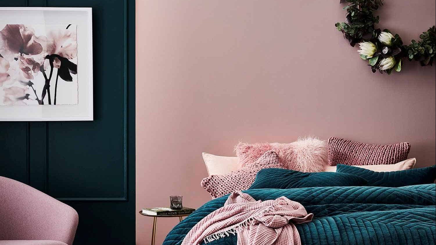
Image Source: Emilymaydesigns.com
The beautiful and rich teal shade mixed with a soft and feminine mink creates a soft, romantic vibe in the bedroom. Furthermore, the bed and the pillows add some extra texture to the look making it even more interesting and appealing. It shows how well colour and texture can work together.
Wall colour combination for bedroom #5 – Yellow & Grey
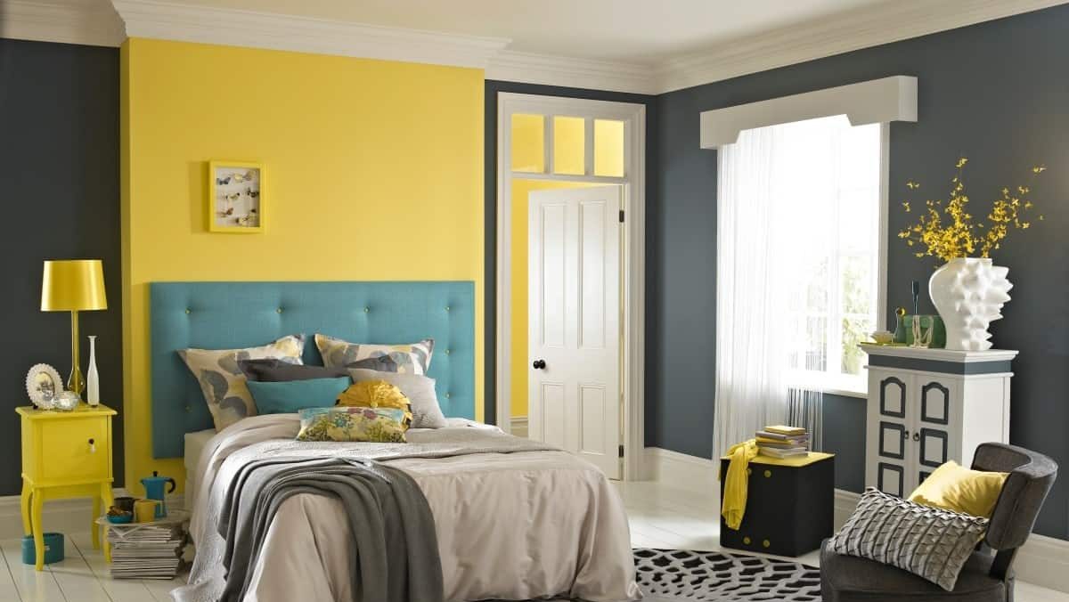
Image Source: Duluxamazingspace.files.wordpress.com
Having a dark shade of grey in a room can have a dimming effect. However, to counteract that, a yellow accent wall has been incorporated into the scheme. Furthermore, the room is decorated with yellow furniture pieces to compliment the accent wall.
| Also see: Bedroom colours: Use this formula to get designer results (49+ ideas) |
Three colour combinations for bedroom walls
Three colour combination #1 – Lavender, Dark Purple, and White
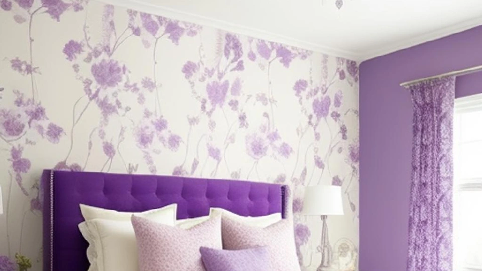
Image Source: 99acres.com
This is a very soothing wall colour combination, with lavender adding a soft, calming touch and dark purple adding depth and contrast, while white provides an accent, balancing the entire look.
Three colour combination #2 – Green, Brown, and White
Image Source: multitradebuildingservices.com
Green, brown, and white are the perfect choices when it comes to creating a timeless and elegant look. While green lends freshness and brown adds warmth and comfort, the white wall perfectly balances these darker shades. Using brown as an accent for furniture can really bring cohesion to the look.
Three colour combination #3 – Grey, Beige, and White
Image Source: colorpsychology.org
If you are into minimalist interiors, then this is the holy grail three-colour combination for you. Grey and beige add sophistication and a comforting touch, while white adds crispness and brightness. These lighter hues also make the room look spacious.
Three colour combination #4 – Grey, Mustard, and White
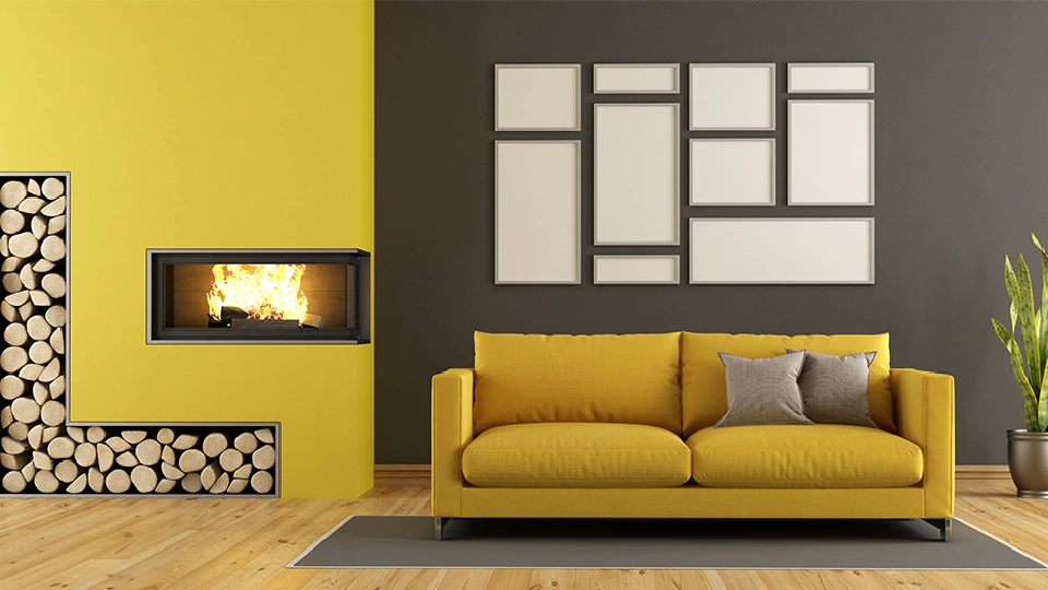
Image Source: tatalavida.com
If you want to add a little drama to your bedroom, mustard and grey can do the job for you. Mustard and grey are a classic colour combination and will surely breathe life into your bedroom. White will balance and brighten the room, providing a clean accent.
Three colour combination #5 – Yellow, Brown, and White
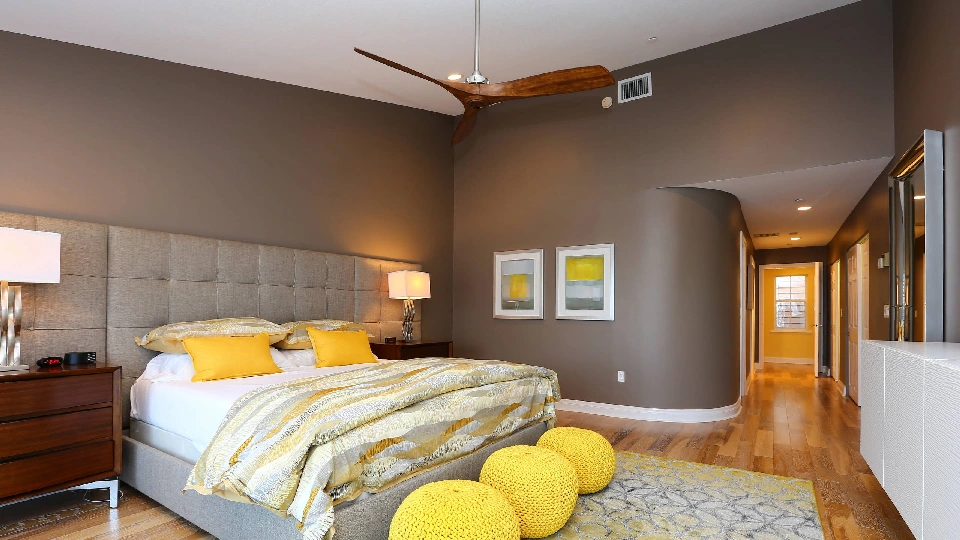
Image Source: st.hzcdn.com


Yellow is known to bring hope and energy into your space, while grey and brown add a cosy and natural feel. This colour combination will make your space feel inviting and optimistic.
| Also see: The emergence of colours in bathroom design |
Living room or drawing room combinations
Wall colour combination for living room or drawing room #1 – Orange & Beige
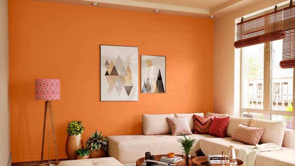
Image Source: Asianpaints.com
The vibrant orange in this living room is paired well with muted beige colour ensuring that the orange pops! The rest of the room is furnished with a minimal look making orange the centre of attention. Also, since orange is a bright colour, keeping the rest of the room simple ensures balance.
Wall colour combination for living room or drawing room #2 – Red & Ivory
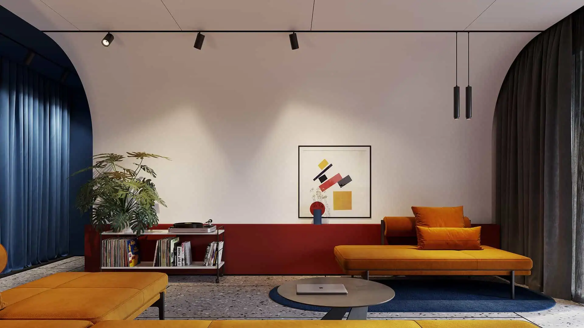
Image Source: Alexandr Aranovich on Behance
The deep rich red colour paired with ivory creates a great contrast. Since red is not used in large quantities, the combination creates enough contrast but doesn’t overwhelm the room decor. Therefore, this wall colour combination for living room blends seamlessly into the decor while giving a very elegant look.
Wall colour combination for living room or drawing room #3 – Black & White
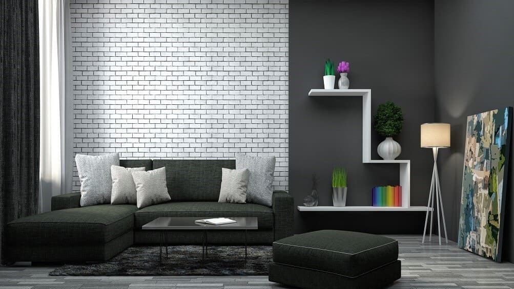
Image Source: Asianpaints.com
The wall colour combination for this drawing room has a very dramatic and industrial vibe with its black and white colour scheme. The room looks exceptionally immaculate and put together with its elegant furnishing and lighting elements.
Wall colour combination for living room or drawing room #4 – Burgundy & Chalk White
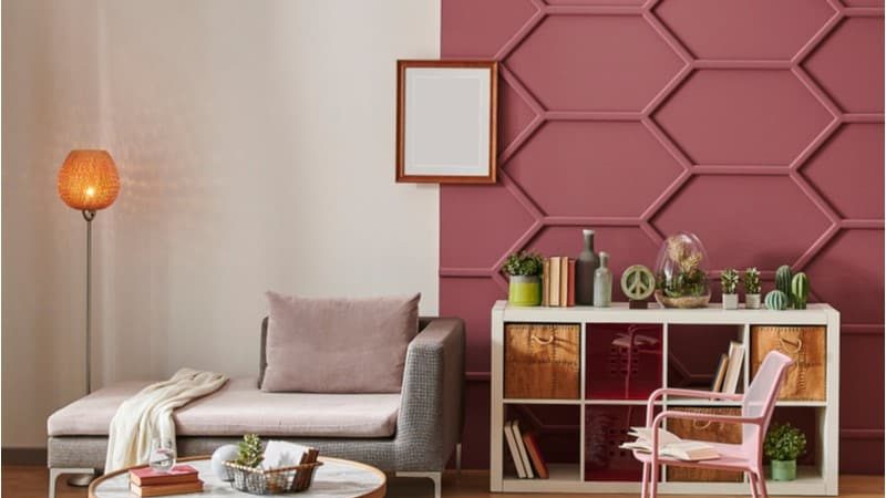
Image Source: C2paint.com
The simple and sober colour scheme of this room incorporates soothing shades of burgundy and white to come up with an elegant living room. The colours are muted and create a very cohesive colour scheme blending perfectly with the rest of the room decor.
Wall colour combination for living room or drawing room #5 – Coffee Brown & Grey
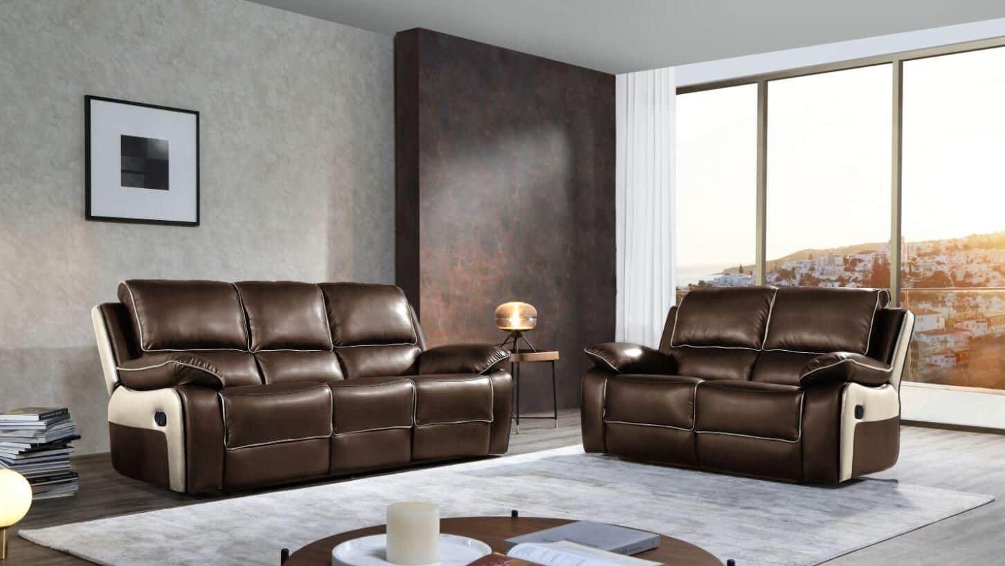
Image Source: Sofa-direct.co.uk
Coffee brown is a very trendy colour these days. This rich brown shade when paired with grey lends the room an elegant vibe. The matching sofa set with cream accents pulls the decor together, making the room seem coherent and complete.
Wall colour combinations for hall room
Colour combination for hall #1 – Shades of Pink
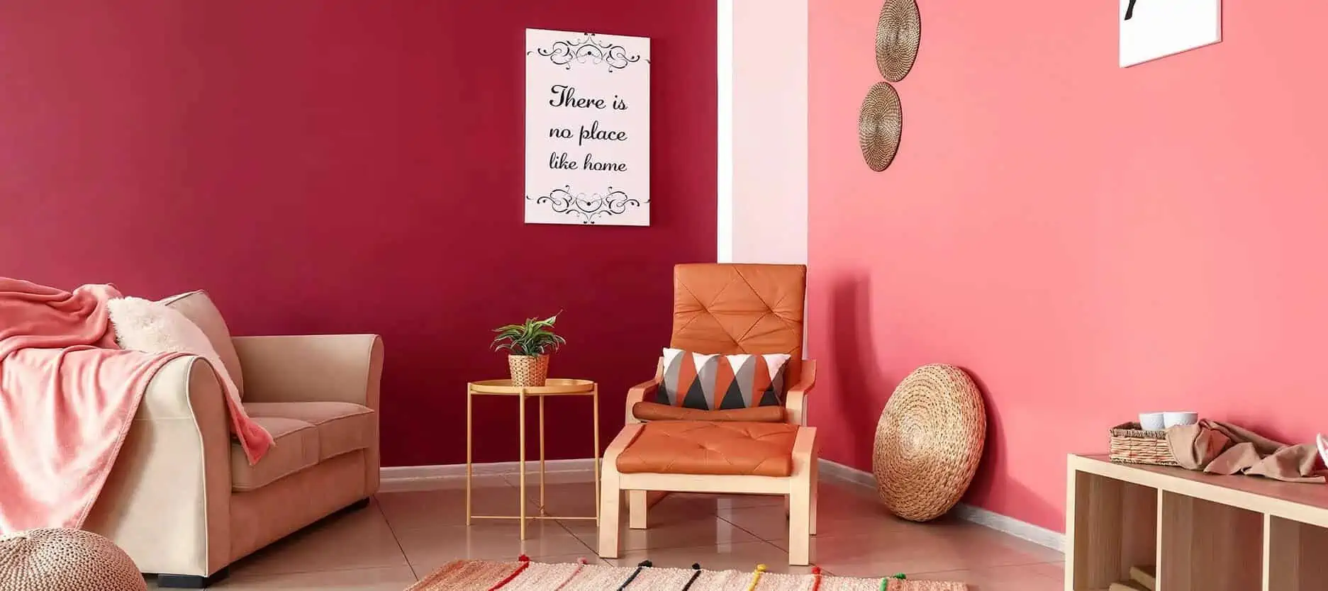
Image Source: Nerolac.com
When combining colours together, it is also possible to pair the different shades of the same colour together. This living room set-up is a clear example of different shades being put together to enhance the visual appeal. The hot pink and baby pink in this living room gives an inviting look ideal for hosting guests.
Colour combination for hall #2 – Green & White
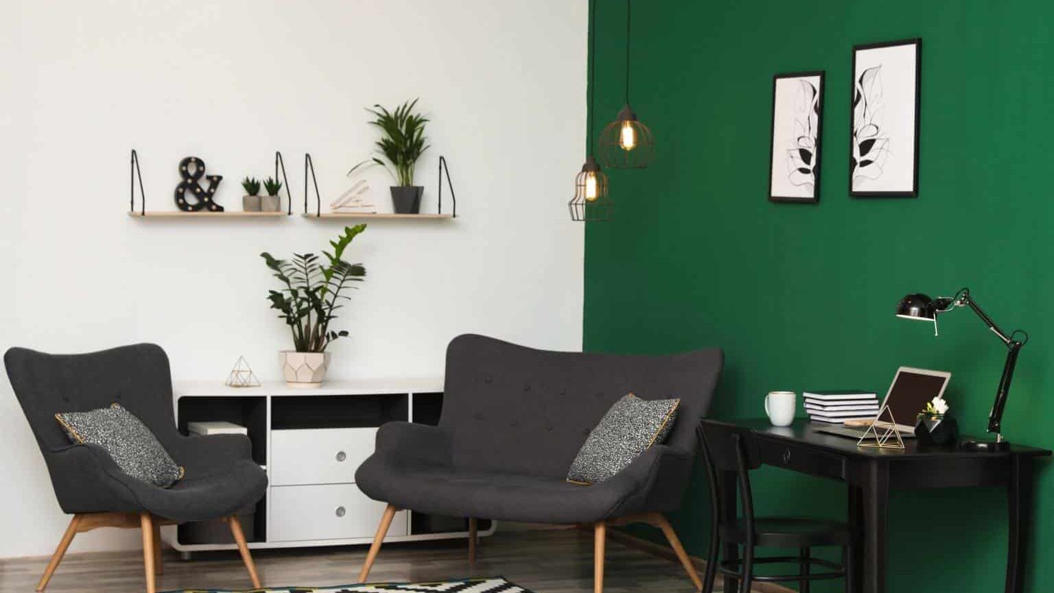
Image Source: Indigopaints.com
The beautiful rich emerald green paired with a graceful white colour makes the room appear immaculate and interesting. The colour scheme is minimalistic and employs basic colours yet it is so effective in elevating the living room. Furthermore, the plants in the room complement the colour scheme and effectively incorporate nature into the design.
Colour combination for hall #3 – Indigo & Yellow
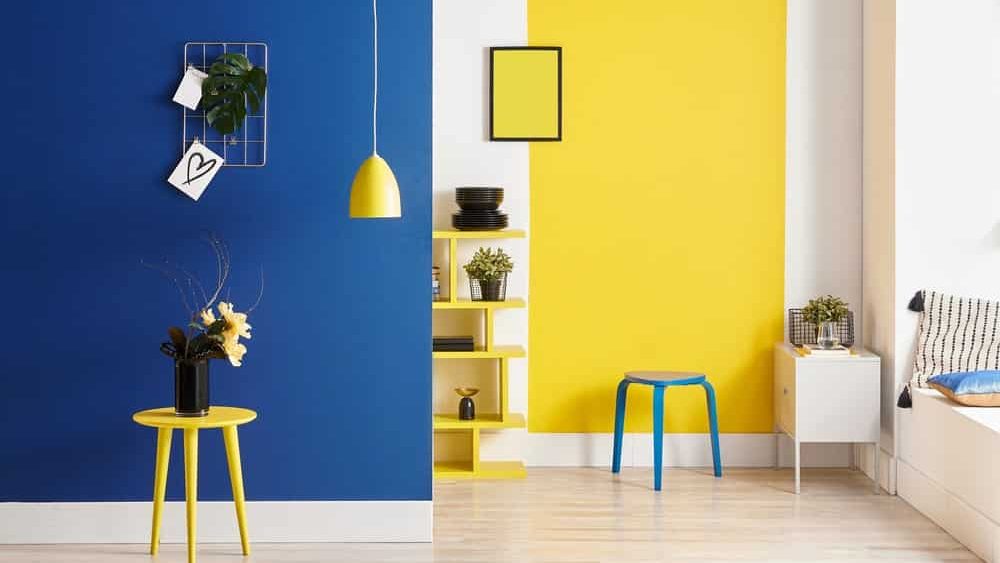
Image Source: Nipponpaint.co.in
When it comes to halls, choosing basic contrasting shades is enough to add visual interest to the room. The two rich blue and yellow shades in this set-up catch the viewer’s attention without overwhelming the overall look.
Color combination for hall #4 – Violet & Lilac
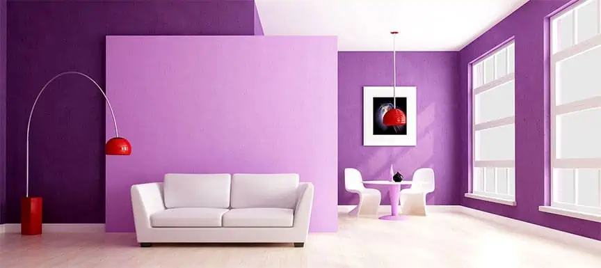
Image Source: Nerolac.com
For those of us with a knack for eccentricity, this beautiful violet and lilac colour combination is ideal. The combination adds whimsy to the room while the minimalistic furnishing and decor provide a good balance. Thus, this proves that eccentric combinations can be employed without overpowering the senses.
Colour combination for hall #5 – Green & Yellow
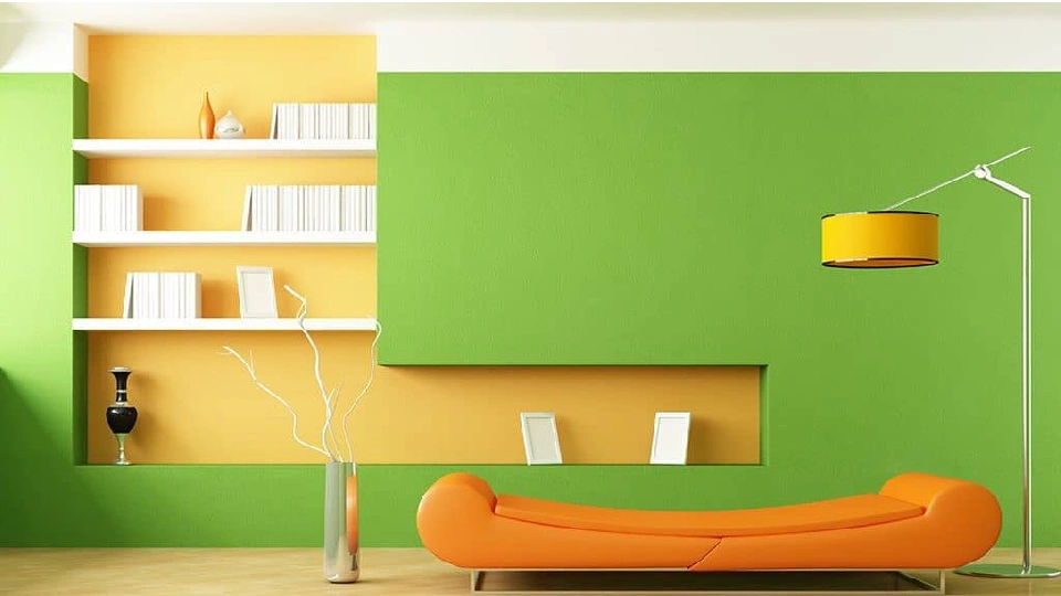
Image Source: Indigopaints.com
While green is a common colour, this shade of green is not used very often. So, this combination shows that even the most commonly used colours can come in an uncommon shade. The vibrant green is used together with this bright shade of yellow and minimalistic furnishing to tie this look together.
| Also see: Hall colour combination: 15 ideas & tips for amazing transformation |
How to select and style the right colour combination for your home?
The right use of colour can give you an aesthetic space that perfectly aligns with your taste and preference. However, there are thousands of colours, shades, and hues available out there. To add to that confusion, the colour combinations to choose from are endless. As a result, people get riddled with confusion when trying to paint their homes. Therefore, it is important to be mindful of the following while shortlisting a colour combination–
1. Factors like the size of the room, decor scheme, and lighting can influence the selection of colour combinations. For example, if you have a compact room, using bright and vibrant colour combinations can help give the appearance of a larger room. Similarly, pastel colours are very effective in giving off an elegant and graceful vibe to the room. Finally, a room that is not rich in natural light should not be painted with dark colour combinations.
2. An accent wall is a popular concept in interior design. Incorporating an accent wall is a great way to give the room an edge and make it appear larger. So, painting one wall in a room with a contrasting or complementary colour will set it apart from the others.
3. Textures are one of those often overlooked elements of home decor that can make a visible difference. The same colour in different textures can give a different look or appeal. Therefore, you may go for a monochromatic colour scheme but incorporate different textures to give the room some visual interest and character.
4. Incorporating colour combinations in your home isn’t restricted to wall paints, you can also go for wall stickers or murals. Wall stickers are available in a number of colour schemes and patterns which can effectively enhance the appearance of any space.
Choosing a wall colour that aligns with your floor tiles
Picking a wall colour that pairs well with the floor tiles can be a little tricky for some. Worry not, we have a two-step method to select a wall colour that sits well with the tone and texture of your floor tiles.
Look for undertones that match your floor tiles
Tiles with cooler undertones pair well with lighter, cooler wall paints like blue or green than with warmer hues like yellow. Warmer undertones call for warmer colours like yellow or soft neutrals. Avoid strong shades, as they can put off the entire look of the room. Thus, knowing your undertones well can help you a great deal.
Notice the texture of the tile
Natural stone tiles go well with neutral colours, irrespective of the colour of the tiles. However, smooth and glossy tiles look best when paired with darker and more dramatic wall colours.
A little insider cheat code is choosing tiles that can be paired with any wall colour and still look stunning! White, grey, light neutral, and soft black tiles go with almost all wall colours.
Conclusion
Colours have the power to make or break the look of any room. Furthermore, the colour of an object can decide whether it blends seamlessly into the decor or looks like a misfit. Therefore, finding the right colour combinations for each room of your house becomes vital. To finalise a colour combination, be mindful of the room decor, colour scheme, and size of the room. Furthermore, incorporating a Vastu-approved colour scheme into your home can bring positivity, peace, and good luck. For that, you can use the Vastu tips displayed above to decorate your home.
Also, it is important to get a better understanding of your personal taste and preference when it comes to colours. Certain colours will appeal to you, and draw you in while others might seem mundane to you. So, identify your personal taste and preference, use our lookbook with the latest ideas for the bedroom, living room, drawing room and hall, and thank us later!
FAQs
What is the most popular colour choice for living room walls?
The best shade would be one that adds to the overall look of your hall or living room; however, generally vibrant and low-maintenance shades work best. Due to high traffic in the living room, the possibility of getting soiled isn’t far away, so light pastel shades, albeit gorgeous, can require high maintenance.
What are the top paint brands in India?
With the paint industry expanding rapidly, the top paint brands include Asian paints, Berger paints, AkzoNobel, Kansai Nerolac paints, Indigo paints, Nippon paints, Shalimar paints, etc. Visit our article for a detailed list of the top paint companies.
Which colours make the room appear bigger and brighter?
Colours can transform any space! Choosing a lighter shade will always make your room appear big and spacious, as it reflects light, while darker shades absorb light, making a room look dark and dingy. Some good shades include taupe, sea green, clean white, earthly ochre, etc.
Which colours should be avoided for bedrooms?
Colour psychology can come to your rescue when deciding which colours to avoid. The red two-colour combination for bedroom walls is a big no-no as it leads to aggression. Darker colours like brown and black, make the room look smaller. The brighter hues, like the lemon-yellow shade, can lend a disturbing neon hue to the room.
How many colours should a bedroom have?
The scale hovers somewhere between two and three colours. Having a single colour can make it look visually bland and boring while incorporating more than three colours can make it look messy, overwhelming, and distracting.
What is the best two-colour combination for a living room?
The best two-colour combination is one that creates harmony with your interiors. The foolproof trick is to choose one primary colour and pair it with a complementary colour. White, beige, grey, and cream are the most common complementary colours that suit every primary colours like blue, purple, orange, yellow, blue, etc.
What are the criteria for choosing a paint finish for my home?
This is primarily a personal choice driven by factors like budget. Just know that high-sheen paints have more luster and shine, requiring good wall preparation because even minor imperfections are visible. Pick high-quality paint for focus areas and normal economy paint for other corners of your home, like ceilings.
What are the Vastu tips to keep in mind for home colour combinations?
- For rooms facing the south-west direction, earthy, natural colours such as green and brown are considered effective in inviting positivity.
- For rooms in the north-west direction, it is considered lucky to use grey or white wall paint.
- The orange and yellow colour combination is considered ideal for rooms facing the south or south-east direction.
- Finally, for rooms located in the east direction, a colour combination of yellow, blue, and white is considered auspicious.
*The featured image used in this article is from Memphis Interiors on Behance
Colours can transform a house into the home of your dreams. Choosing the correct colour is extremely important for the overal
Home colours guidebook: 50 classic combinations, ideas and tips