
Colours can transform a house into the home of your dreams. Choosing the correct colour is extremely important for the overall design of your home. The paint colour combination you choose for the interior and exterior of your home has a significant impact on your daily life.
Different colour combinations work for different people. While one person may prefer an all-white monochromatic and minimalistic look, the other person may go for a deep red with brown to create a rustic and homely vibe.
Colour selection is a personal choice which is influenced by various factors. It depends entirely on the homeowner to make a choice they are comfortable with.
This article deals with the best home colour ideas and combinations. Read along to understand how colour psychology and colour wheel impact the different areas of the house.
Contents
- 1 Best colour ideas for home exteriors
- 2 Unique colour combinations for home exteriors
- 2.1 Colour combination for outside walls #1 – Grey, orange and white
- 2.2 Colour combination for outside walls #2 – Yellow and brown
- 2.3 Colour combination for outside walls #3 – Blue and cream
- 2.4 Colour combination for outside walls #4 – Red and white
- 2.5 Colour combination for outside walls #5 – Blue, yellow and grey
- 3 Useful tips to select paint colours and colour combinations for outside walls
- 4 Trending colour ideas for home interiors
- 4.1 Home colour for interiors #1 – White
- 4.2 Home colour for interiors #2 – Blue
- 4.3 Home colour for interiors #3 – Orange
- 4.4 Home colour for interiors #4 – Pastels
- 4.5 Home colour for interiors #5 – Red
- 4.6 Home colour for interiors #6 – Grey
- 4.7 Home colour for interiors #7 – Metallic
- 4.8 Home colour for interiors #8 – Purple
- 4.9 Home colour for interiors #9 – Yellow
- 4.10 Home colour for interiors #10 – Green
- 5 Home colours for different rooms of your house
- 6 Tips to select the best home colour for interior walls
- 7 Home colour combination ideas with colour palettes (Image gallery)
- 8 Vastu for home colours
- 9 Factors to consider while selecting colours
- 10 Watch this video: Best paint colours for the whole house (9 mins 29 secs)
- 11 FAQs
- 11.1 What is the best paint finish for the living room?
- 11.2 Which colour is best for Indian homes?
- 11.3 What are the best colours for the kitchen as per Vastu?
- 11.4 Which exterior colours fade the fastest?
- 11.5 What colour will make the space look bigger?
- 11.6 Where to use which type of paint colour in your house?
- 12 Conclusion
- 13 63+ Ideas for wall decoration: Upgrade from dull to dazzling walls
Best colour ideas for home exteriors
Picking the right colours for the outside walls of our home is as important as picking the colours of our home interiors. The colour of the home exteriors should be such that it grabs the attention of people at once. Paint companies in India have launched numerous collections by following this emerging trend. Various waterproof, weatherproof, anti-dust, antibacterial and antifungal home exterior paint colours are now available. The exterior paint must be sturdy, durable and of high quality.
White is a favourite outside home colour as it creates a serene and pristine atmosphere and it helps keep the house cooler. Blue-grey, light pink, pale yellow and leafy green exterior colours are used for homes. Cream and brown are classic colours for the outside which give an earthy and rooted look to the home. Blue and white, red and beige, and yellow and green are other perfect combinations to give home exteriors a welcoming look.
Home colour for exterior walls #1 – White

Image Source: Felix Fuchs on Unsplash
White is a popular home colour for exterior walls. It represents tranquillity and peace. Moreover, white is a timeless colour that easily blends with other hues. You will find different shades of colour. However, there is no need to get overwhelmed by the subtle shades of white. Go for an off-white or ivory-white shade, to achieve crisp, sleek, and classy aesthetics.
Home colour for exterior walls #2 – Grey
Image Source: Asian Paints
Whether dark or light, shades of grey are in trend. For a sophisticated appearance, go for the darker shade of grey. If you want a contemporary and finished look, paint the walls using a lighter shade. You can also combine the lighter shade with white, orange, or green accents for a stately look.
Home colour for exterior walls #3 – Red
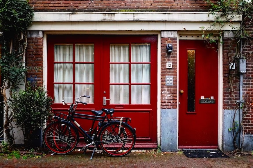
Image Source: Quaid Lagan on Unsplash
With its cherry-like appearance and inviting vibes, the primary colour red is winning hearts. Using red colour for the exterior walls of your home will add a sense of modernity to the entire look. Moreover, the colour will make your home stand out from the crowd. To balance the boldness of red hues, you can pair them with lighter shades like white.
Home colour for exterior walls #4 – Beige
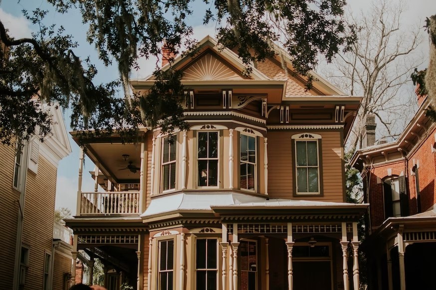
Image Source: Jessica Firtney on Unsplash
Are you looking for ways to beautify your home exteriors? Simply add a splash of neutral shades. Beige will make the home exterior stand out with its calming effect and old-world charm. When choosing shades of beige (khaki, mocha, tan, coffee, etc.), consider the architectural style of your home. If you want a modern look, pair different shades of brown with beige or yellow.
Home colour for exterior walls #5 – Blue
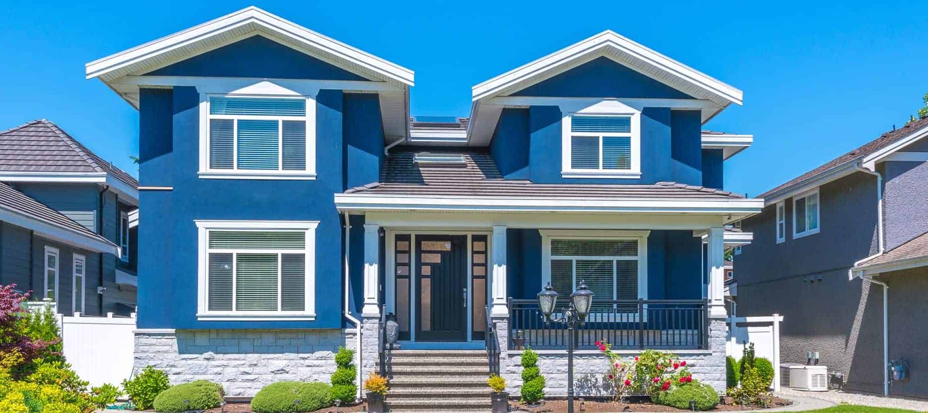
Image Source: Shutterstock.com
The shades of blue are known for their airy, calming, and inviting appearance. If you choose blue for painting your home exterior design, you don’t need to pair it with any other colour. From dreamy and beachy aesthetics to a timeless classy look, the shades of blue can do all the wonders.
| Also read: The emergence of colours in bathroom design |
Unique colour combinations for home exteriors
Colour combination for outside walls #1 – Grey, orange and white
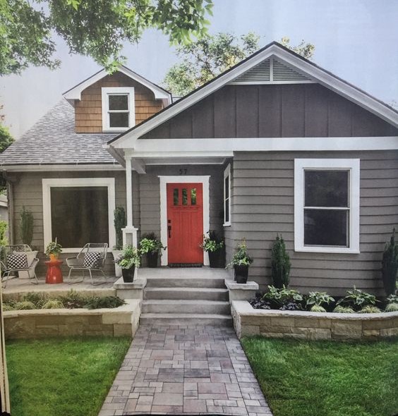
Image Source: Mary Elise on Pinterest
Combining neutral hues like grey and white with a bright orange colour creates a sophisticated and fun look. Using grey and white as base colours will give you a modern look that is adaptable to any decor style. The orange colour is a great way to add some personality to your home without going overboard.
Colour combination for outside walls #2 – Yellow and brown
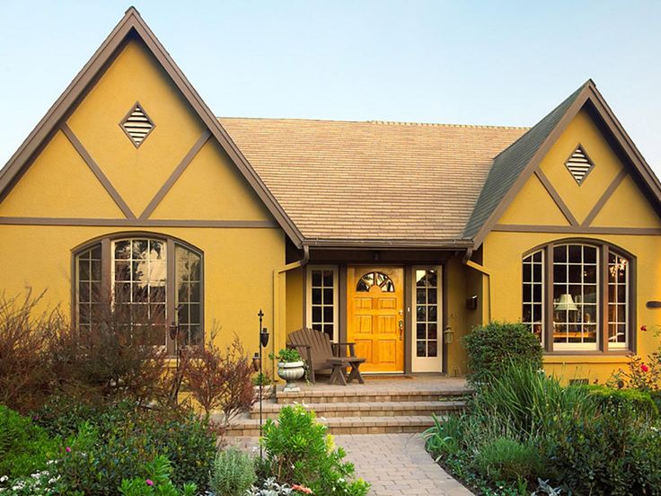
Image Source: Pinterest
A yellow and brown colour scheme for the outside walls is a great choice. This combination will work well if you want a subtle and soothing vibe. With bright yellow and earthy brown blending perfectly with each other, the wall of your home gets a natural-looking aesthetic.
Colour combination for outside walls #3 – Blue and cream
Image Source: Asian Paints
Give a relaxing beach theme to your exterior walls with a combination of pale blue and cream. These serene colours are a suitable substitute for traditional white. In addition to giving a refreshing exterior, this combination will create an elegant design worth staring at.
Colour combination for outside walls #4 – Red and white
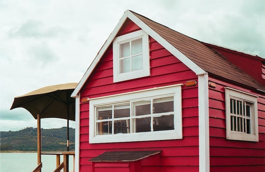
Image Source: Felipe Prieto on Unsplash
When white is combined with, red tiles with wooden accents look fantastic. Consider this colour combination if you like Scandinavian and industrial styles. A blend of dark and light colours has never failed to impress. Moreover, this colour scheme will draw attention to the exteriors of your home, enhancing its charm.
Colour combination for outside walls #5 – Blue, yellow and grey
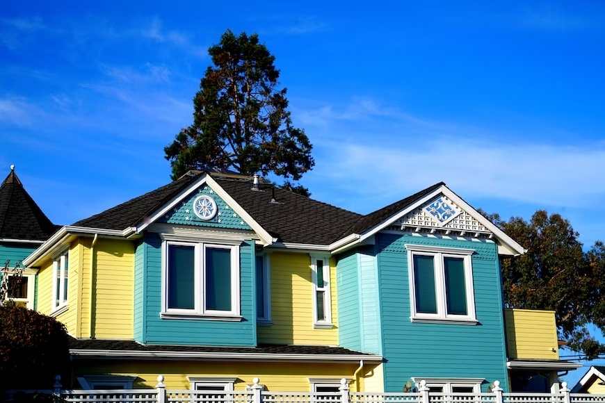
Image Source: Tim Photoguy on Unsplash
Create an eye-catching look by using this magical colour scheme on your outside walls. Vibrant blue, grey, and yellow can make your space feel more welcoming. Paint the door yellow, the roof grey, and the facade blue for a vivacious and opulent look. This colour palette will give a bold yet elegant home exterior.
| Also see: 25 head-turning Indian house colour combinations for outside walls |
Useful tips to select paint colours and colour combinations for outside walls
- When choosing a colour combination for the outside walls, choose no more than two to three colours to avoid a cluttered and uncoordinated appearance.
- The first thing anyone notices about your home is the exterior wall colour. So, make sure to opt for a cohesive and simple colour scheme. Also, the colour of the outside walls should be in harmony with the roof and architectural elements like doors, railings, etc.
- The selection of a colour is as important as choosing a combination. Avoid dark colours as they absorb dust particles and can require regular maintenance.
- Choose paint for the outside walls mindfully as the durability of your home exterior depends on it. High gloss paints are not a durable option. Go for paint with satin, emulsion, acrylic or eggshell finish as they are long-lasting and easy to clean.
- Choose colours that complement the natural environment around you. When selecting home exterior colours, consider the weather, region, and availability of natural light.
- Consider the theme you want for your home’s exterior, making the selection of colours much easier. Focusing on the theme will bring unity and cohesion to the home exterior.
Trending colour ideas for home interiors
Home colour for interiors #1 – White
Image Source: The White interior Design Studio
White is often the most popular colour in home interior design. It is the perfect mix of elegance, sophistication and versatility. It gives the space a crisp fresh vibe. Also, it provides a clean slate to the designer and is not only minimalistic but also classic and timeless. It creates an illusion of space and acts as a perfect backdrop to work around. It maximises the use of natural light and helps in enhancing the effect of artificial lighting. The white colour also helps with the styling of decor accessories and helps them stand out. This colour is also a common choice for the outside walls of the home.
Home colour for interiors #2 – Blue
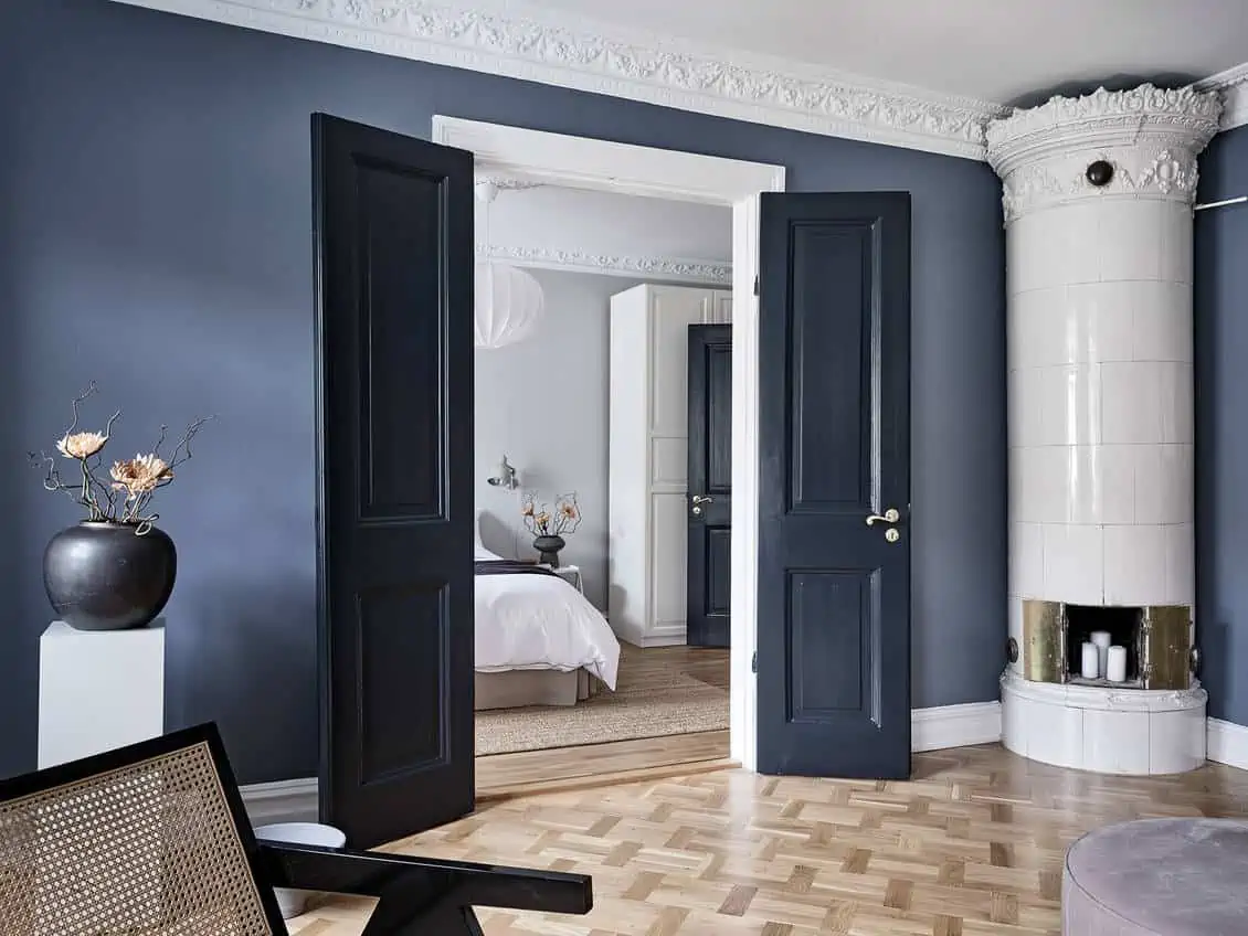
Image Source: That Scandinavian Feeling
The blue colour in the home interior design adds a cool and classic aesthetic. It can be the focal point in a room when used with a neutral colour. Also, it can add depth to an all-white space and the combination of blue and gold is considered a match made in heaven. This primary colour is easy to style. While this colour does not belong to a particular era, it can be both contemporary and classic in its approach. Choosing darker shades of blue helps in preventing the furniture from looking too bulky. The blue colour, in combination with white, is commonly used for painting the outside walls of a home.
Home colour for interiors #3 – Orange
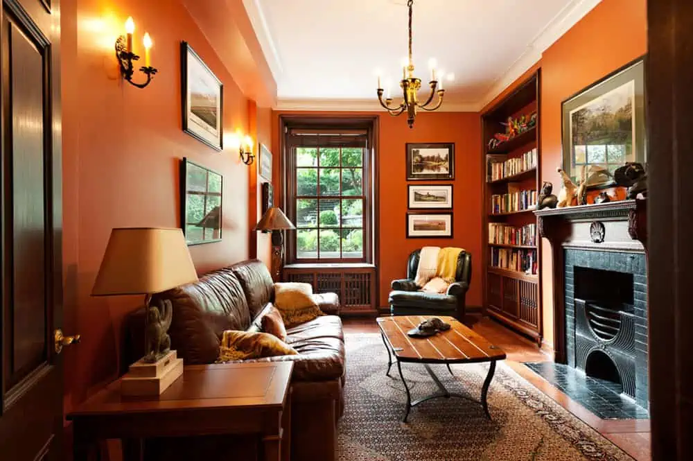
Image Source: David Giral Photography
A pop of orange colour in home interiors can create a vibrant and engaging vibe. A warm colour nestled between yellow and red on the colour wheel, orange is also the colour of autumn. It can be contemporary or eccentric depending on the different tones used. Generally, it is used to add drama and as an accent. Orange works well with white to create a soothing colour combination. It can be used with brown colour to give a cosy vibe to the home design.
Home colour for interiors #4 – Pastels
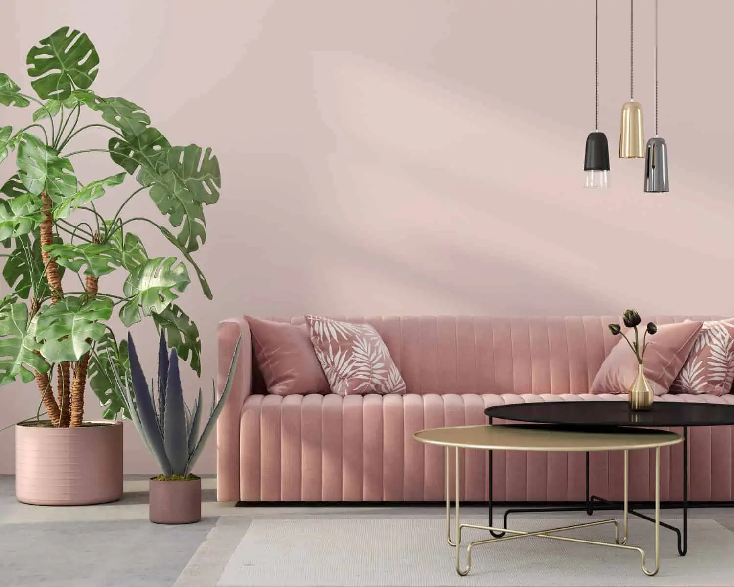
Image Source: Latelierkauldhar
Pastel colours are everywhere when you look around. From blush pinks to baby blues, magic mints, rose tans, soft lavenders and pale mauves the list is endless. These colours have been associated with happiness, serenity and peace. Pastels can be paired with white and added in the form of furniture or accessories. Also, the shades can be used as accent colours. Using a pastel paint colour will give a soothing vibe to your home.
Home colour for interiors #5 – Red
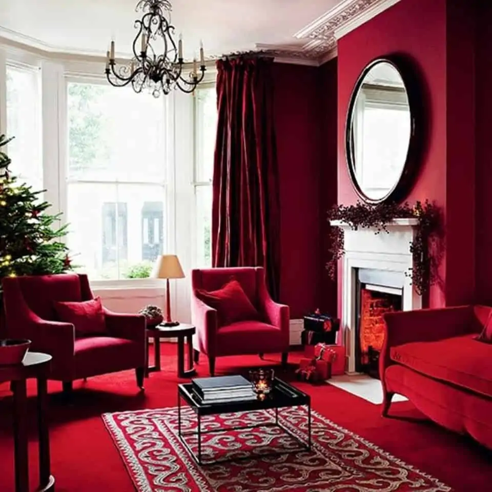
Image Source: Bougainvillea Design Studio
Red is a powerful colour that can add warmth and drama to a space. This colour is associated with love, romance, passion, good fortune, fertility and elegance. The red colour is often used to create a stunning impact on interiors. It works well with neutral colours like white and grey to create a retro and cosy look. Red when paired with gold is royal and majestic. It complements wooden finishes to create a rustic look. The emerging trend is to add a touch of red colour to the outside walls of a home.
Home colour for interiors #6 – Grey
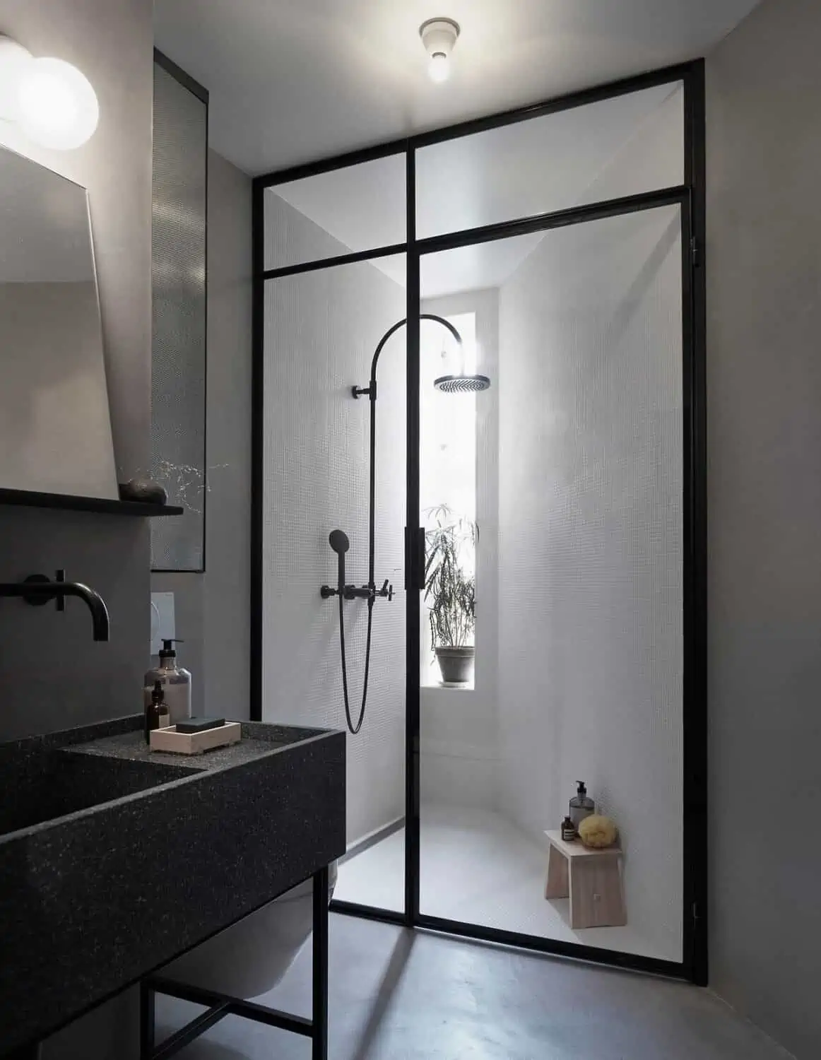


Image Source: Magnus Marding
Grey colour has become a popular choice with homeowners and design professionals. Grey is a versatile neutral colour that helps in making a place look spacious and airy. It creates a soft palette that acts as a cocoon in the winter months. It helps in giving a sophisticated and unobtrusive look to a place. Light grey colour when used in combination with white looks chic and functional. Using grey with beige or brown gives a warm homely feel. Grey is commonly used as an outside wall colour for our homes in modern times.
Home colour for interiors #7 – Metallic
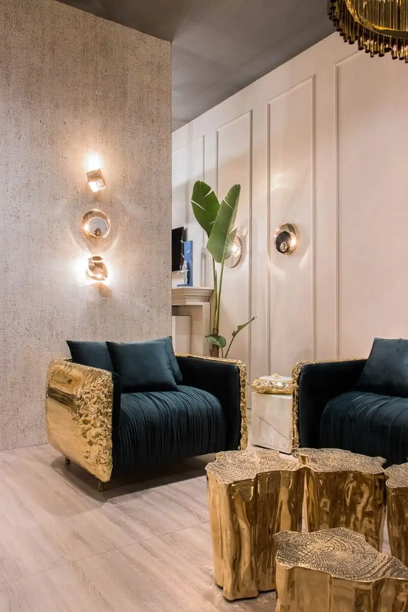
Image Source: Boca Do Lobo
Using metallic colours in your home can make it sparkle and glamorous. A touch of gold, silver and rose gold adds shine and shimmer to a space. These luxe metallic textures transform a space making it look royal and majestic. Emerald green, soft pink, red and blue complement the golden colour. Metallic colours go well with marble and can be used in decor items. If balanced well with simple furniture pieces, they can become the talking point of the interiors.
Home colour for interiors #8 – Purple
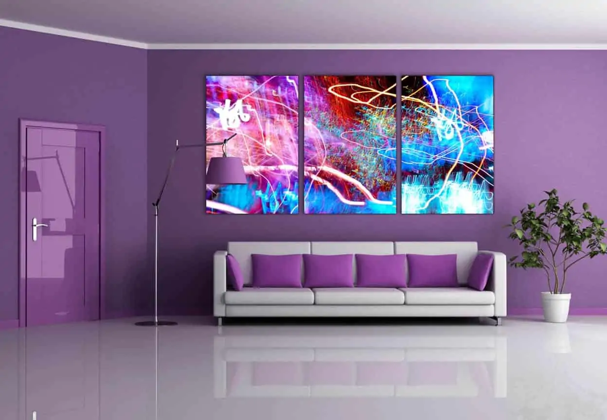
Image Source: Treehouse
The purple colour gives a royal and creative feel to a home design. A combination of blue and red can be dramatic or subdued per its use. Purple denotes power and wealth. Purple goes well with whites and greys to create a style statement.
| Also see: Purple colour combination for bedroom walls: 25 adaptable ideas |
Home colour for interiors #9 – Yellow
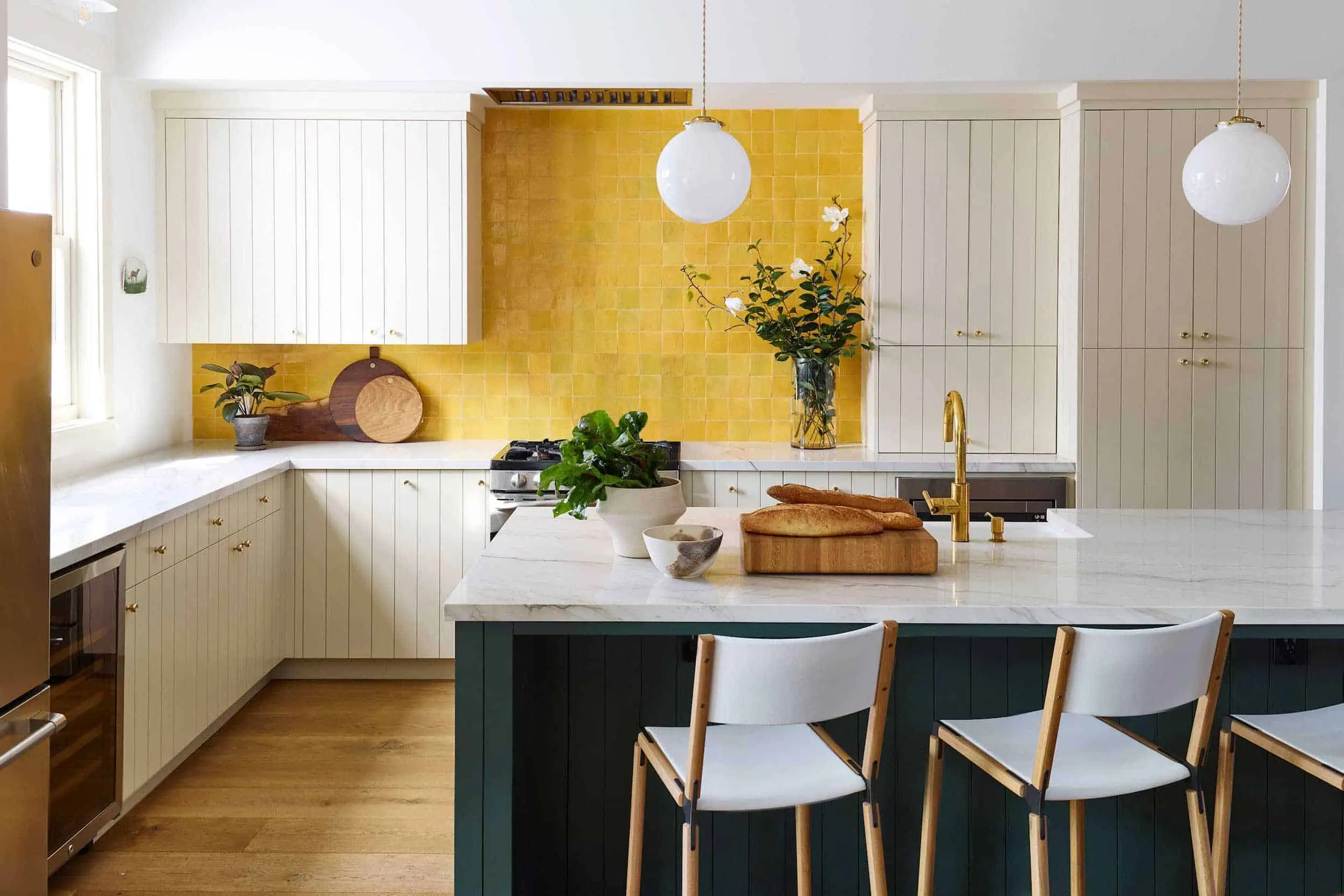
Image Source: Style By Emily Henderson
A splash of yellow can create feelings of joy and cheerfulness. Using yellow in interior design is often considered a designer’s trick as it immediately lightens up a space. The colour of flowers and sunshine, yellow goes well with neutral colours. Vintage yellow looks eclectic and adds drama to a space. Yellow colour is a mainstay in Indian kitchens and dining rooms as it is said to mentally stimulate appetite. Yellow colour is used for the home exterior as well.
Home colour for interiors #10 – Green
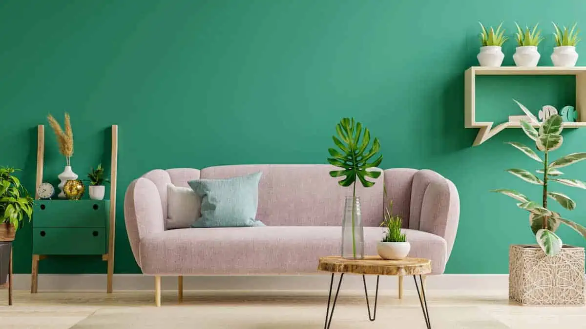
Image Source: Her Zindagi
Green is generally associated with growth, freshness, prosperity and harmony. The colour of forests, green has a raw aesthetic to it. Tranquil and soothing, this colour can look royal and stunning when paired with gold. Green when paired with earthy browns, suave greys and cool whites can look refreshing and grand. Painting your home in green colour is said to relieve stress.
Home colours for different rooms of your house
Home colours for the bedroom
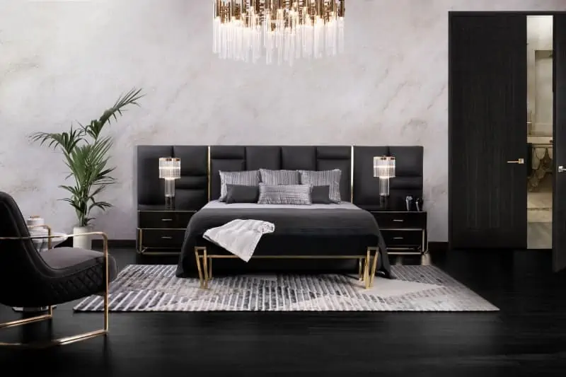
Image Source: Boca Do Lobo
The bedroom is the place where one spends the most amount of time when at home; therefore, the bedroom colour selection must be correct. A bedroom should look relaxing and peaceful. You could choose the classic combination of white with wood and add colour through furnishings and accessories. Grey colour used in combination with off-whites and pastel hues looks lovely in a home. Monochromatic paint colour in the bedroom when balanced properly with furniture adds the wow factor to a home. Blue, green, soft pink, white, red and beige are considered the best colours for a restful sleep.
When you have a small bedroom you can go for lighter colours like white and pale grey as they make a room look bigger. If you want to add colour you can create an accent wall with a darker colour. If the bedroom does not receive abundant natural light you can use bright colours like orange, yellow and pink to brighten the room.
| Also see: Bedroom colours: Use this formula to get designer results |
Home colours for the kitchen
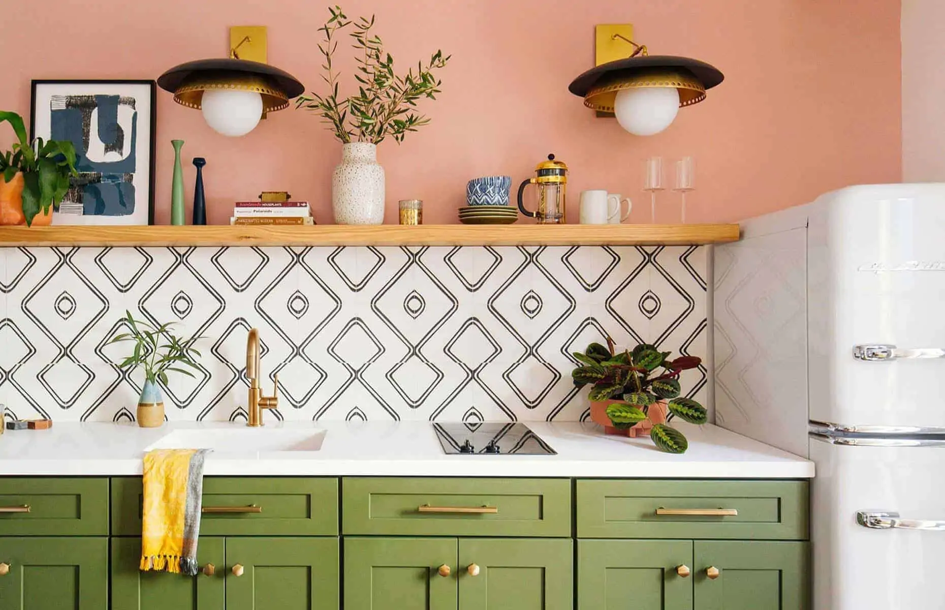
Image Source: Loveproperty.com
Kitchens today are designed in such a way that not only do they serve their purpose of cooking, but are also stylish. While designing a kitchen one can go for a neutral palette with metallic finishes. You can also use a combination of warm and cool colours for the home kitchen. Wood finishes are also trending. Two-toned kitchen designs are a blend of two different shades for the base and the wall cabinet. The colour of the appliances also plays a role in kitchen interiors.
Most kitchens receive some amount of natural light, so you can use white, yellow, orange, and red among other colours to add more depth to the kitchen. Even if the kitchen is small, a well-designed layout and cool colours such as white, lighter shades of yellow, pink and grey can make the kitchen look bigger.
| Also see: 7 Popular kitchen cabinet colour schemes to match your appliances |
Home colours for the living room
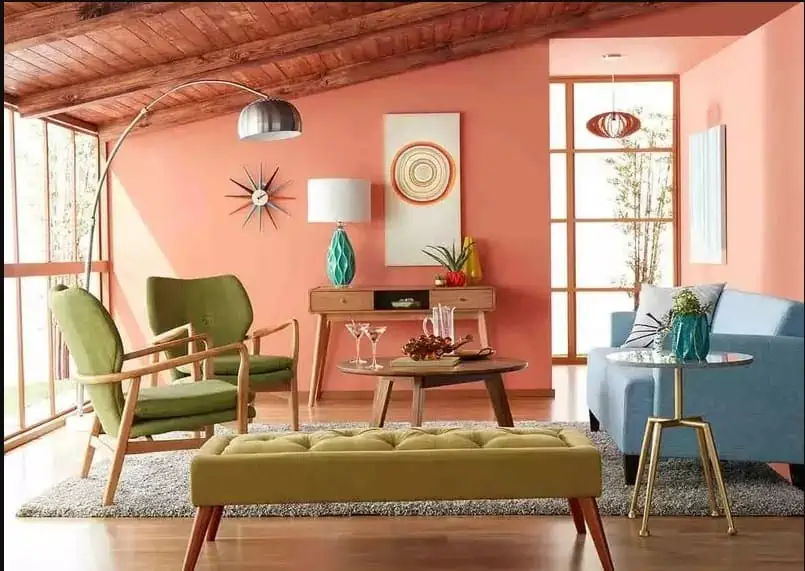
Image Source: Times of India
The living room is a place where the family hangs out and entertains their guests. Modern living rooms often serve as the showstopper in home interiors, so while designing the living room one can use subtle pastel colours and add layers in the form of patterned furnishings. Monochromatic colours are quite fashionable when it comes to living room decor. Warm colours add a cosy vibe to the living area and using them in combination with beige, tan and gold gives a lively feel to the home. A splash of red, a touch of vintage yellow, emerald green and white, and eclectic blue are some of the home colour ideas that can brighten the space. A popular option in the contemporary world is a minimalistic all-white living area which is a classic and chic combination.
Natural light adds warmth and cosiness to a room, so even if you have less natural light you can use lighter colours like white, beige or ivory to reflect more light and brighten the visual space. The best colours for a small living room are pure white, cream, yellow, light grey and dark blue. Dark blue can be used as it creates the illusion of enlarged walls. For a larger living area, you can use darker colours like purple and navy blue with warm undertones as it gives a cosy and comfortable feel to the space.
| Also see: Hall colour combination: 15 ideas & tips for amazing transformation |
Home colours for the dining room
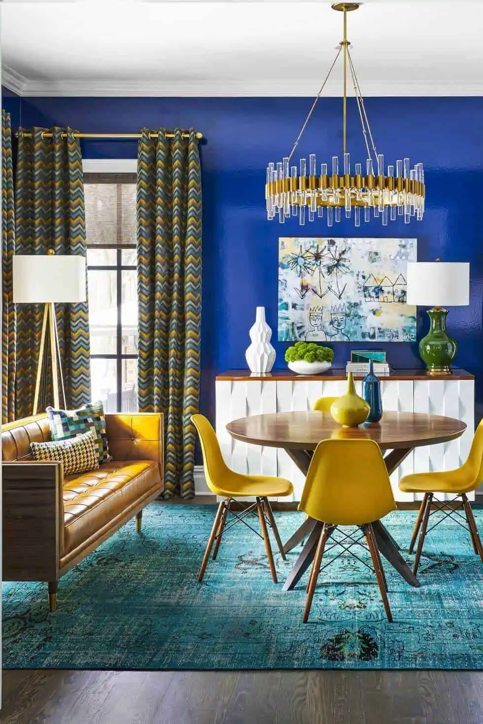
Image Source: Hommes Studio
The dining space is one of the most used spaces in a home. Thus, it is pivotal that it is a comfortable and well-designed area. The dining room plays host to family gatherings and dinner parties. The colours for the dining room interiors can be a blend of earthy neutrals like beige, brown and grey and vibrant shades like yellow, blue, red and green. Also, offbeat choices like pink and purple balanced with white are popular. The most commonly used colours are yellows and oranges as they are said to mentally stimulate appetite.
Most dining rooms generally don’t have access to sunlight. Therefore, it is necessary to use a mix of neutral hues like white, beige and light grey with bright colours like yellow, orange and green to make the area look bigger. You can use jewel tones like gold and silver in larger dining rooms to give them a royal look and when used with darker colours like emerald and blue they add warmth to a space.
Home colours for the bathroom
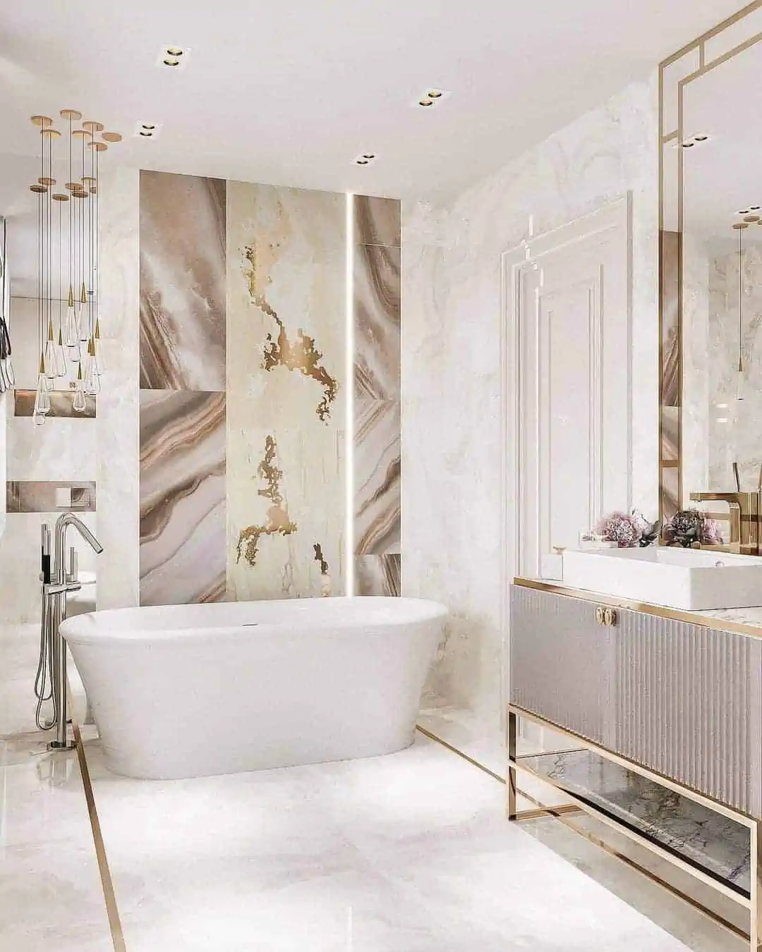
Image Source: Covet House
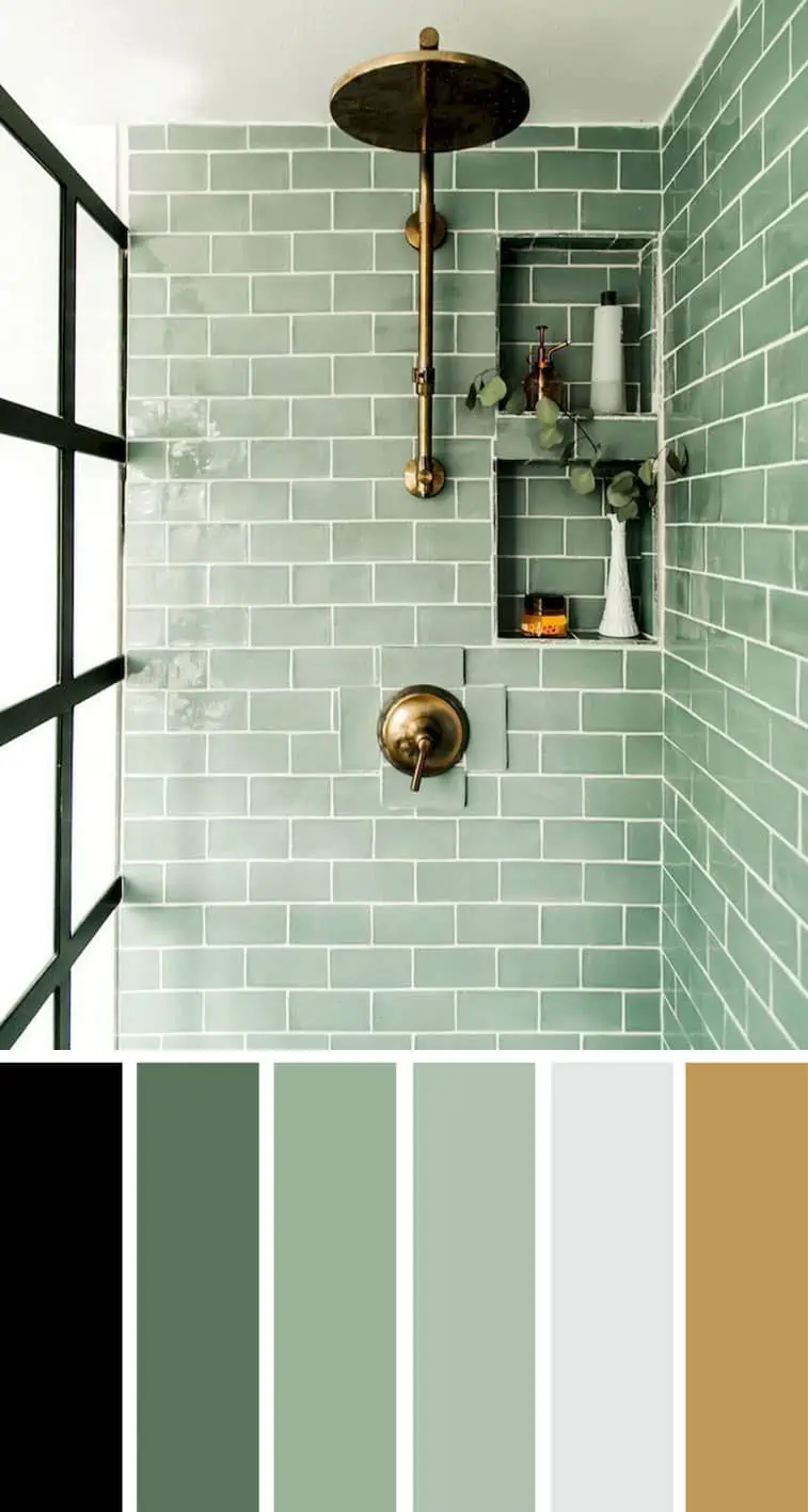
Most urban bathrooms are small in size. Therefore, it is important that the colours that are chosen for a bathroom be such that they create an illusion of space. The most popular choice is white which makes a bathroom look open and airy. A cool blue gives a crisp look to a bathroom. There is no other colour which is as glamorous as black. Many powder rooms use an exquisite combination of pink and gold. Yellow feels like sunshine and adds a cheerful vibe to a bathroom. Greens added in the form of paint or plants give a fresh feel to the bathroom.
Most bathrooms lack natural light so you have to use colours which will enhance the artificial lighting used in the bathroom. Blue and white are generally the favourite colours to reflect light. If you have a small bathroom you can use light grey, beige white, pale blue and deep green to make the bathroom look larger. If you have a large bathroom you can create a palette of light and dark colours to add a glamorous look to the bathroom.
Best colours for the home office
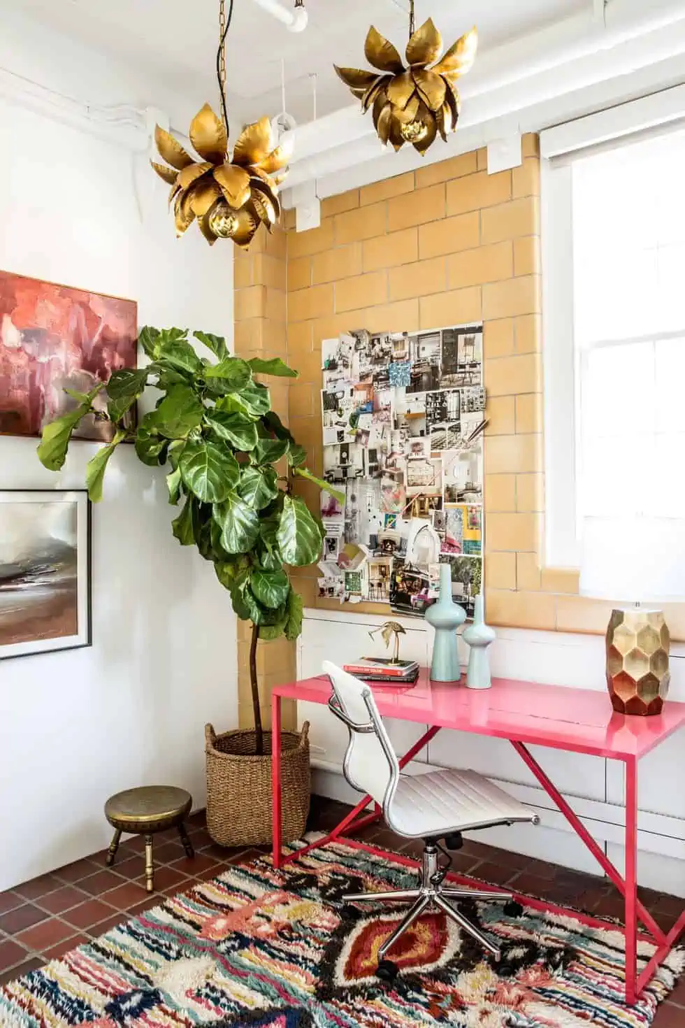
Image Source: Oprah Daily
While home offices were an emerging trend since the beginning of the 21st century, they have become an absolute necessity in the post-pandemic work-from-home era. A dynamic colour combination can brighten the home office. Neutrals when used with the right mix of decor items and furnishings can be appealing. Greens and blues add a cool aesthetic. Black and white look minimalistic and sophisticated. Using patterns with grey gives an eclectic feel to the space.
Using white paint colour is a good option to make a small home office look spacious and open. Warm shades like light brown and taupe make the place look cosy while making it look larger. Since most home offices are created in nooks or spare rooms, natural lighting is generally scarce. In these scenarios, you can use colours like aqua, yellow, leafy green and white to optimise the use of available light.
Home colours for the foyer
Image Source: Pinterest
The entryway or the foyer of a house should be elegant and jazzy. It is generally a transitional space which opens into the living area. While neutrals like white, grey, beige and black are the most popular choices, one can go with an electric purple, royal red, blush pink, navy blue and mauve among other options to make a style statement. Adding metallic detailing with gold, silver, copper or rose gold will give a luxurious look to the space.
In case your foyer does not get enough natural light using colours like white, beige, pale yellow, and light pink paired with good sources of artificial lighting makes the entryway look cheerful and welcoming. White, grey and wood colours look elegant in smaller foyers, whereas purple, metallic colours and red make large foyers look compact and cosy.
Tips to select the best home colour for interior walls
- You should choose a colour combination as per the colour wheel theory as the colour schemes are well-balanced. For example, you can choose an analogous colour scheme which comprises three colours adjacent to each other on the wheel and when used together, they create a harmonious look in the home design.
- One should follow the rule of three, which states that a maximum of three colours should be used in a room. It is advised to follow the 60-30-10 ratio which says that you should use 60% of the dominant colour, 30% of the secondary colour and 10% of the accent colour to achieve a flawless blend.
- Have a coveted art piece? Colours can be chosen from there as most painters are also masters of colour.
- One of the most important steps to select the paint colour for your home is doing a sample test. Most companies offer sample paint sizes so that a small area can be tested without having to redo the entire wall.
- Colour selection depends on the dimensions of the space. You cannot pick dark colours for small spaces as they will make the space look smaller whereas using white and similar light colours in a small area creates an illusion of space. If you like dark colours, you can make an accent wall with them and balance it with white on other walls.
- Keep in mind the room’s function and mood setting while picking colours for your interior. To create a relaxing space use cool colour tones. However, if you want a high-energy space, go for warm tones.
- Before choosing home colours for the interior, take note of the type of room lighting. While incandescent lights bring out warmer tones and fluorescent lights emphasise the sharp blue tones, natural light reveals the paint’s true colour.
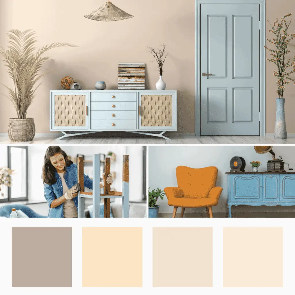
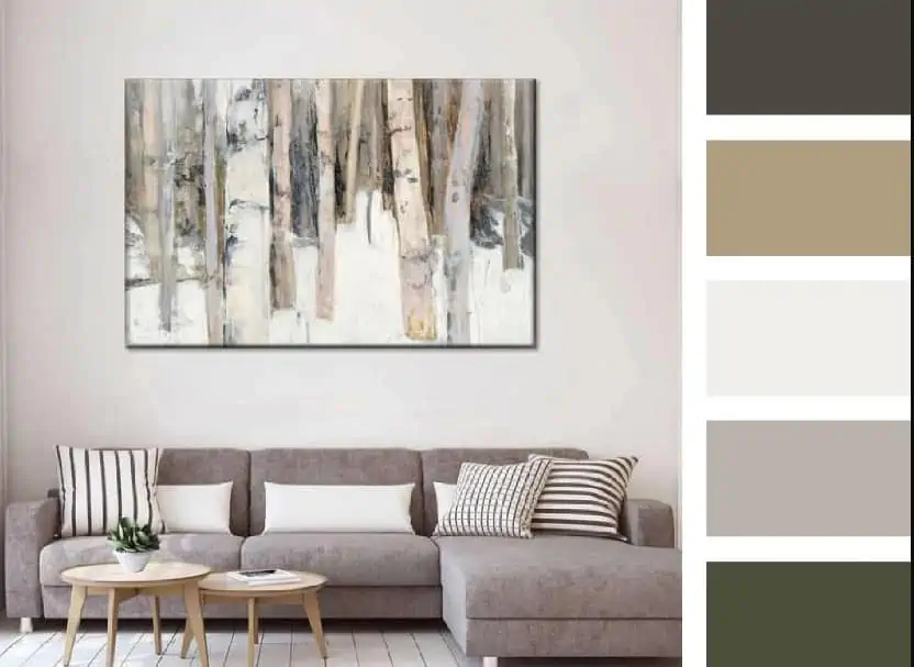
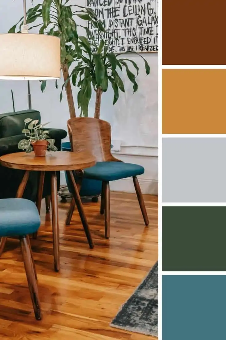
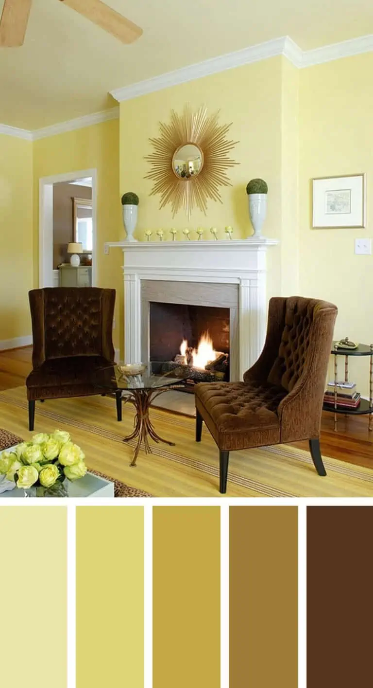
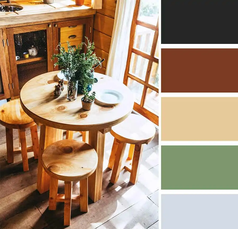
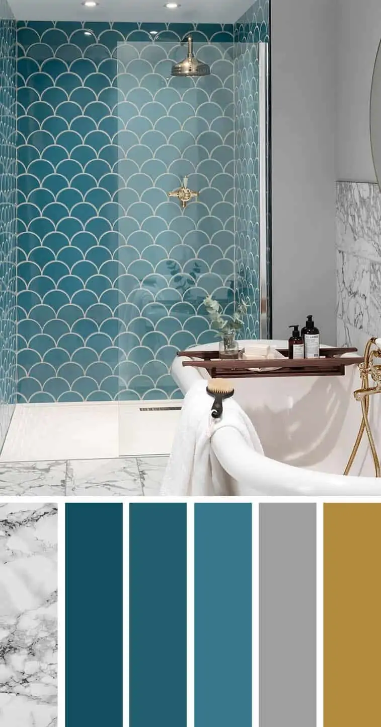
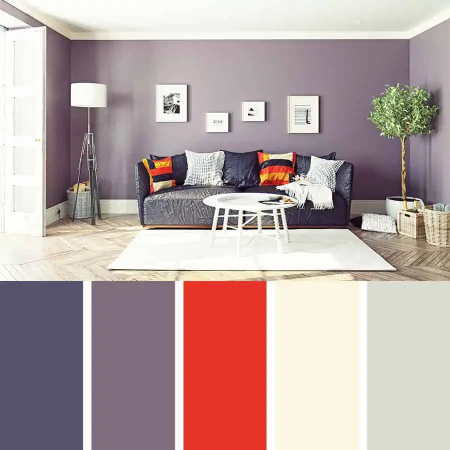
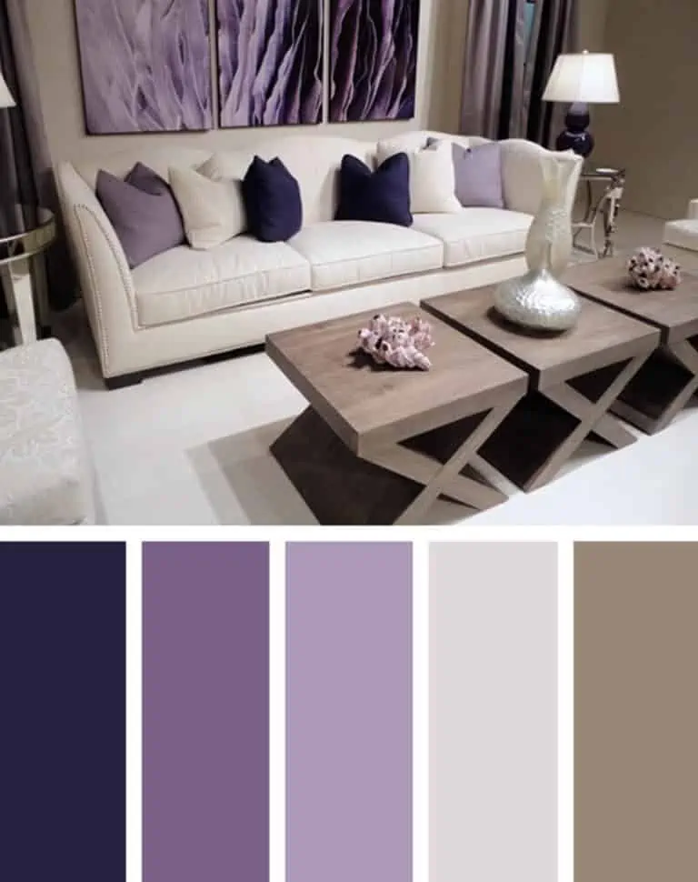
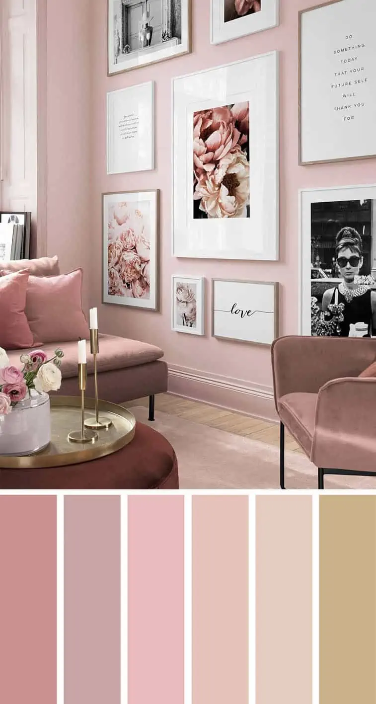
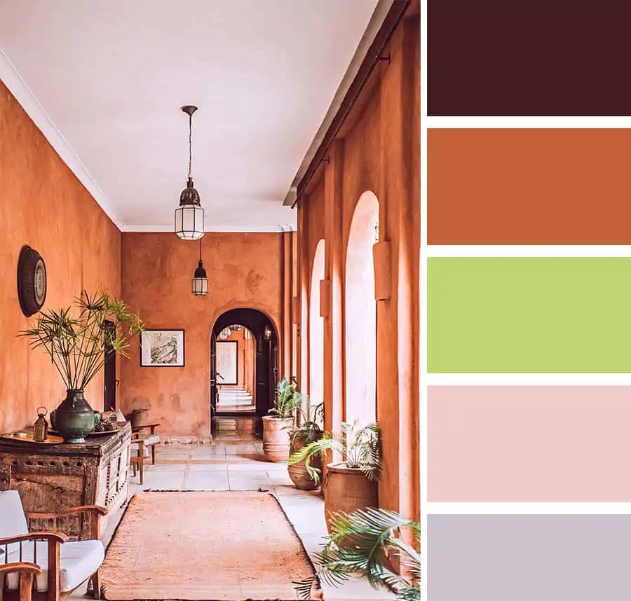
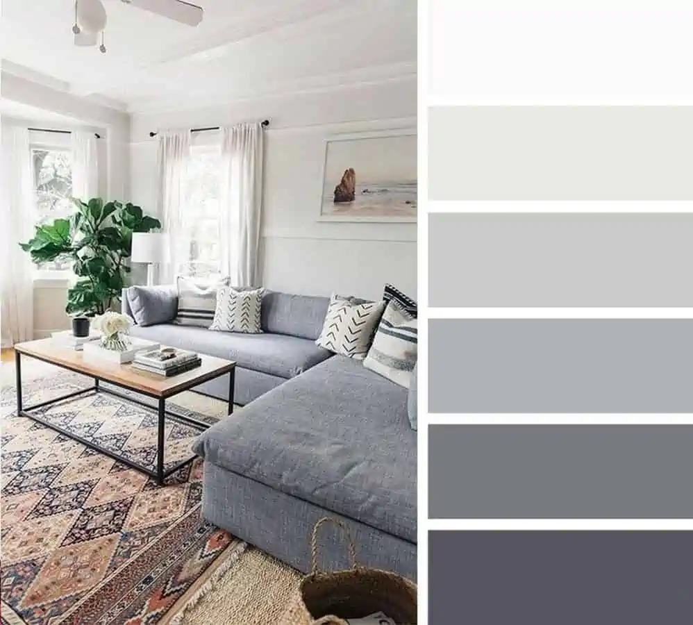
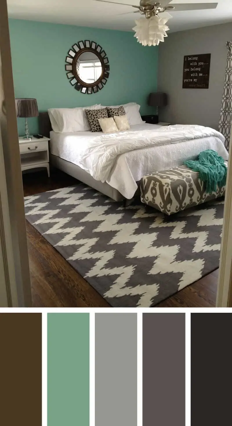
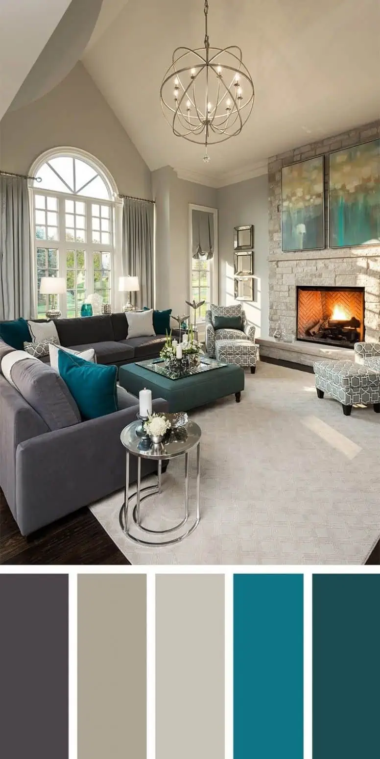
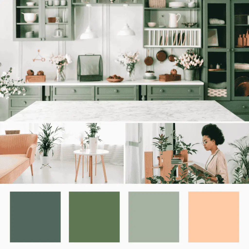
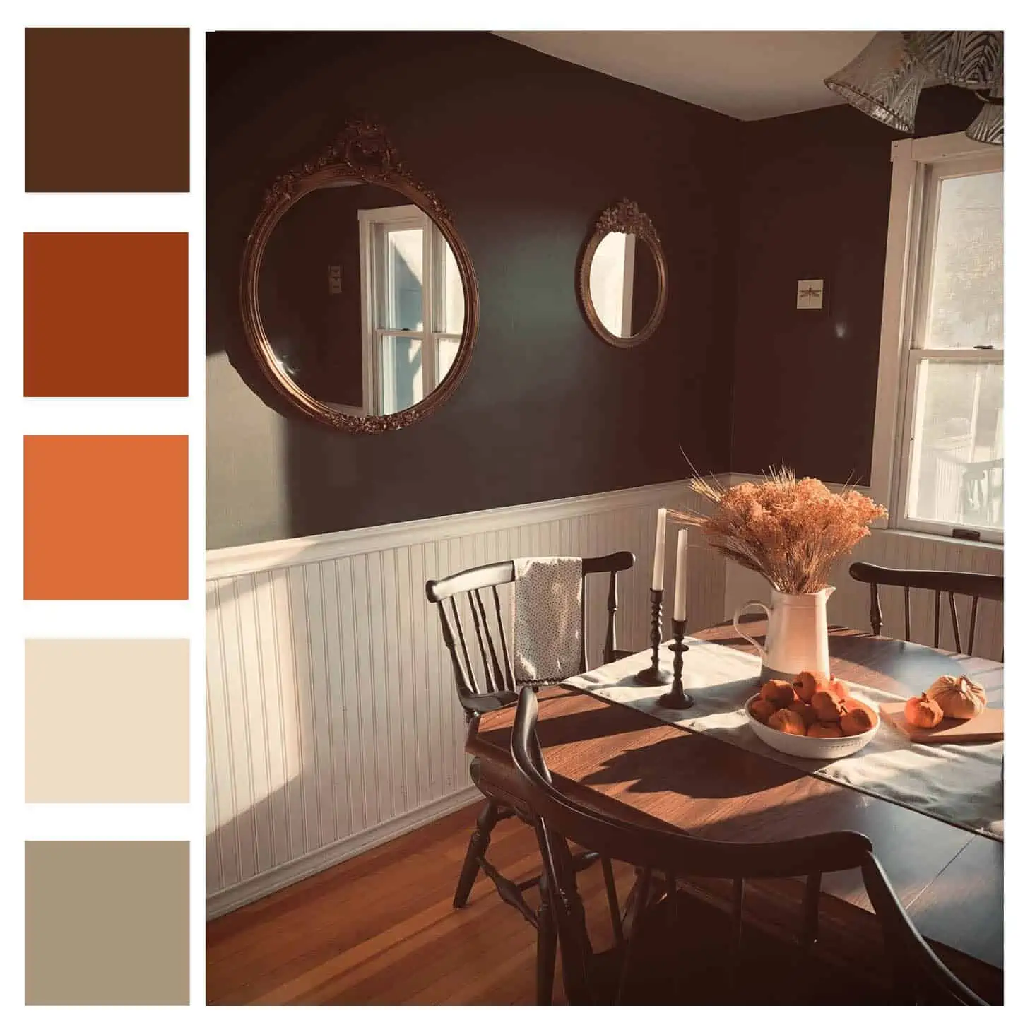
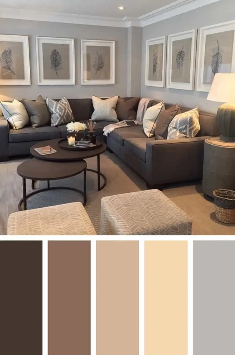
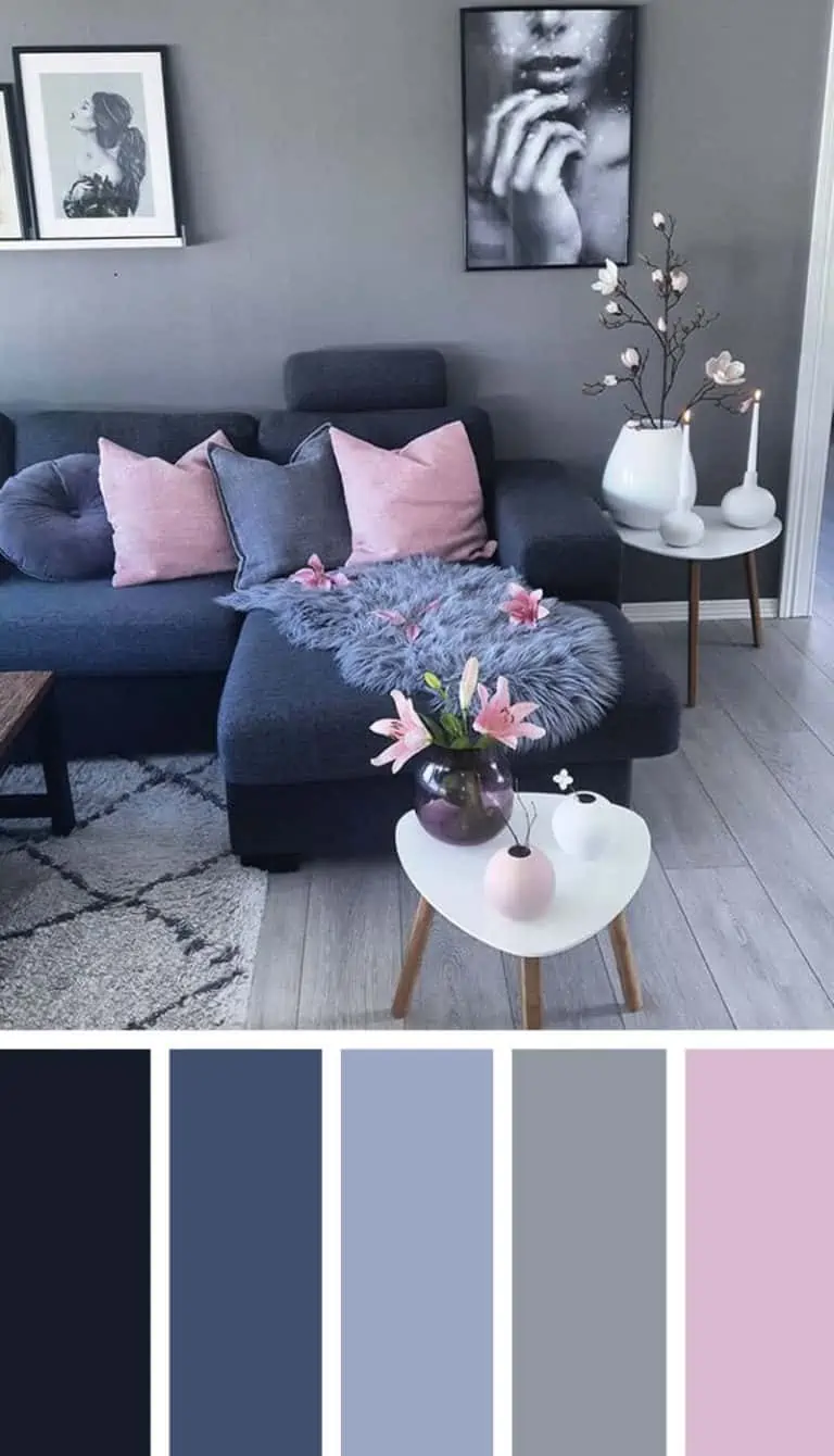
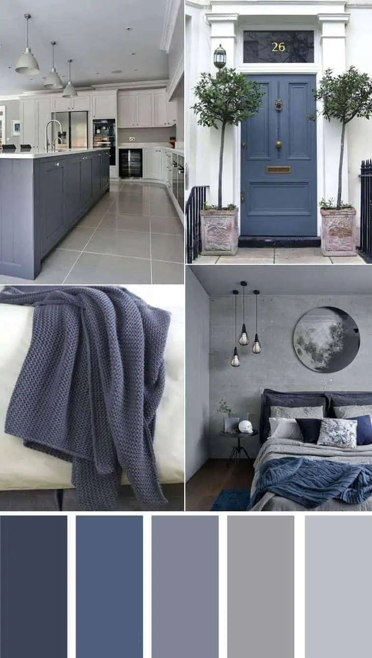
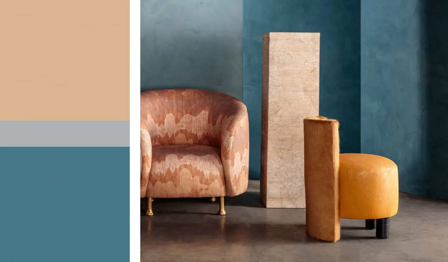
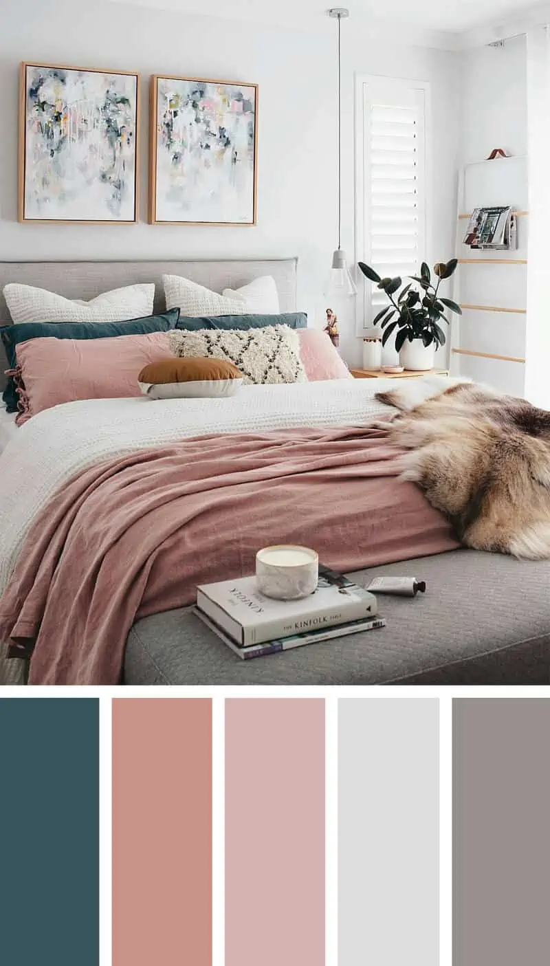
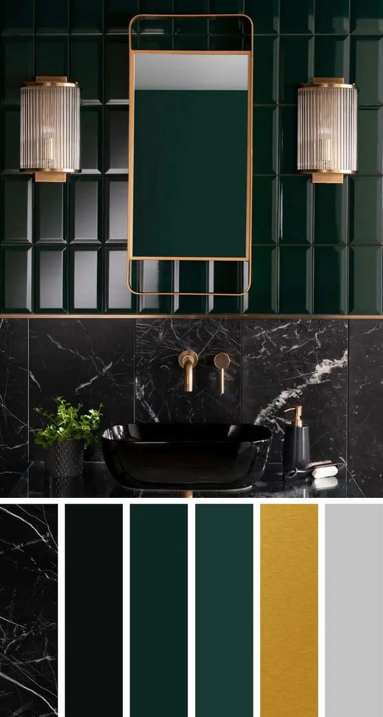
Home colour combination ideas with colour palettes (Image gallery)
-

Image Source: The Licata Group
-

Image Source: Elephant Stock
-

Image Source: Pinterest
-

Image Source: BHG
-

Image Source: Sarah Titus
-

Image Source: Itakeyou.com
-

Image Source:Sarah Titus
-

Image Source: Coco Kelley
-

Image Source: Fabmood
-

Image Source: Sarah Titus
-

Image Source: Rethinking the Future
-

Image Source: Retro Ranch Renovation
-

Image Source: Pinterest
-
Image Source: The Licata Group
-

Image Source: Free Theory
-

Image Source: Sophie Patterson Interiors
-

Image Source: Instagram
-

Image Source: Itakeyou.com
-

Image Source: TrendBible
-

Image Source: Instagram
-
Image Source: Fabmood
-
Image Source: Fabmood
| Also see: 17+ colour combinations for room: Selecting a versatile scheme |
Vastu for home colours
Vastu tips to choose home colours
Here are some tips to choose colours for homes in different directions:
North-East direction: This direction helps you have a clear perspective. According to Vastu Shastra, any light shade of blue is ideal for the North-East corner. Besides blue, the best Vastu colours are silver, grey, brown, green, off-white, cream, or any other metallic hue.
East direction: Vastu suggests using balanced colours for the walls. Homes facing the East have positive energy from nature and strong social connections. You can paint the walls in tangerine colour to counterbalance it and make the most of this direction.
South-East direction: Homes facing the South or East are symbols of cash, fire, and liquidity. Use colours that symbolize a healthy lifestyle with unrivalled wealth. Pink, red, orange, lilac, purple or aqua green will work well for you, resulting in a dynamic lifestyle.
South direction: Vastu states, if balanced well, this direction provides fame as well as relaxation. These two elements are challenging to manage. Choosing the right colour will make it easy to balance them. Use light brown or green shades. Mint green, ruby pink and tangerine are other eye-catching hues.
South-West direction: South-West is an independent direction in your home. Moreover, it supports relationships, guidance, and skill-building. Ideal colours for this direction are pink, red, or any shade of red.
West direction: It is not recommended to use earthy tones like brown or green in the West direction. Use light shades of blue if the West is extended. You can also use neutral shades like white, cream, or coral.
North direction: North represents financial and romantic relationships. If your home is North facing blue colour will be a good choice for the walls. However, white is a suitable substitute if you want to balance your professional and personal life equally.
Vastu colours for home exteriors
According to Vastu, there is a specific set of colours for the home exterior walls that you should try to attract happiness and balance in your life. Here is a list of Vastu colours for the outside walls of your home:
- Yellow: Yellow colour is associated with power and brings in positive energy. Painting the exterior walls of your home with yellow brings happiness, wisdom, and optimism to the members of the family.
- Pink: This is the colour of playfulness and it promotes good health of the occupants.
- White: This colour represents purity and wholesomeness. In addition to making the house look bigger, it attracts positivity.
- Blue: Blue brings in peace and tranquillity and promotes calmness and creativity.
- Green: Green is the colour of nature and is known to have healing powers. Thus, it is the best colour to sustain liveliness.
Vastu colours for home interiors
According to Vastu, it is recommended to choose colours for different areas based on the amount of energy needed in that space. Picking colours wisely for each room of your home helps to maintain positivity and zest in life. Have a look at the table given below to know the ideal colours for various rooms in your home:
|
Rooms |
Colours to use |
Colours to avoid |
| Living room | Serene, white, bright yellow, green, light pink | Black, red, navy blue, brown, maroon |
| Dining room | Peach, light shades of pink, light orange, saffron, yellow | White or black colour palette |
| Kitchen | Shades of orange, saffron, yellow, light scarlet, woody green, brown | Dark grey, dark red, brown, black |
| Pooja room | Yellow, light blue, light green, | Red, black, brown, navy blue, dark grey (all dark colours) |
| Master bedroom | Shades of pink, light red, light brown, mauve, mahogany | Dark shades of red, fiery orange |
| Kid’s room | Shades of light green and light yellow, light blue | Dark shades of red and blue |
| Bathroom | White, light yellow, beige, cream, light brown | Black, red, dark grey, navy blue (all dark colours) |
Factors to consider while selecting colours
Colour wheel
The colour wheel is an arrangement of colours and their hues according to their wavelength. The colour wheel consists of three primary colours: red, yellow and blue. Primary colours are mixed to derive secondary colours namely green, violet, and orange. Tertiary colours are derived by combining equal parts of a primary and secondary colour, like blue-violet, red-violet, red-orange, yellow-orange, blue-green and yellow-green. You also get opposite pairings known as complementary colours which are red and green, yellow and purple, and orange and blue among others. The colour wheel helps in creating a suitable colour combination for your home. You can select paint colour combinations for your home from the colour wheel.
| Also read: How to use colour wheel for interior design projects? (19+ ideas) |
Colour psychology
Colour psychology is a study that shows how colours affect human behaviour. Warm colours like red, orange and yellow exhibit emotions like comfort, love and warmth whereas cool colours like blue, green and purple are calm and soothing. It is widely believed that colours in our home influence our mood and therefore our lives. Every colour denotes a certain emotion. You can match the colour with how you want the room to look and feel and also with the design of your home. Colour psychology is also taken into consideration while selecting the outside wall colour of a home.
Vastu Shastra
According to Vastu, colour therapy is essential to balance our mind, body and soul. Different colours bring different energies into various spaces of our home. This energy has a positive effect on a home as well as its occupants. Moreover, Vastu Shastra states that the perfect placement of your home is a matter of direction and colour. As per the Vastu, different colours are ideal for different directions in your home.
Room decor
Cool and light colours make the room appear larger to the eye. Dark colours make the room appear smaller, creating a cosy atmosphere. The placement of colours and textures alters the room’s appearance and draws attention to specific features. So, before you choose a colour palette for your room, think about how you want the room’s decor to look.
Architectural elements
While choosing home colours, it is important to consider architectural elements like windows, doors, railings, shutters, etc. Considering these elements will help you achieve a cohesive look. Moreover, it will elevate your home exterior.
Watch this video: Best paint colours for the whole house (9 mins 29 secs)
FAQs
What is the best paint finish for the living room?
Choose an eggshell or satin finish for the living room. It conceals flaws and imperfections, especially on uneven walls, giving the room a high-end look.
Which colour is best for Indian homes?
The best home colours for exterior or outside walls are yellow, white, pink, blue, green, grey, beige, and red. For the home interior design, you can opt for white, yellow or a combination of white, yellow and green colours. If you want an airy and cool vibe, go for lighter colours. Dark colours will create a cosy look.
What are the best colours for the kitchen as per Vastu?
According to Vastu Shastra, the best kitchen colours are orange, brown, white, yellow, and green. These colours create a warm and inviting atmosphere and promote good physical health.
Which exterior colours fade the fastest?
Red exterior paints are most prone to fading, based on how their specific pigments interact with UV light. This is especially true of intense red colours, which may fade even faster. Whites and lighter neutrals are the most fade-resistant colour choices.
What colour will make the space look bigger?
The best colour to make the space look bigger is white. There’s no doubt that lighter colours make the room appear larger, especially when it’s filled with natural light. Eggshell or satin paints can aid in reflecting the light, giving a bigger appearance to your space.
Where to use which type of paint colour in your house?
| Type of paint | Where to use? |
| Acrylic paint | Ceiling and living room walls. |
| Mid-sheen emulsions like silk or velvet | For rooms with medium or low sunlight. |
| Low-sheen paints | For ceilings and rooms with direct sunlight. |
| Matte finish | Deep-coloured walls which get more than usual sunlight. |
| Semi-gloss paint | For bathrooms and kitchens or areas which are exposed to humidity. |
| High-gloss paint | On wooden and metal surfaces. |
| Teflon surface protector paints | Kid’s room or areas that are prone to staining. |
| Weather-coat external paint | Exteriors. |
Conclusion
Colours can make or break a space. A homeowner’s tastes and preferences as well as the emotions each colour portrays help in finalising the colour combinations of space. You can see how colour wheel theory presents various options to choose the perfect room colour combination. You can choose from monochromatic, complementary and analogous colour schemes.
Colour psychology is a means of creating a specific atmosphere or mood. Every hue invokes a specific feeling. It is a powerful tool that impacts the mood of the room. It is important to consider the atmosphere you wish to create and then choose the colours which will help you achieve that.
Different colours create different effects in home interior design. You must choose the correct colour according to the look you want to achieve. The paint colour selection also depends on the dimensions of the home and the natural light available.
Colours bring a different vibe and ambience to each room. Creating rooms with fresh bright colours energises and boosts your mood while using cool colours creates a calm and soothing effect. You can go for outside wall colours like white, light brown, grey, green, pale yellow and blue, to give a welcoming look to the home.
You should choose the right colours for your home as it is the most influential and fundamental aspect of interior design.
Now that you have all the necessary information and inspiration for choosing the best home colours, you can go all in and paint your home in beautiful hues.
*The featured image used in the article is from Boca Do Lobo

63+ Ideas for wall decoration: Upgrade from dull to dazzling walls
Empty walls are nothing but plain canvases for your creative imagination. There are a lot of ideas out there for wall decorat